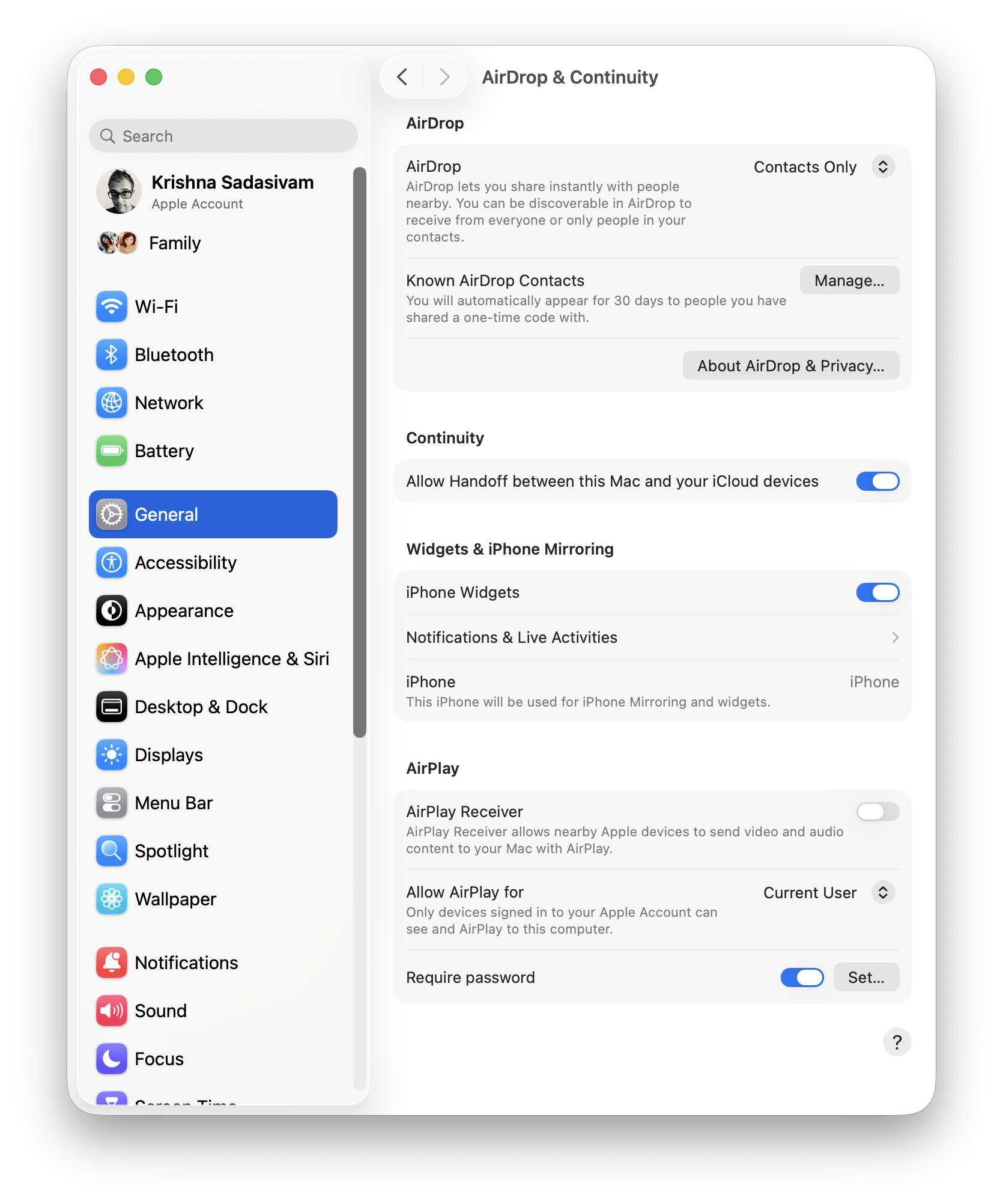
The last two major settings I’m interested as part of setup is AirDrop and FileSharing. In AirDrop, I’ve turned AirPlay Receiver OFF as I have no intent or interest in having my other devices send over video and audio.
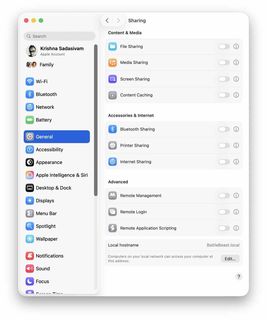
Under Sharing, I’ve turned File Sharing OFF. I prefer to have it turned on ONLY when I have a need to share files between my Macs. The plan is to implement a script (like I did in Alfred) to toggle File Sharing without having to visit System Settings each time.
And that basically concludes my macOS System Settings setup for FrugalMac. The FrugalMac series will continue, as I examine the third party applications I’ll need to make the most of using my new Mac.
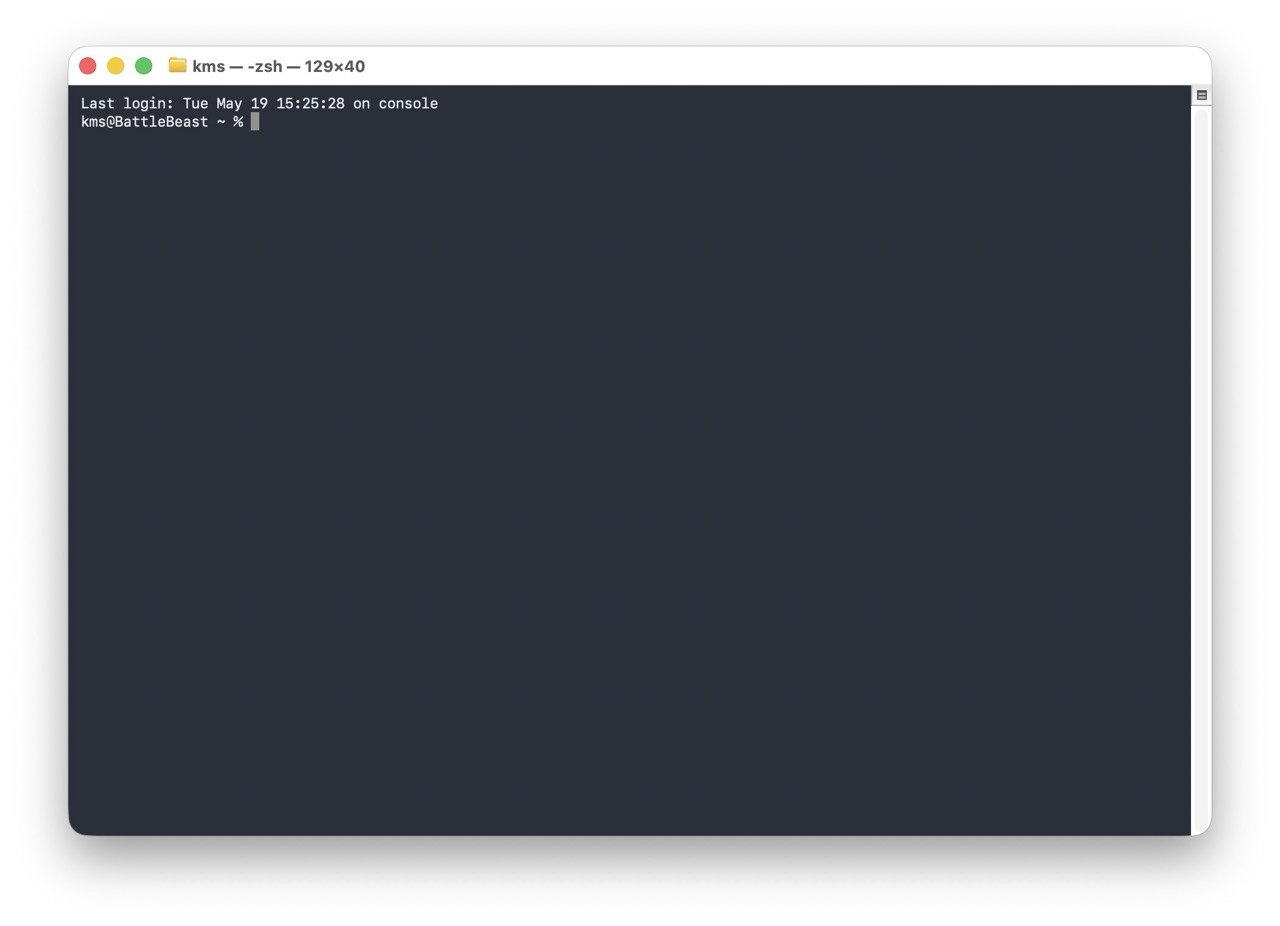
This post will focus on how I configured the macOS Terminal from its default settings. Here’s how it looks, on first launch from a fresh macOS install. The type is unbelievably tiny (for me).
Let’s get started.
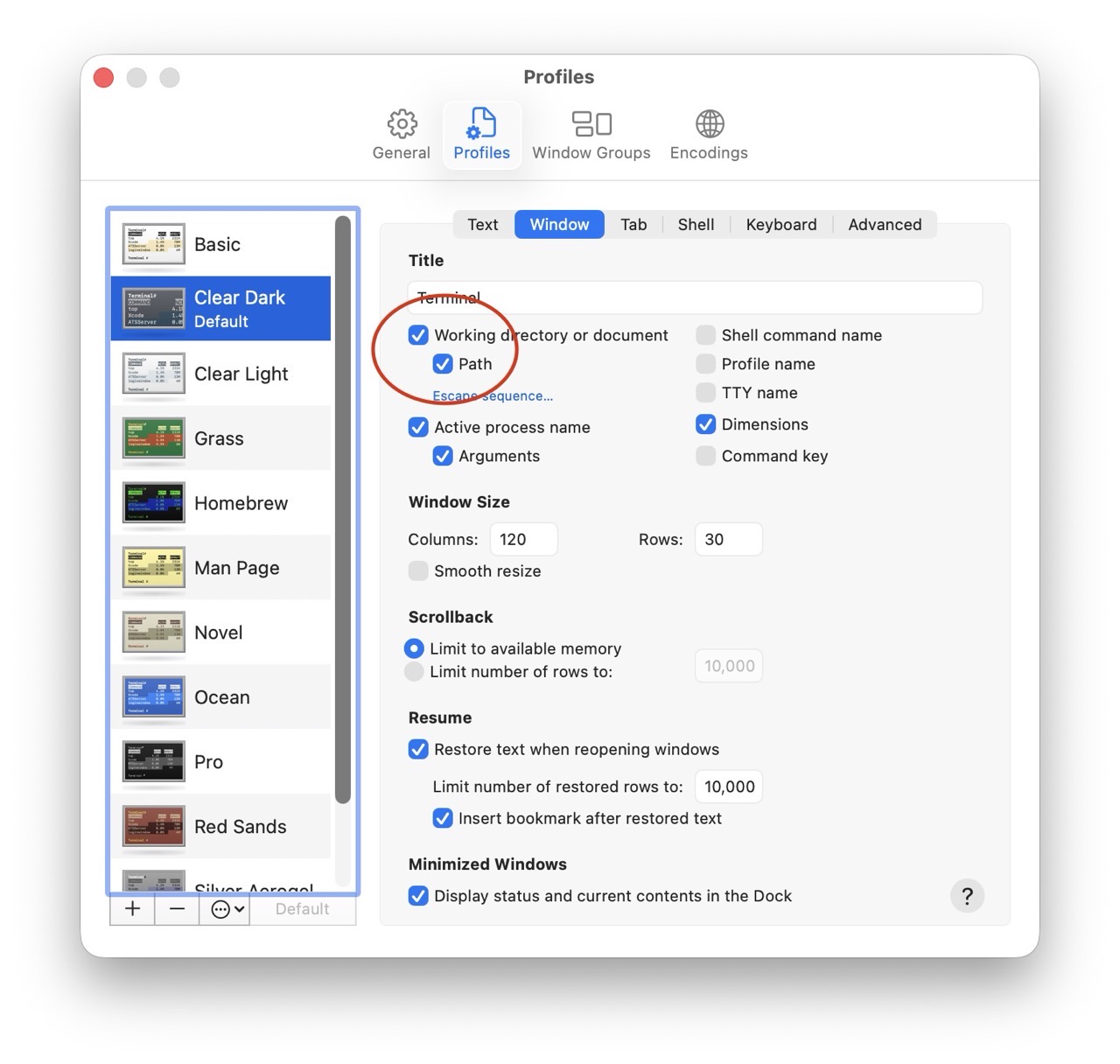
In Terminal’s Settings panel, I have checked “Working Directory” and “Path”. These parameters will show up on the Window title bar for a new Terminal session, making each Terminal window more descriptive.
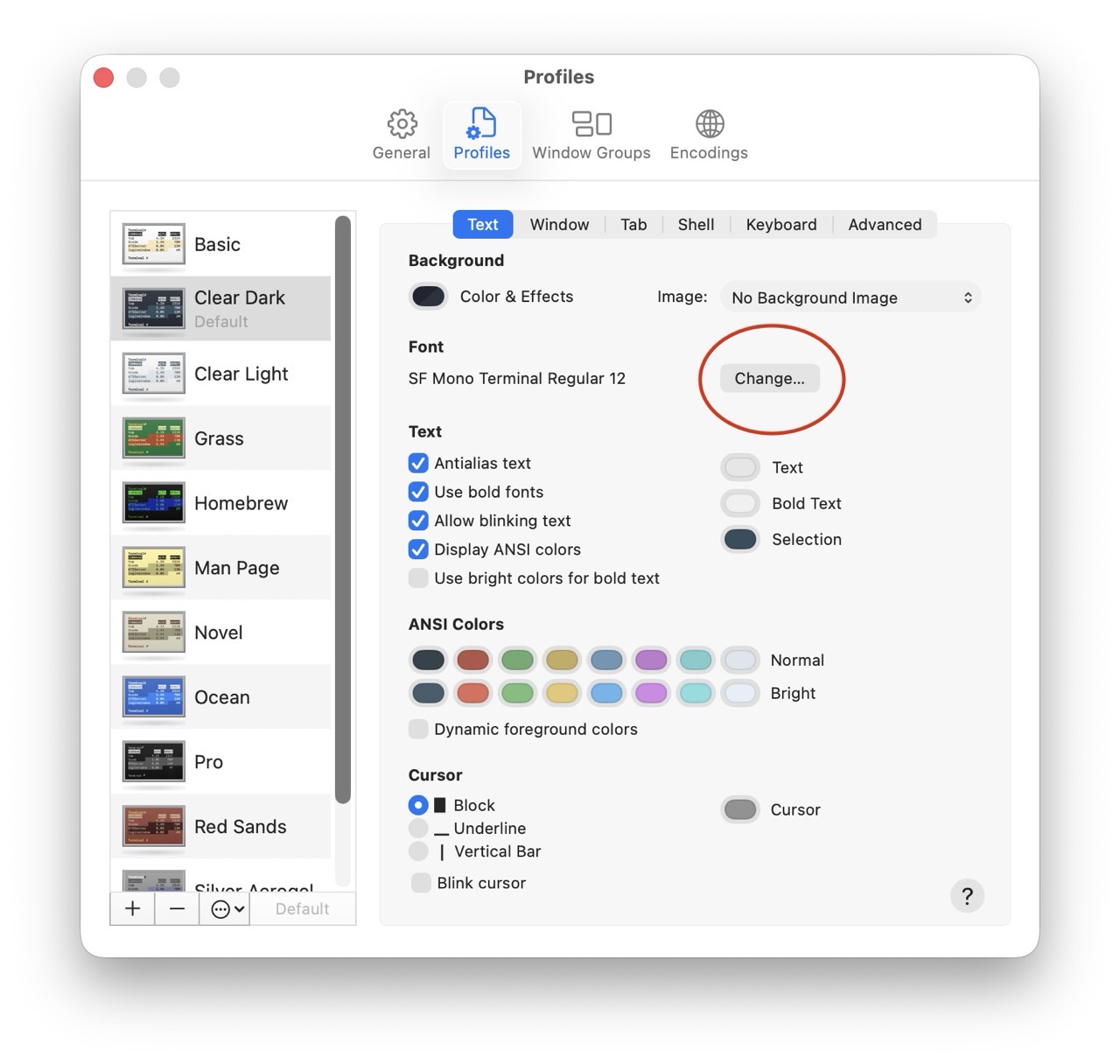
Next, let’s increase the size of the terminal font. (12 pt is too small, so I’ve bumped the size up to a respectable 18 pt.)
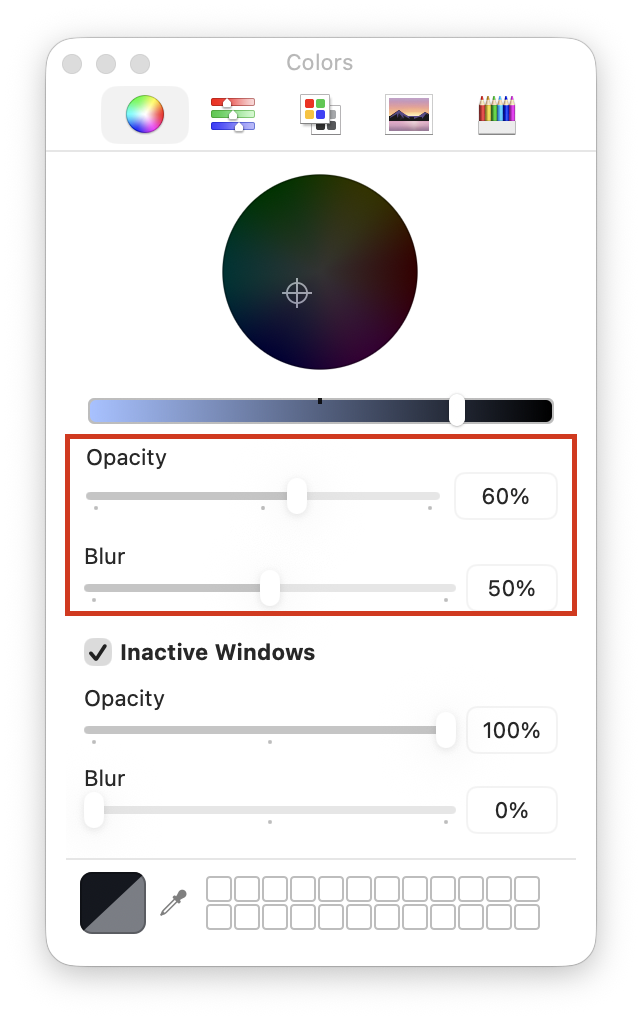
Next, I’ll tweak the appearance of the Terminal window itself, making it slightly more transparent (and less blurry).
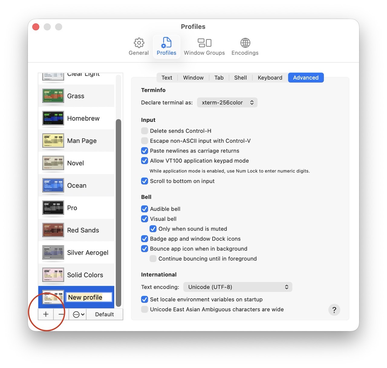
With the new Terminal appearance settings in place, they must be saved. (I recommend saving them into a new profile.)
More often than not, I want two Terminal windows open at the same time. macOS Terminal does offer this option, but it’s not super obvious.
Here’s how I set it up.
1) Open two terminal windows. Adjust the window size for both windows as needed. (I’ve stacked them vertically, one atop the other.)
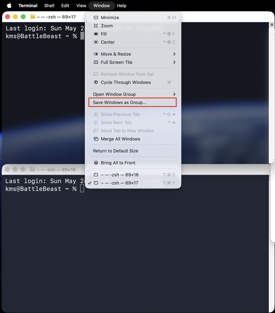
2) In the menubar, select Window > Save Windows as Group and provide a descriptive name.
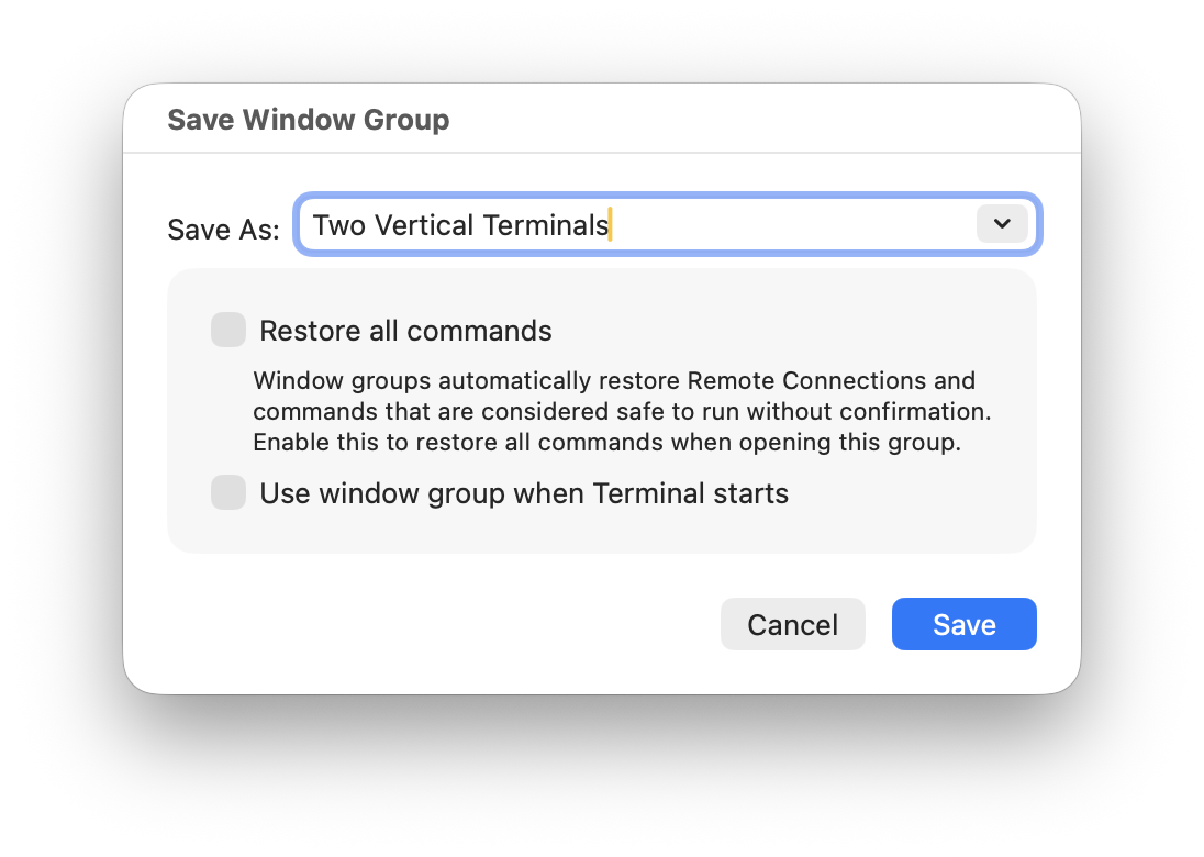
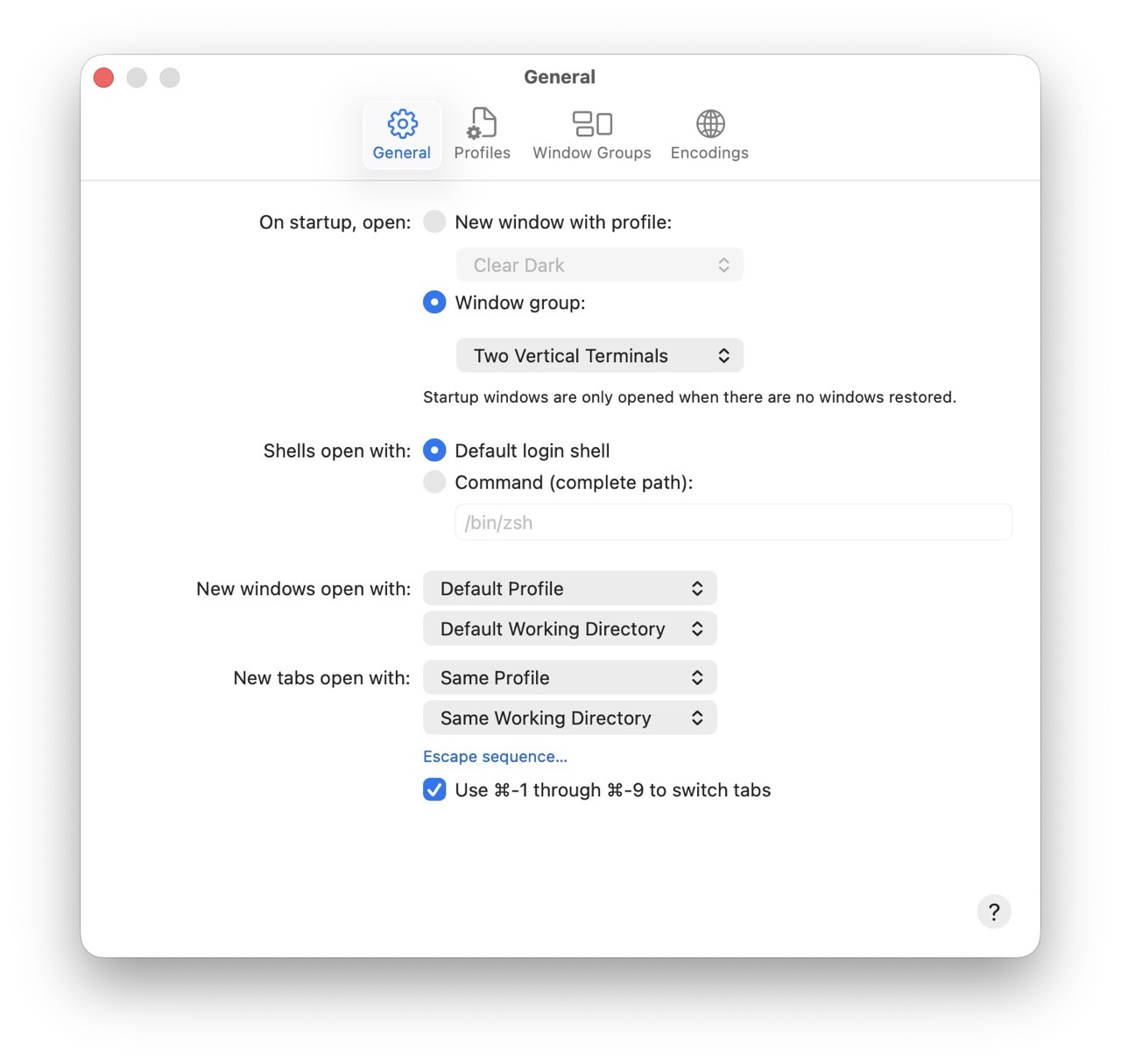
3) Lastly, set this Window Group to automatically open on startup.
Each time I launch the Terminal, I’ll now see two vertically stacked Terminal windows. There’s plenty more configuration left to do within the Terminal itself, but I’ll save that for a future post.
My newest instructional video focuses on using Illustrator’s Shape Builder tool (Shift M), coupled with Effect > 3D and Materials > Extrude and Bevel and Effect > Distort and Transform > Transform tools to create interesting head gear (among other things).
I used this technique to create the following illustrations below.
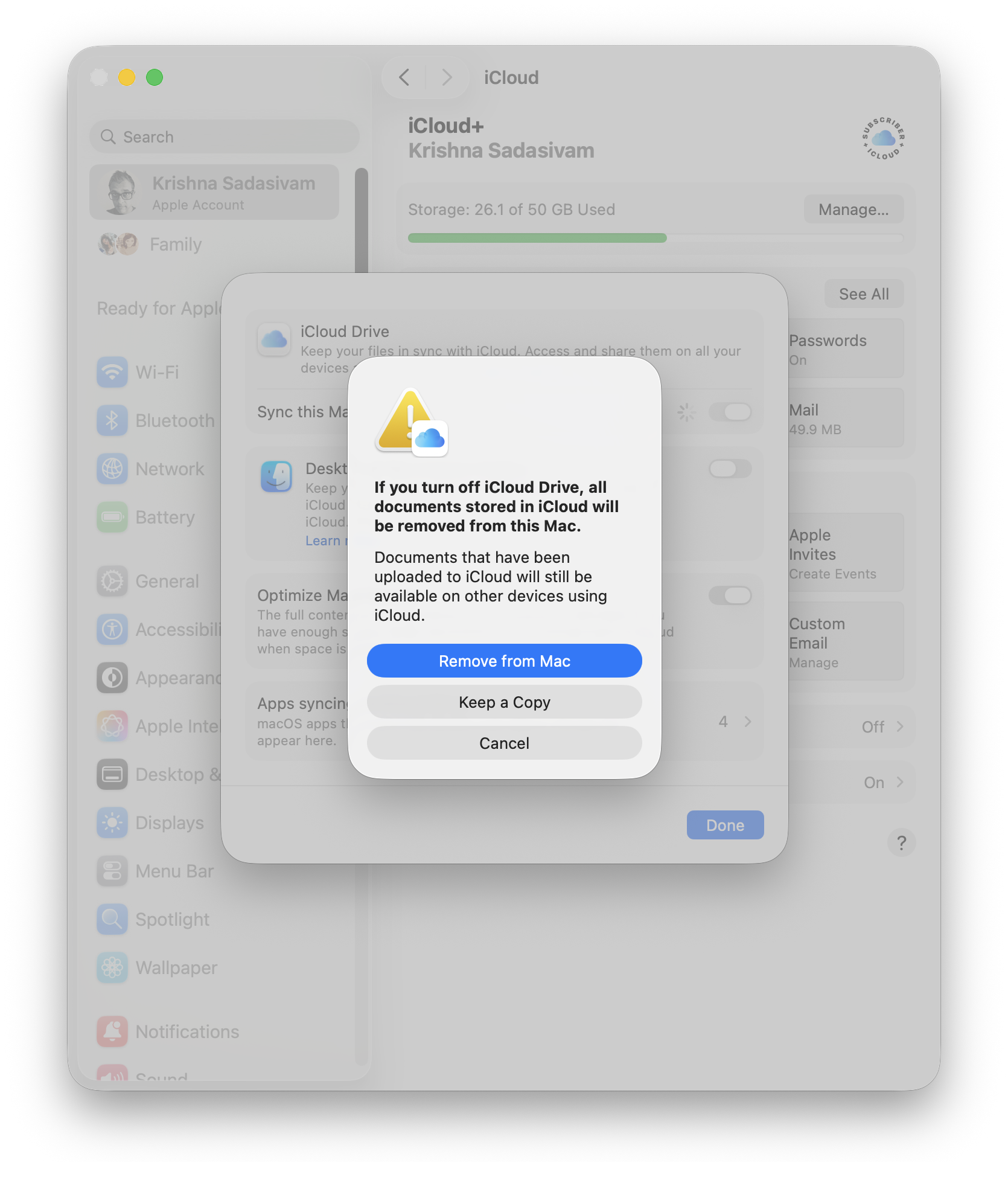
Cloud-based syncing via iCloud is generally pretty good, but right now, during setup: it’s a distraction. The FrugalMac setup is all about intention, so I’m turning it off until I’m ready. To do so, go to your Apple account, click iCloud and turn off iCloud Drive. This will remove iCloud Drive files from my M5 Pro – keeping the iCloud contents themselves intact (in the “cloud”).
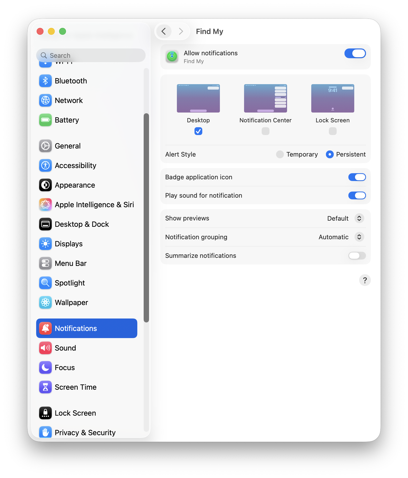
Notifications:
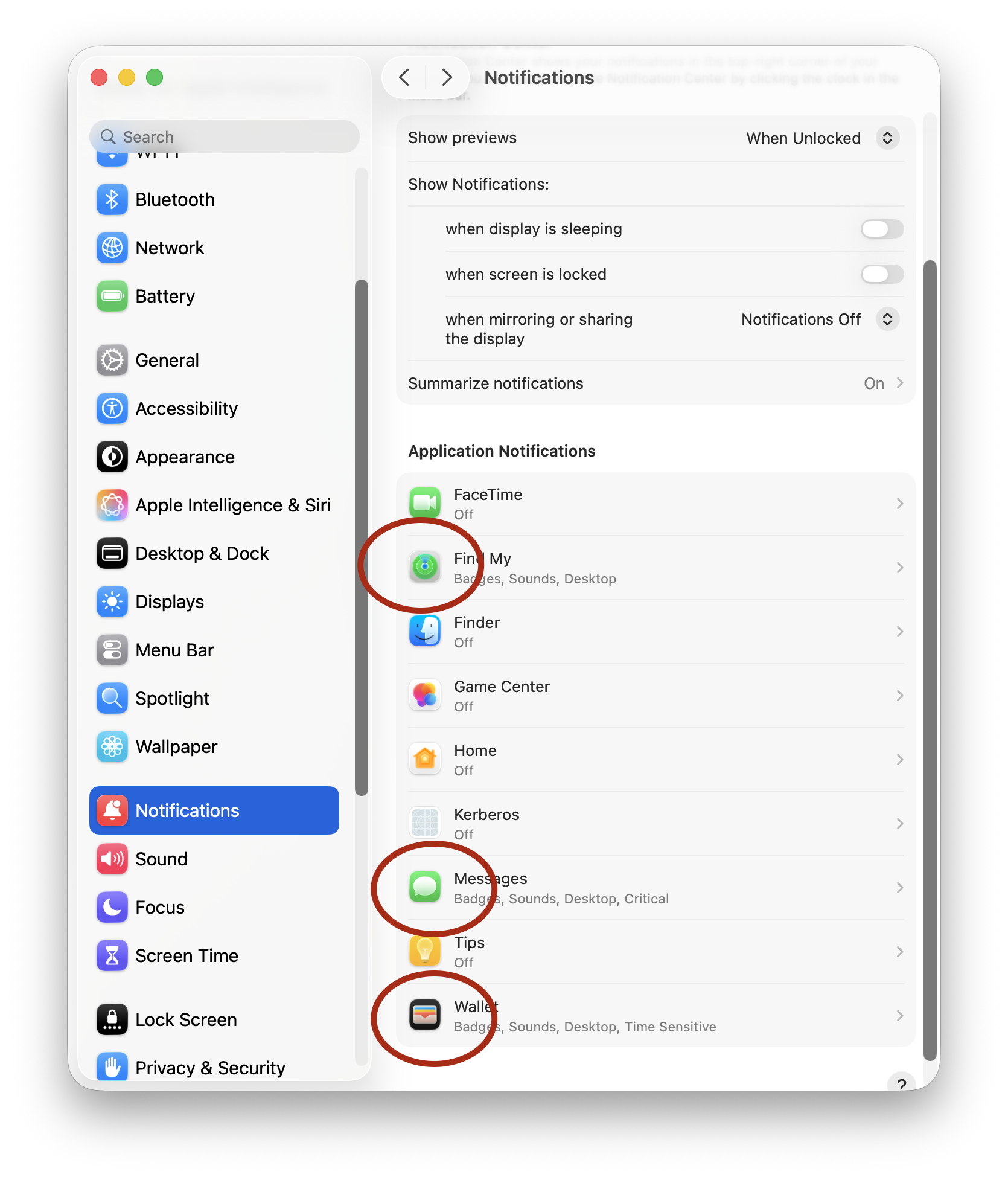
Notifications are useful, until everything becomes a notification. My default stance on notiications is “no notifications”. But there are some exceptions to that rule: Find My, Messages and Wallet. These notifications appear on my Mac, and stay until I dismiss them.
Notifications that I deem important will show a badge and play a sound.
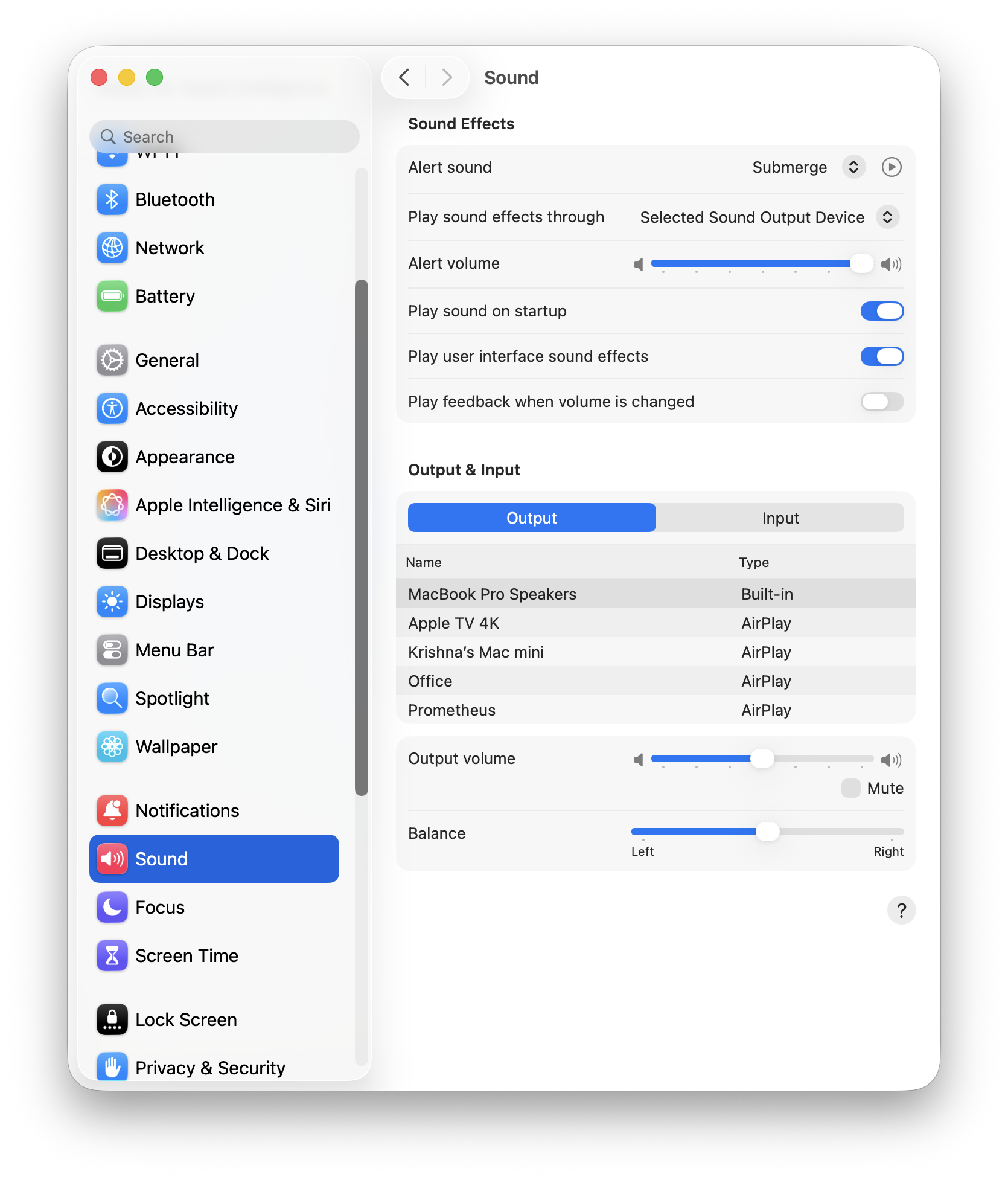
Sound:
The only change I’ve made here is the selection of “Submerge” as my Alert sound.
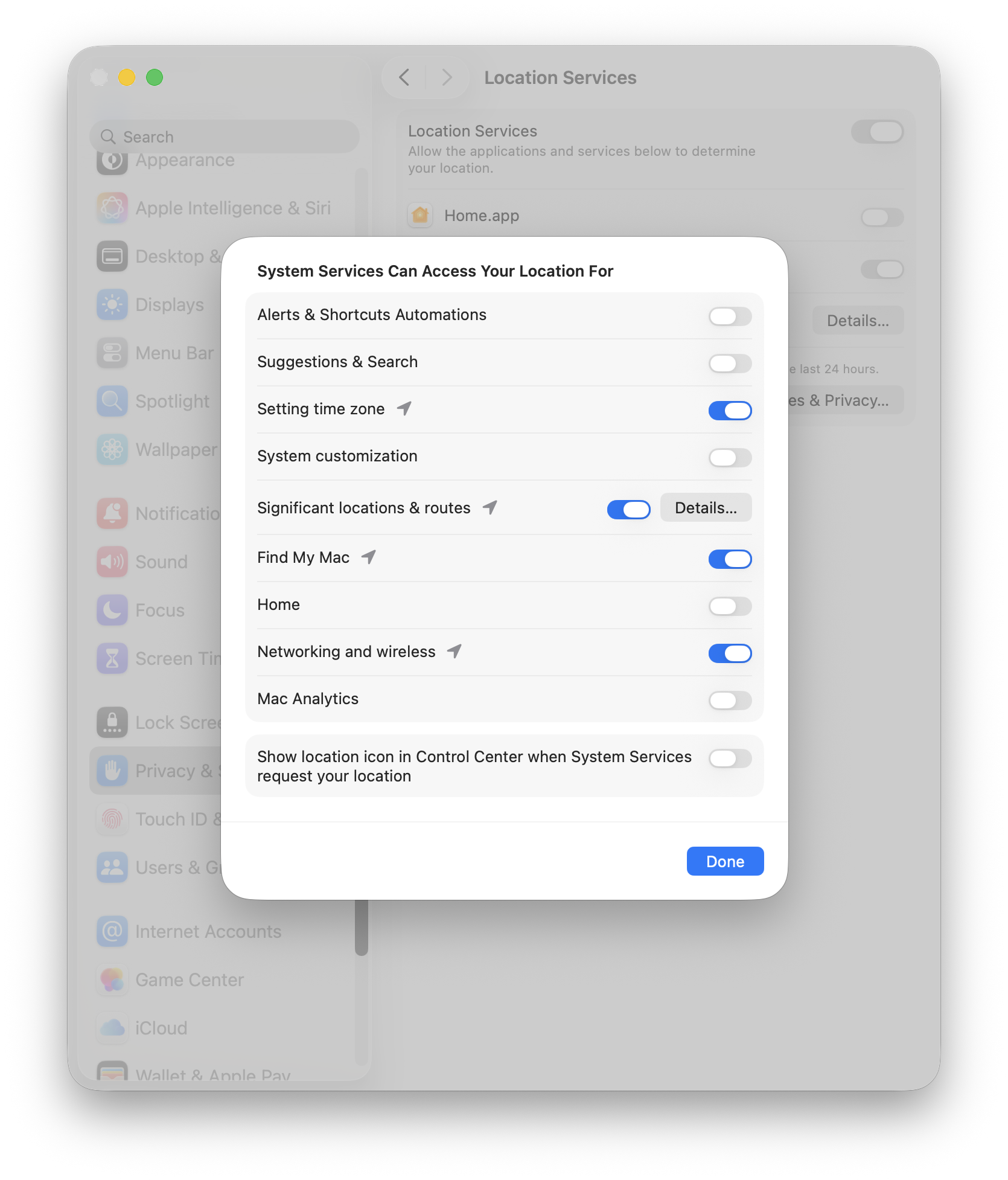
Location Services:
Location services are allowed access for setting the appropriate time zone, Find My and Networking. That’s it.
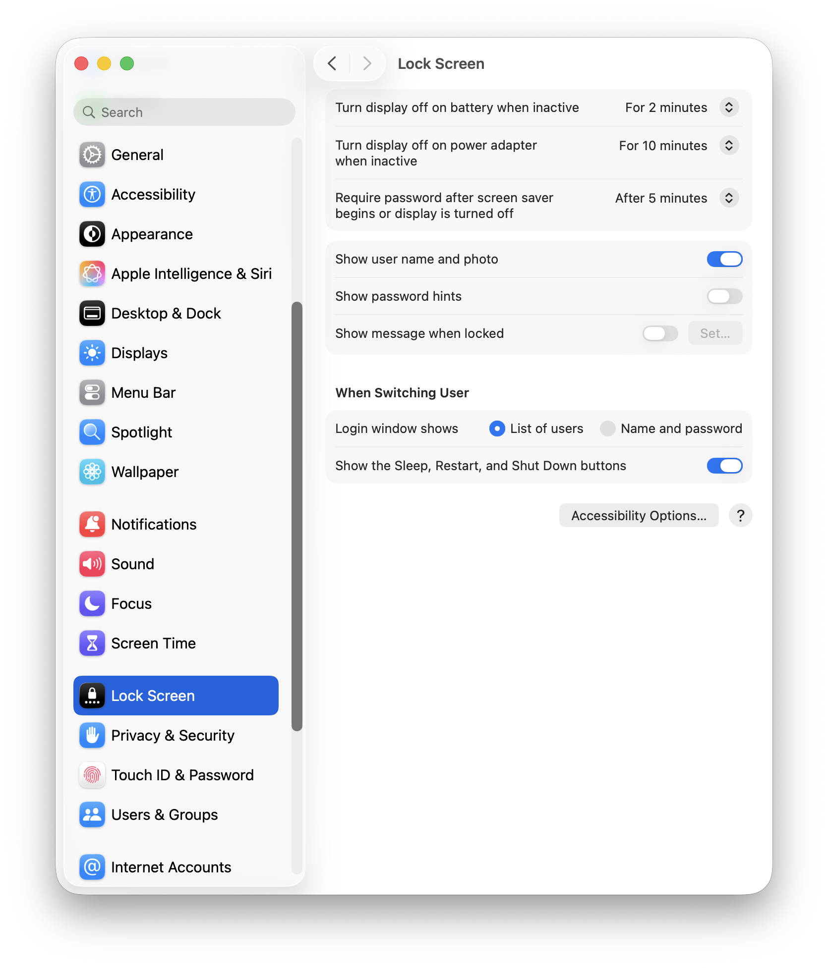
Lock Screen:
I take my laptop with me where I go, so having the Lock Screen active is imperative. No password hints.
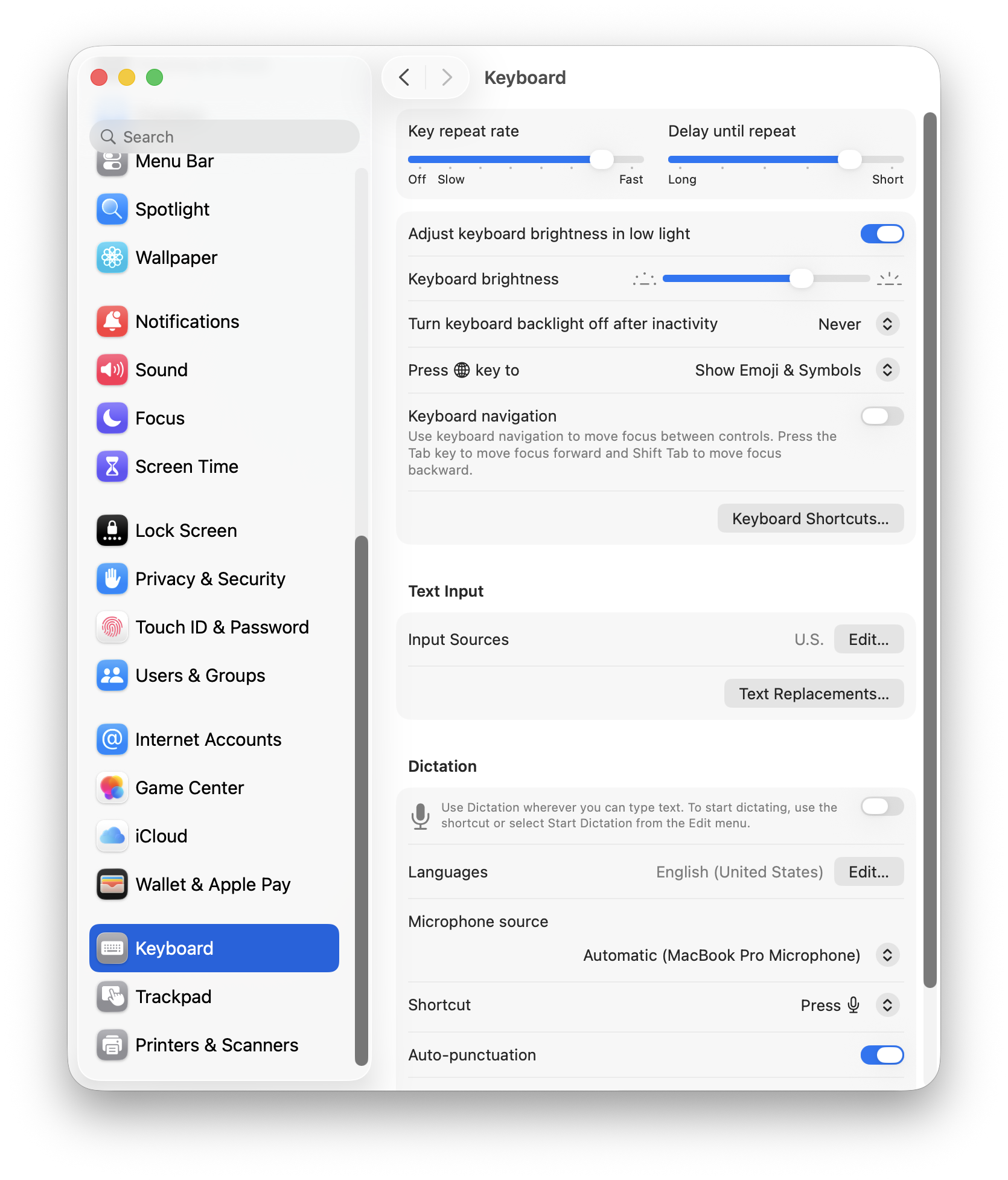
Keyboard:
I prefer a higher key repeat rate (press a letter and it repeats with just a hint of delay).
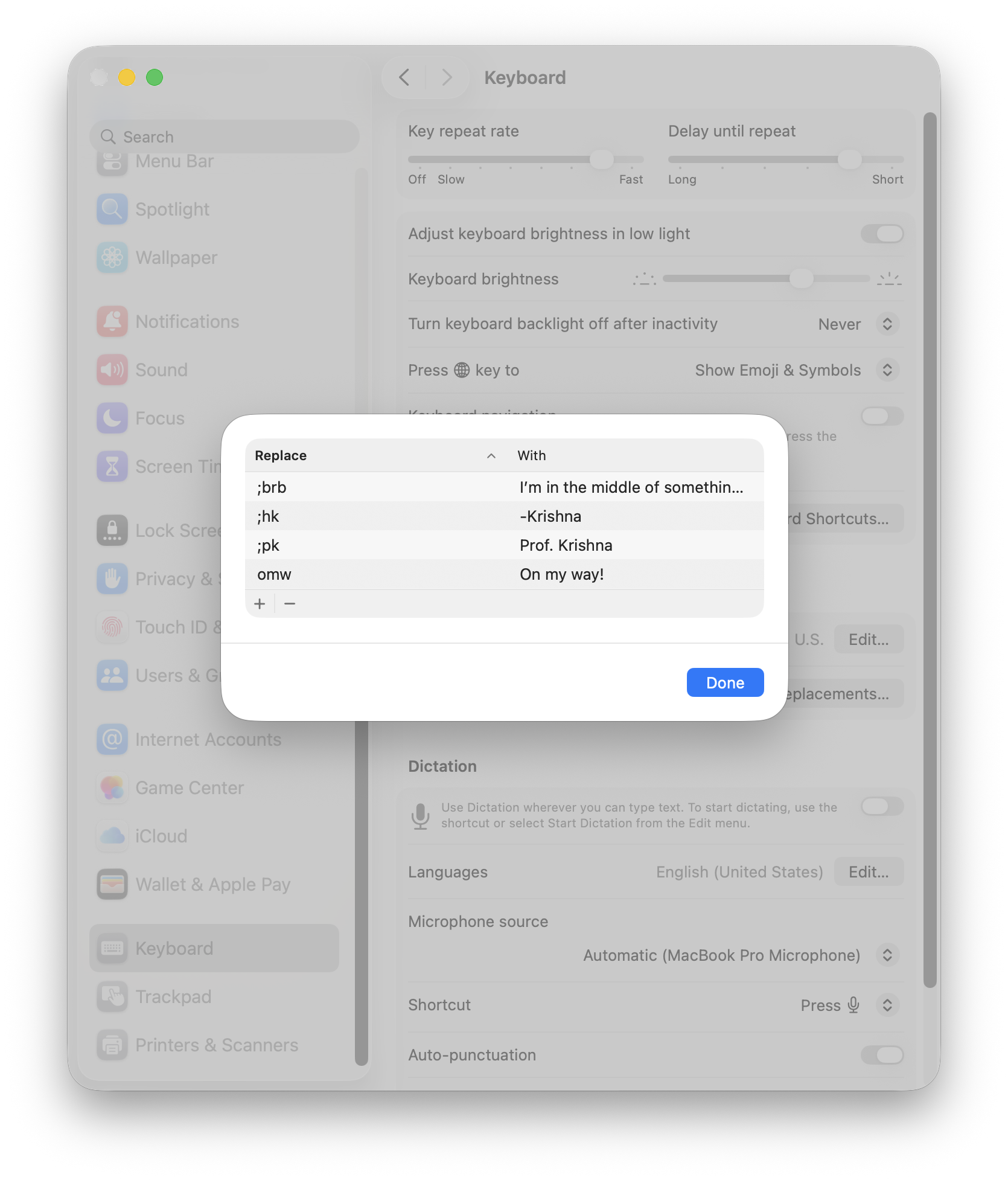
Under Text Input, I have a few hard coded text replacements, mostly for sign-offs and canned text replies. This will work, for now.
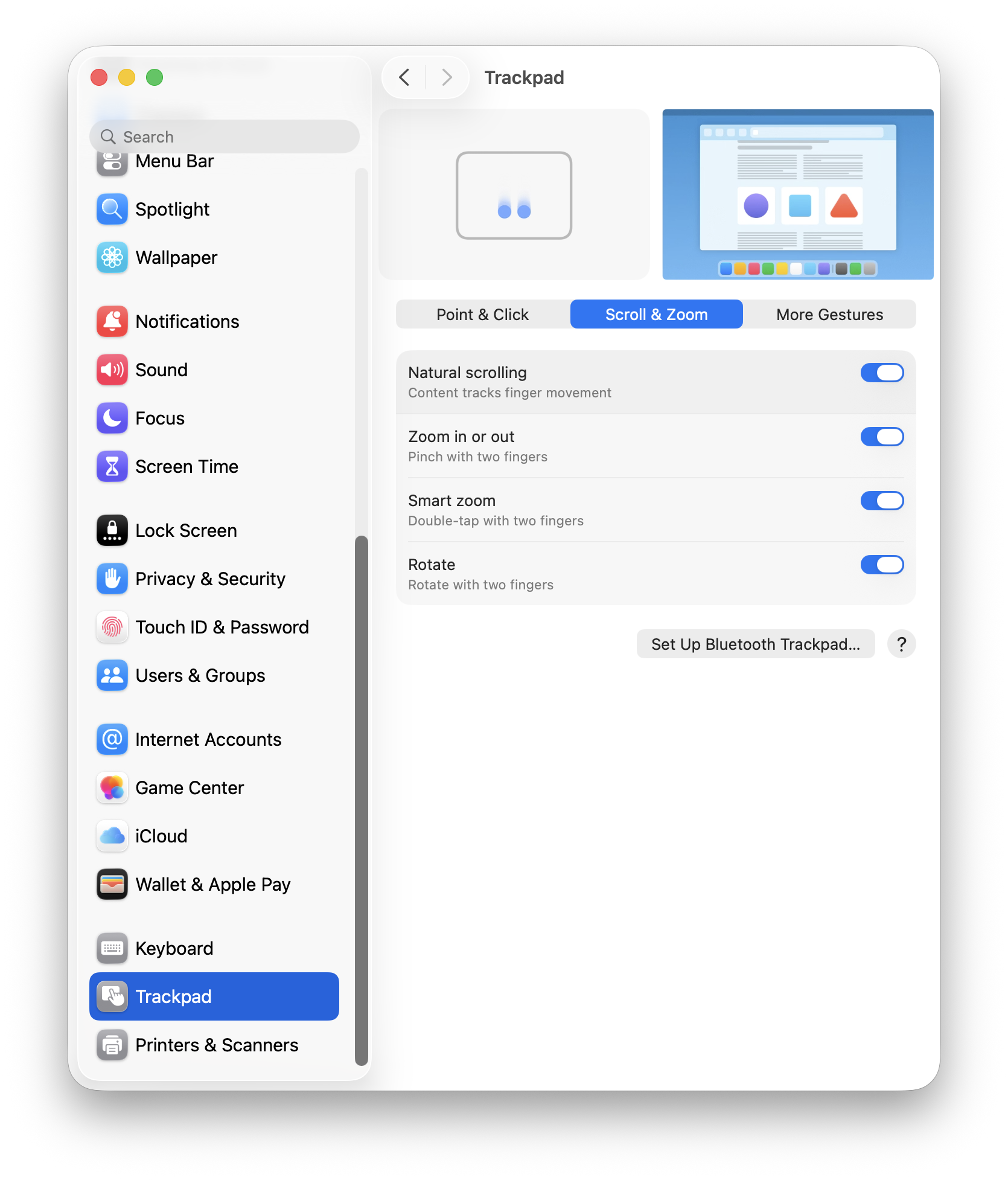
Trackpad:
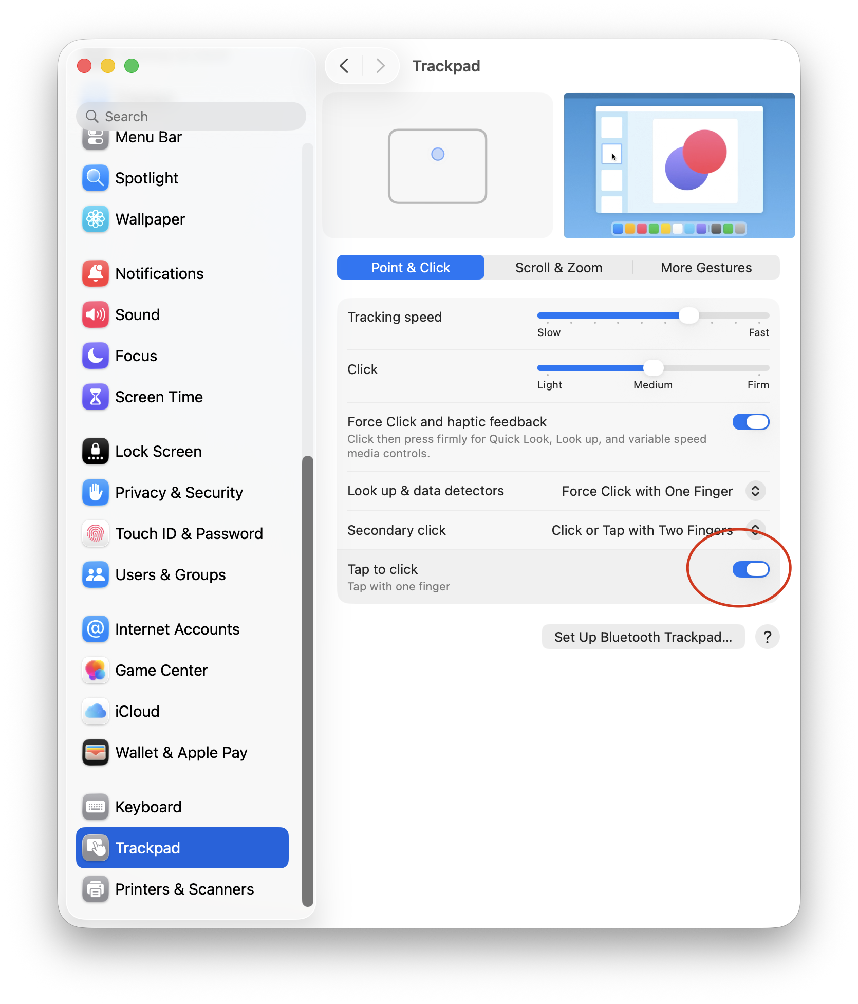
I’m more of a mouse user than a trackpad user. When I’m at the office or working from home, I always use a Logitech MX Master 3S mouse as my main peripheral. For Point & Click, I like a faster tracking speed and Tap to Click.
For trackpad scrolling, I have kept the defaults. I tried using the Mac without “Natural scrolling” but it felt wrong, so I stuck with the defaults.
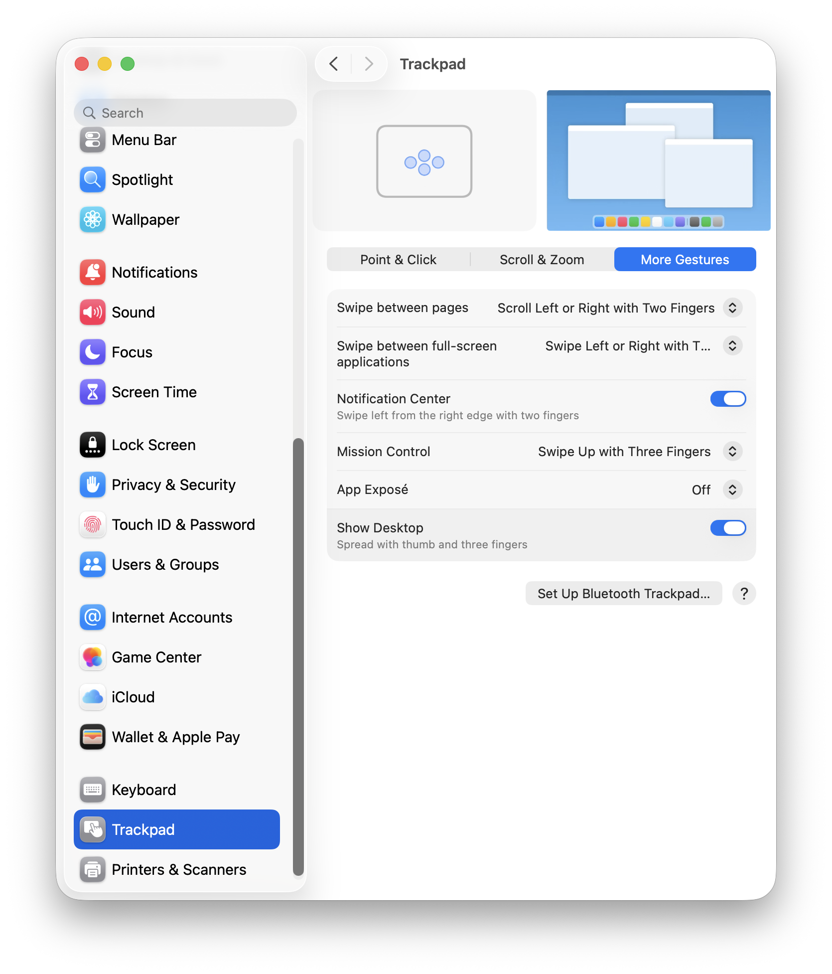
I haven’t used the trackpad extensively to take full advantage of trackpad gestures, so I’ve kept the defaults as is.
At this point, FrugalMac has a solid base-line setup. Next, I’ll look at AirDrop & Continuity, Sharing, Login Items and Passwords.
I’ve skipped more than a few System Settings. I’ve also left off e-mail and browser configuration, but I’ll be using both stock Apple Mail and Safari for those tasks, respectively.
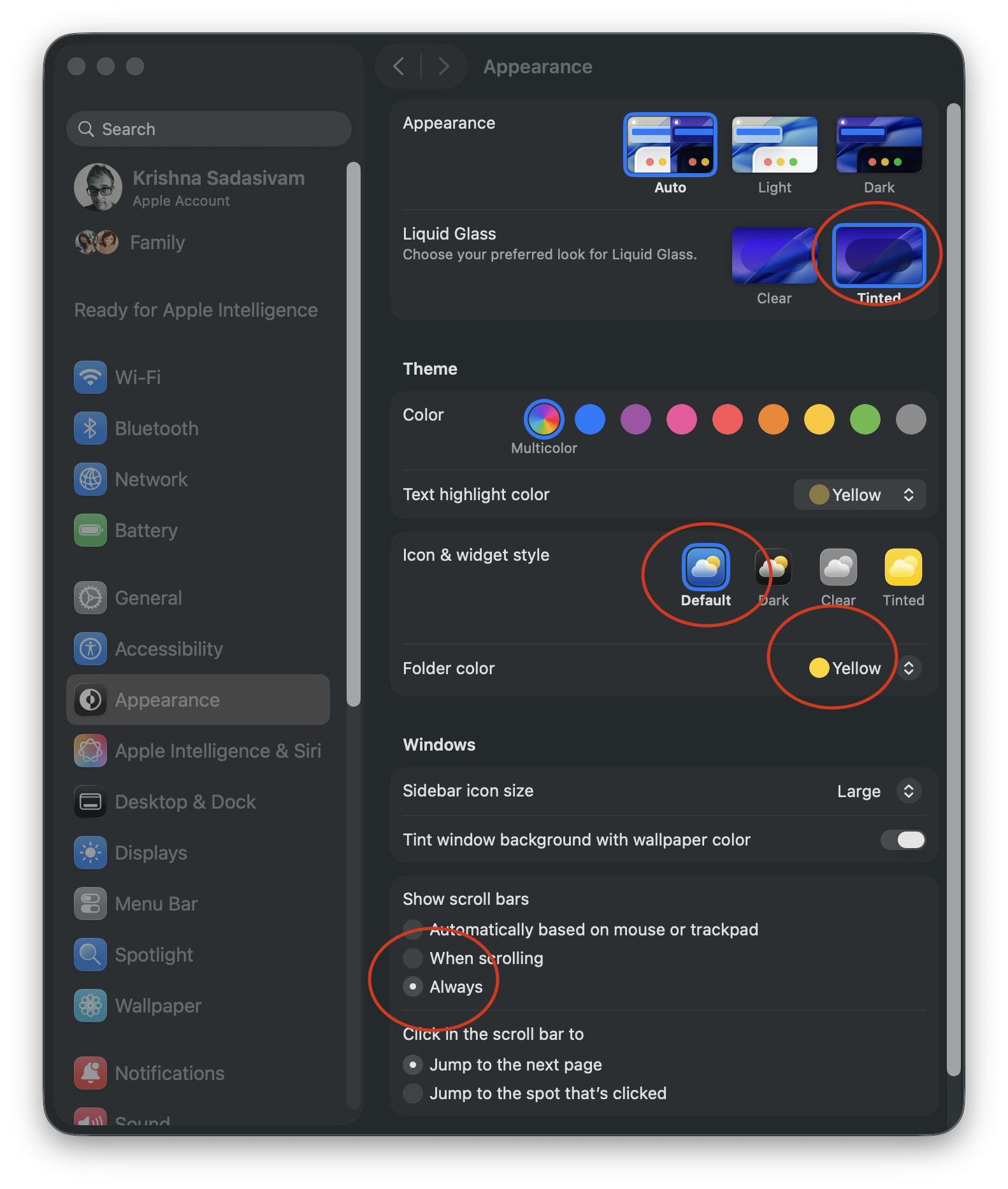
As a long-time Mac user, macOS’s customization options have slowly improved. (More customizing options are still needed.) Let’s start with some basic appearance tweaks, found within Settings > Appearance.
From the top, I’ve chosen Auto to have my Mac change from light to dark mode, based on time of day.
However you feel about Liquid Glass, it can’t be replaced in macOS 26. The Tinted option is what I prefer, to improve contrast. I’m sticking with the Default Icon and widget style because, for me, color distinction is critical for quick icon identification.
I’ve set my default folder color to yellow, while scroll bars are set to Always. I’m not a fan of Tahoe’s thick scroll bars, but having them always visible lets me know that more options are available if I scroll. While I’m here, I will make the sidebar icon size Large.
I hope that one day soon that users will have the ability to influence more window color options beyond light and dark variants. (I’m not holding my breath.)
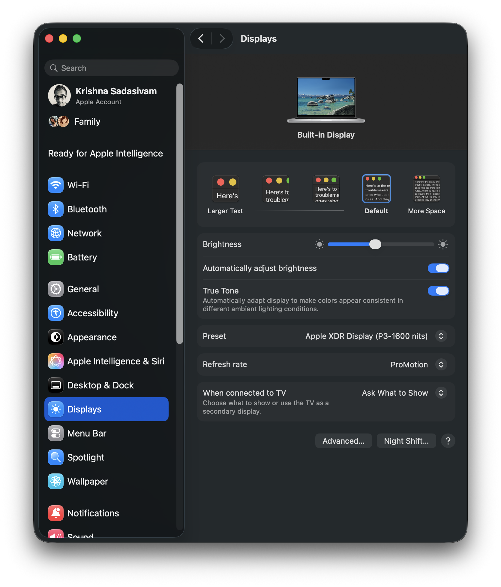
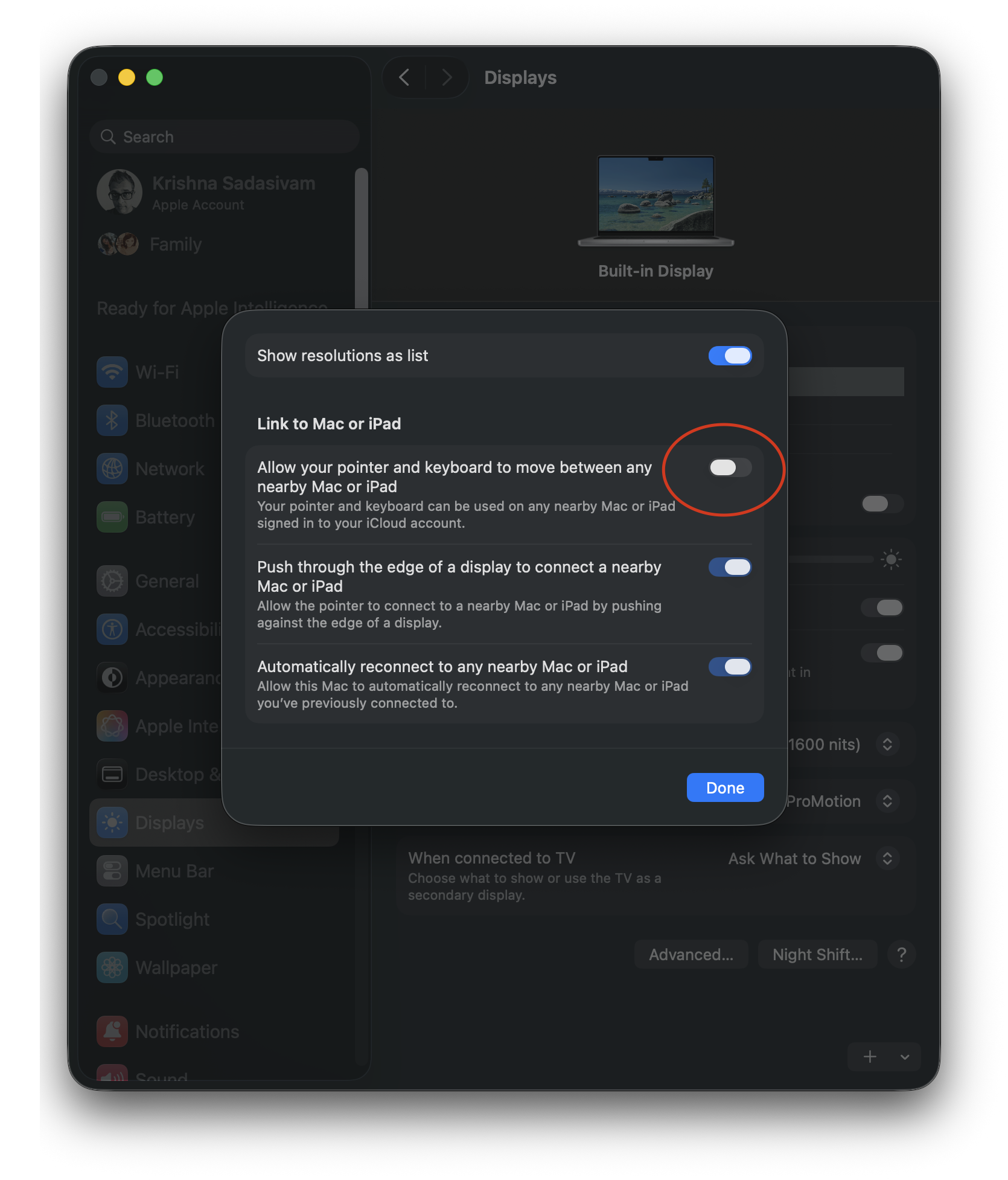
Onto System Settings > Displays, where I have kept most of the default settings. Clicking the Advanced button reveals additional options for showing specific screen resolutions.
Show resolutions as list is ON, and “Allow your pointer and keyboard to move between any nearby Mac or iPad” is turned OFF. Bizarely, the remaining two options cannot be toggled OFF.
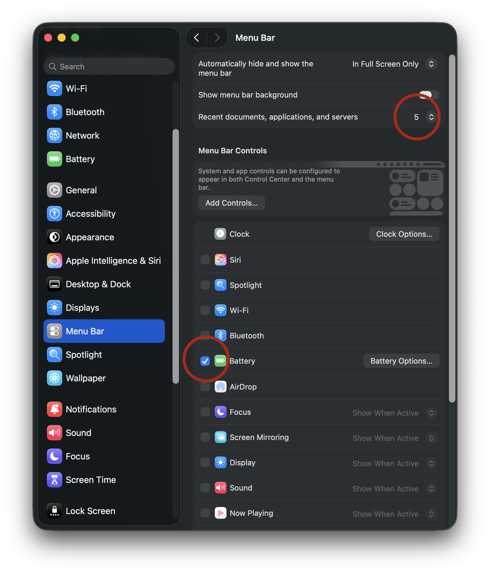
For System Settings > Menu Bar, I limit the number of recent documents, apps etc. to 5 instead of 10. I’ve also turned off all menu bar controls, save for Battery. (Some of the menu bar options that are OFF, such as Wi-Fi and Bluetooth, will be placed in Control Center.)
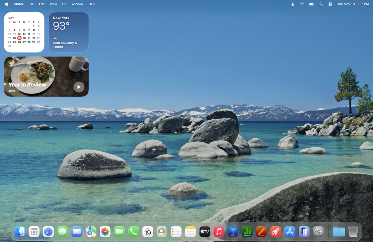
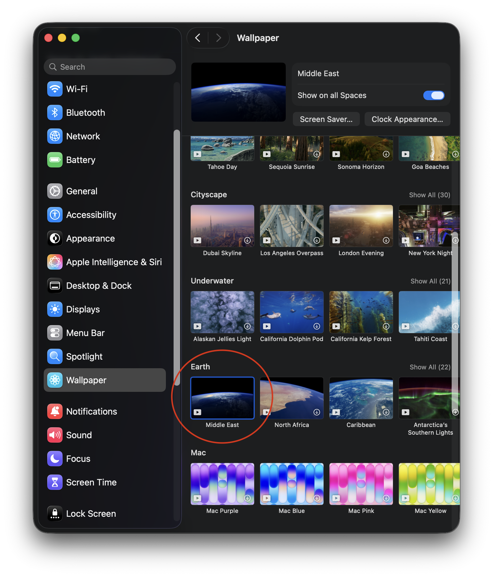
Wallpaper and screensaver settings will change later, but for now, I’ve selected a simple time-based wallpaper (Earth > Middle East), only because I like the contrast between the dark background and the icons on my Desktop.
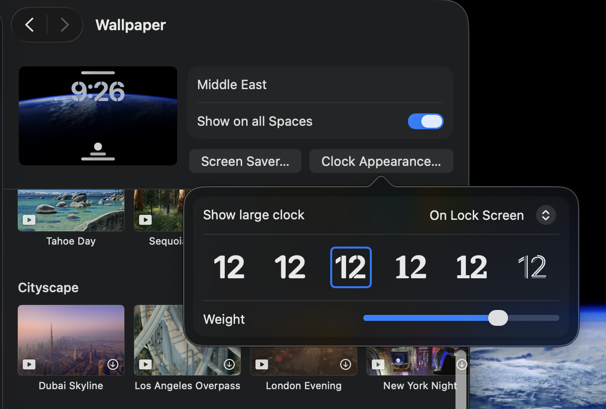
The same wallpaper will be used for the screensaver. When my Mac is locked, the screensaver will display an animated wallpaper, with a large floating clock in the top center. Clicking on the Screen Saver button provides options for customizing the Clock appearance.
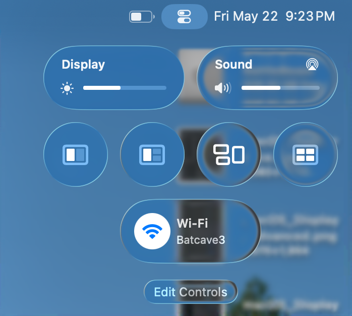
Finally, I’ll configure Control Center, by first removing everything and adding the settings I actually find useful: Display, Sound, window management (including Mission Control) and Wi-Fi. Even if you are configuring your Mac differently than mine, the idea is that the decisions are made with intention and purpose.
Next up: Notifications, Sound, Focus and ScreenTime.
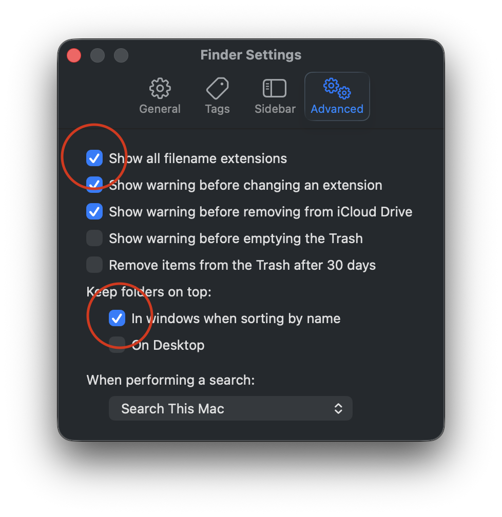
Perhaps the title is a bithyperbolic. I’m not fixing the Finder’s windows, I’m configuring them to work best for me. But first, let’s go to Finder Settings > Advanced and turn on Filename Extensions and Keep folders on top. I routinely share files between different platforms, so having visible file name extensions are a must. I also like to keep my Folders separated from my files.
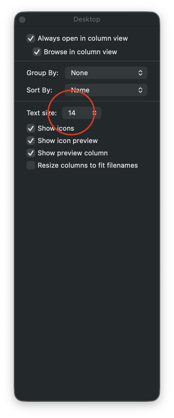
Next, let’s go to View > Show View Options, where I will increase the text size and sort items by name.
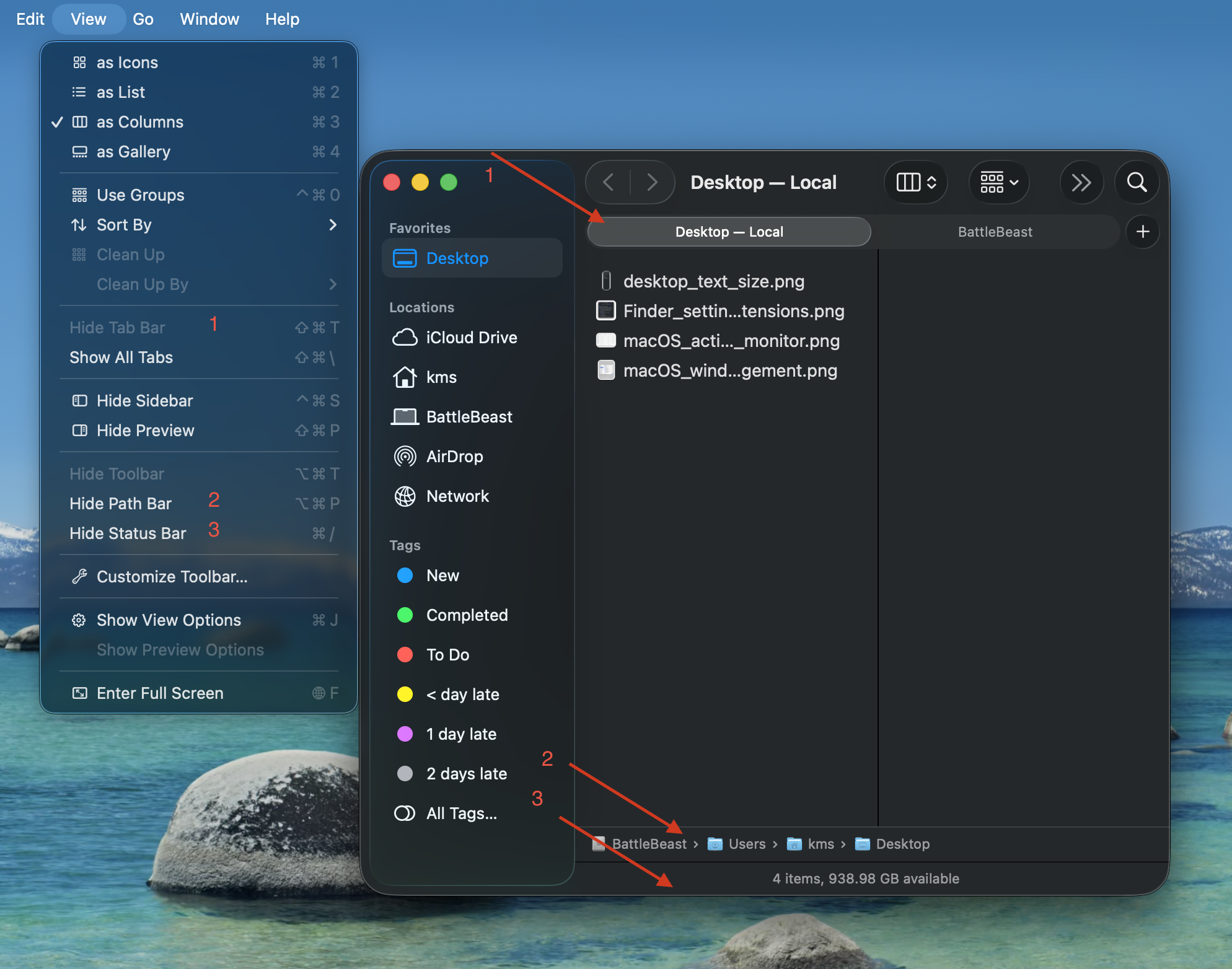
Now let’s move to the Finder window settings. I have “Show Tab Bar”, “Show Path Bar” and “Show Status Bar” active. The first option will let me quickly move between two different Finder locations in one window. The second option will show a breadcrumb trail of where I’m at within the file structure. The third option gives me an item count and overall remaining space. Of the three options, I feel that “Show Path Bar” should be the default setting from Apple, because it makes the most sense.
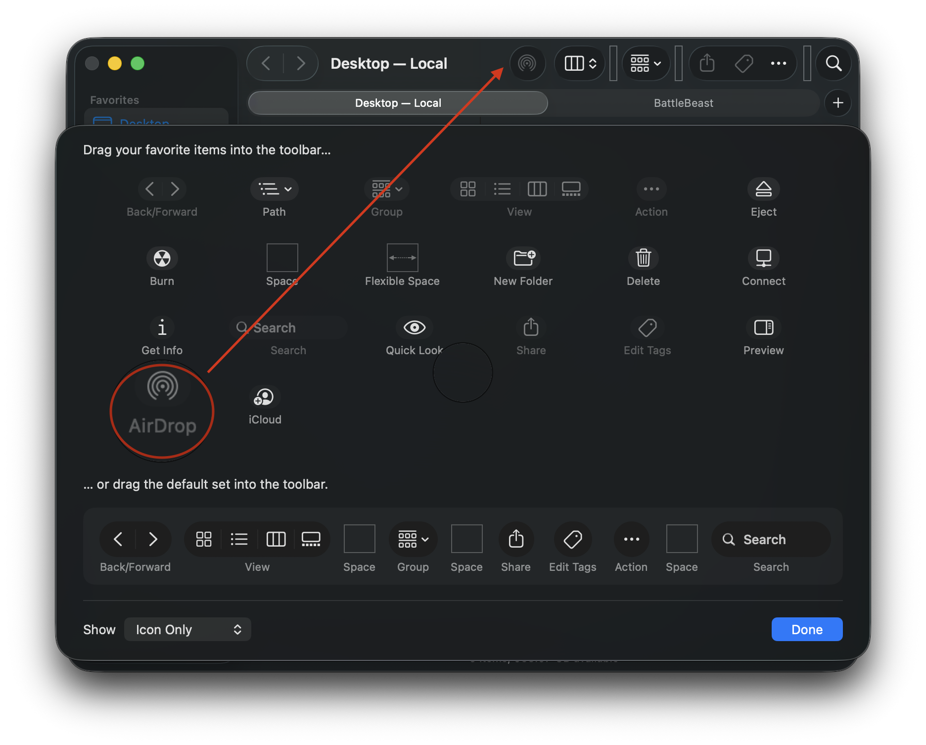
To configure the Finder window’s toolbar, go to View > Customize Toolbar. I keep the default settings, with the exception of adding AirDrop. Dragging the AirDrop icon into the toolbar gives me quick access for sharing files and folders from each and every Finder window.
Finally, the Finder is somewhat useable.
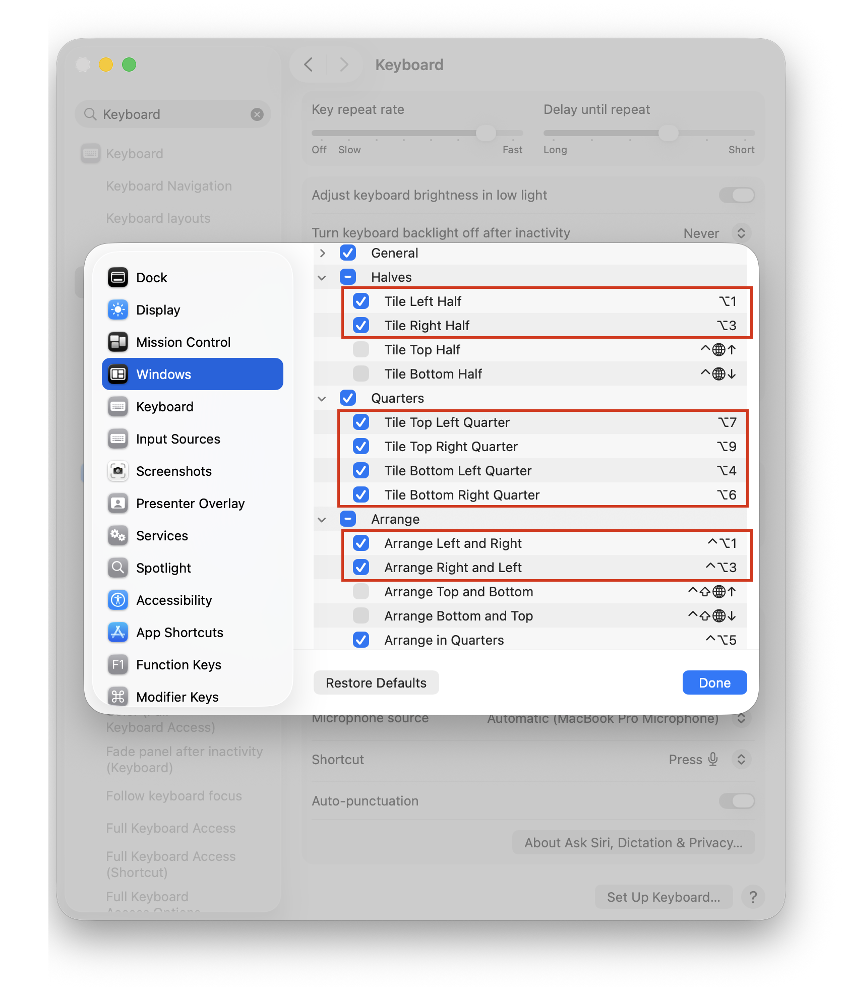
One more thing… let’s configure useful hotkeys to make the window management experience less painful. In System Settings, search for Keyboard Shortcuts. Then, scroll down to Windows. Below are my custom hotkeys, replacing Apple’s defaults. These are the same hotkeys I’ve used when managing windows with Raycast. The Arrange section lets me switch / flip windows from left to right or vice versa.
(Alas, macOS does not include any built-in option for moving a window to a different display via hotkey. This is a hole that I will have to remedy with third party window management software.)
Incidentally, I have yet to add any new piece of software to this Mac. My FrugalMac approach is to work with what I have first. When I run into limitations that go beyond the scope of what the vanilla macOS experience provides, I will investigate appropriate third party solutions.
The number one mistake I see artists make is not accepting that they run a business. If you cannot accept and even embrace this simple fact, you are totally hosed. It is hard to start a business; it is way harder to do it by accident.
The author makes so many notable points on the realities that come with working as a full-time artist. As someone who freelances part-time, it’s not just about creating, it’s also about managing a business as an ongoing concern. As a creative freelancer, one must embrace marketing, promotion, and accounting.
There is so much wisdom in this essay, particularly on finding one’s style, and the image-market fit that keeps many artists from achieving success.
If you enjoy making art, ask yourself why that is not enough? Why do you need to make money from this activity? Why do you need to do it with more of your time? Can it not perhaps give you more joy remaining a hobby?
I used to struggle between making work that I like and having to make work to please others. But with each passing year, I’m coming closer to the conclusion that maybe what I create for myself is all I need.
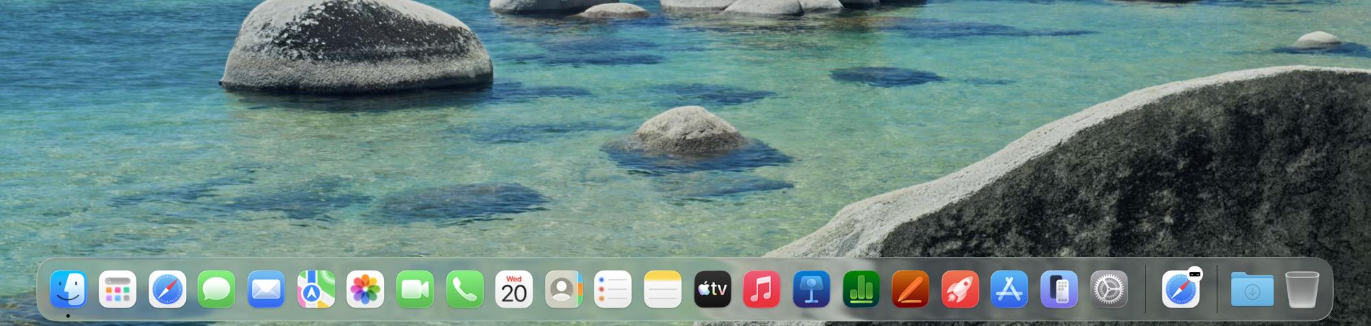
The default macOS Dock is littered with application icons, many of which I don’t use. And most of which I don’t care to see. Below is the macOS Tahoe Dock in its default state:
Hideous, right?
Let’s remove the clutter.
Ahh! Much better.
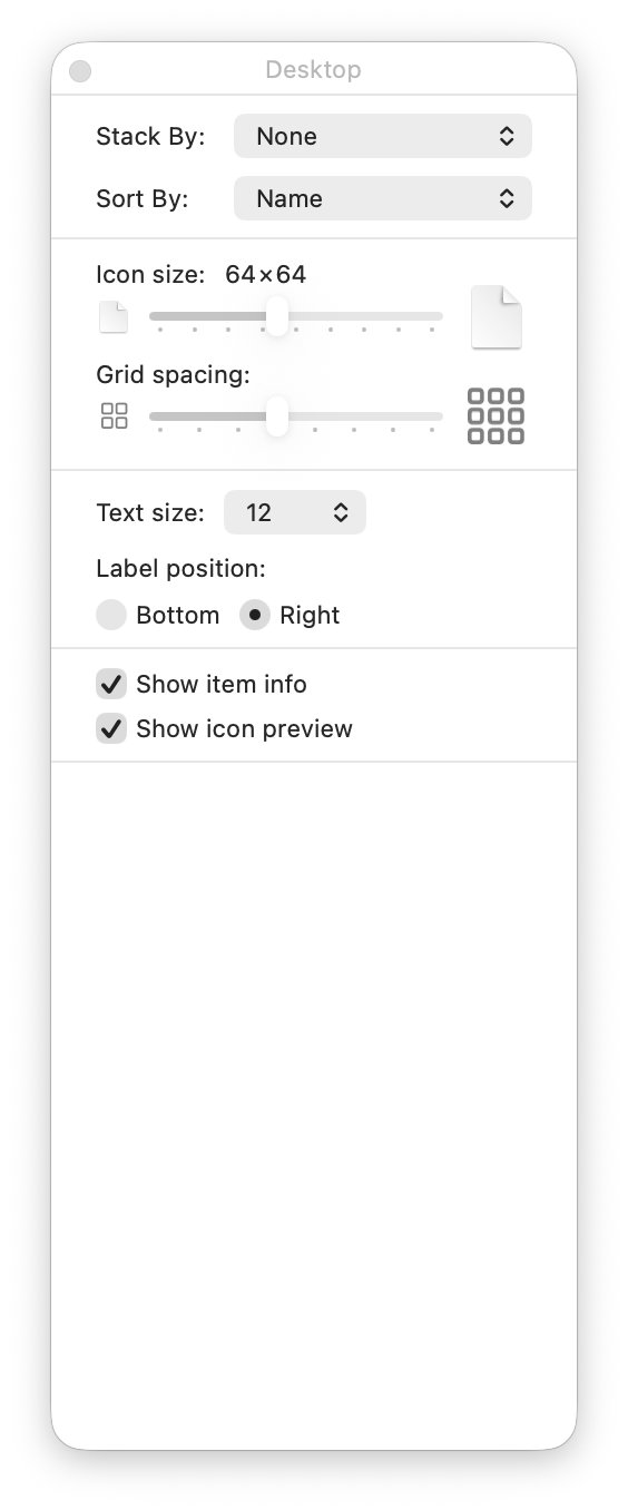
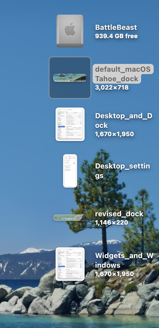
Next, let’s tackle the Finder Desktop settings, under View > Show View Options. I prefer items sorted by Name, and keeping text to the right of the icon. Why? Because I use long file names and I want to see them in all their glory. Showing item info let’s me see image sizes, without having to guess.
Next, let’s turn our attention to the Desktop and Dock. To modify its settings, we must visit Settings > Desktop and Dock. I’ve turned off all defaults, leaving Show indicators for open applications. I also turned off Stage Manager. I absolutely despise Click Wallpaper to Show Desktop, so I’ve banished that option to Stage Manager, so I’ll never need to deal with it again. I understand what Stage Manager is supposed to do, but I find that it gets in the way of my work. In its current state, it feels half-baked.
Scrolling down, I’ve left most of the options ON for both Widgets and Windows. I rarely use Mission Control or Spaces, so those options were unchecked.
Over the last few posts, I’m acutely aware of certain areas of friction as I work with the default macOS Tahoe setup.
1) AirDrop is tucked away inside a nested context menu, visible only when I right-click on a file or folder. I use AirDrop constantly to move files between my Macs, and SuperCharge gives me the option to have AirDrop visible directly when I right-click.
2) Keyboard-based window management in macOS Tahoe is set up differently to what I’m used to with Raycast. (If I can modify the keyboard shortcuts within the OS, I may not need to have Raycast installed.)
In terms of learning new skills, we live in a glorious time. The Internet is chock full of excellent, actionable design tutorials that go way beyond what a classroom environment or textbook could provide.
Incidentally, much of what I know about Photoshop comes from reading books and applying the techniques into my own work. (Aside: Scott Kelby’s “Photoshop Down and Dirty Tricks” and Matt Kloskowski’s “Layers” books are two excellent resources for hands-on learning.) This was in the days before YouTube, so options were limited.
While I’m very comfortable with many aspects of Photoshop, I’m using this summer to really shore up my Adobe Illustrator skills. I have a good working foundation of vectors, anchor points and the like, but I want to go beyond OK and become highly proficient.
Enter social media.
I use my Instagram’s algorithm to surface tutorials on Illustrator. The more tutorials I like, the more Instagram learns what I’m interested in. The Instagram format provides me a space where I can be exposed to a wide gamut of Illustrator techniques. Some of the more helpful instructional reels show two contrasting approaches, amateur and pro. Seeing side-by-side comparisons in this way, allows me to build on what I know and improve my skill. My only critique is that some of these videos are a bit too fast; I have to watch a video multiple times in order to absorb the technique.
When I watch a particularly useful video, especially one that includes accompanying keyboard shortcuts, I’ll take a screenshot of it on my iPhone and send it over to Apple Notes. I’ll then organize my screenshots into one Apple Notes file, for quick access. Because Apple Notes synchs across all my Apple devices, I have a collection of foundational tutorials that I can easily refer to when I’m at my Mac.
Viewing and capturing tutorials is only part of the learning equation. Practicing them on a new personal project helps reinforce what I have just learned. I also take the new skills I’ve learned and teach it on my YouTube channel. (The old adage rings especially true: “The more I teach, the more I learn.”)
Make no mistake, Illustrator has a steep learning curve. Go into learning with an open mind. I recommend going to YouTube to learn the basics. From there, I recommend watching one or two Instagram tutorials a week, to get slowly exposed to new workflow techniques. Don’t overwhelm yourself.
Practice what you’ve learned and find ways to inject that knowledge into a few of your own personal works, to build that muscle memory. Scaffolding what you know with what you are learning gives room for absorption and a sense of accomplishment; two traits that are vital to learning.
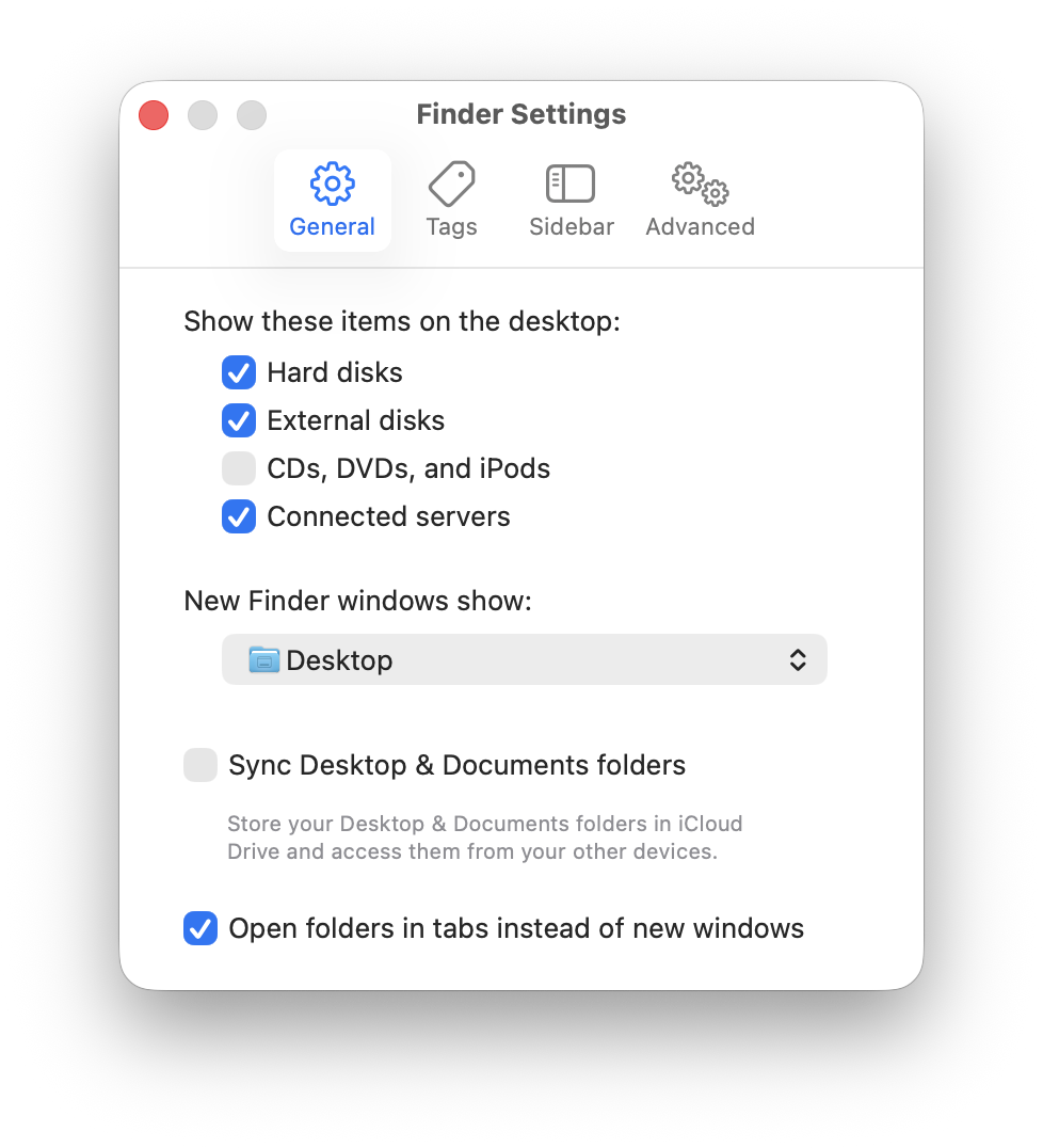
The first stop in changing the default Finder experience is Finder > Settings….
In the General tab, I have Hard disks, External Disks, and Connected Servers checked to be visible on the macOS Desktop. I also prefer having new windows open to show the Desktop.
Next, let’s examine the standard Finder window sidebar. In its default configuration, it’s overwhelming.
I prefer to keep the sidebar as minimal as possible, only adding items that I absolutely need. Off to the Sidebar tab we go then.
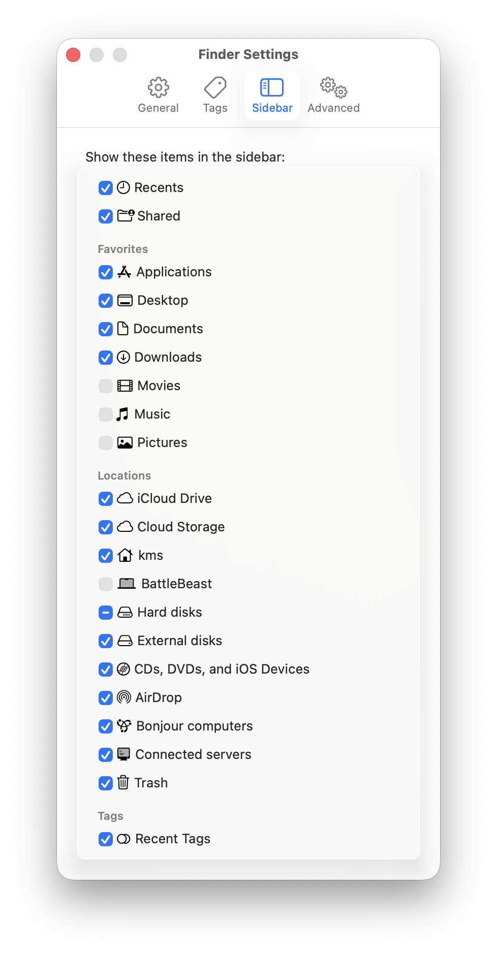
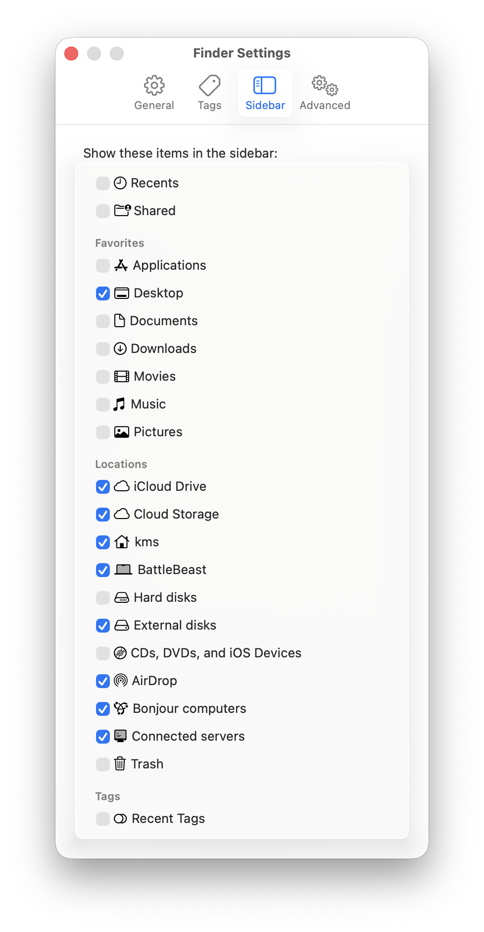
Everyone has their specific preferences, so adjust accordingly. Here’s what my Sidebar settings look like.
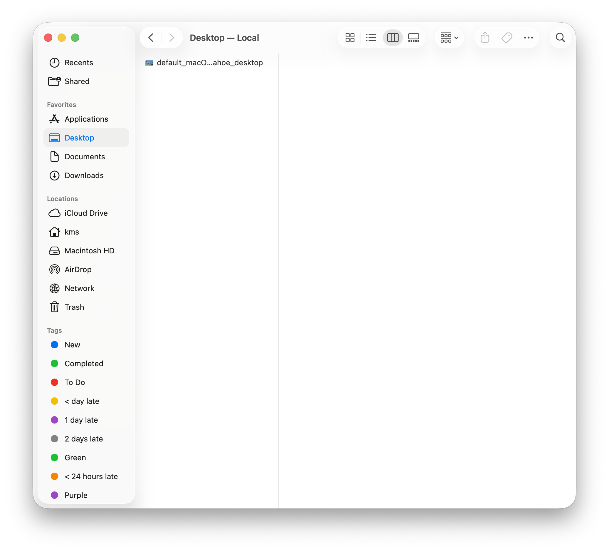
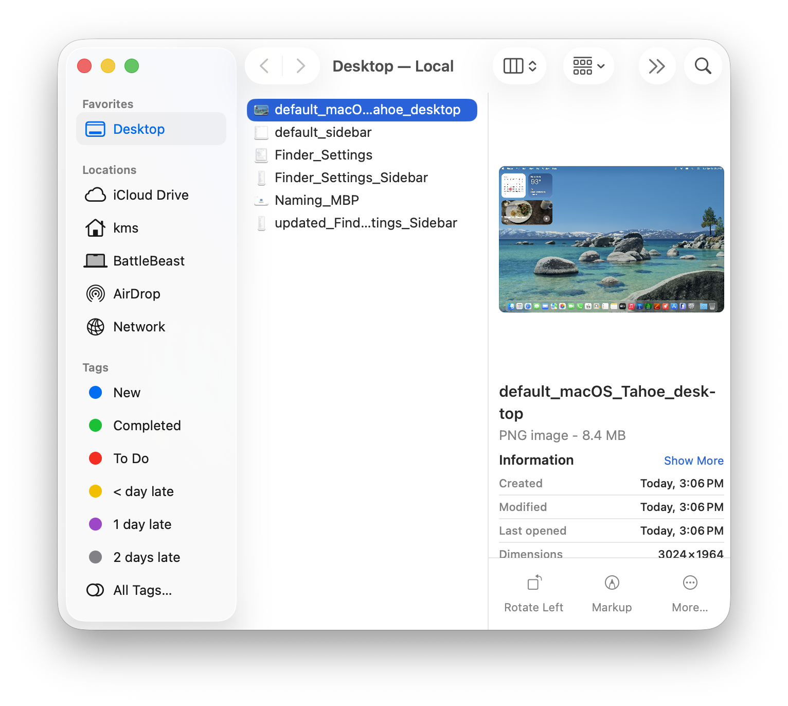
My Sidebar favorites only includes the Desktop as a visible option. I have several Locations checked, mostly to facilitate file access and file transfer between other machines on my local network.
Here’s what my Sidebar looks like now:
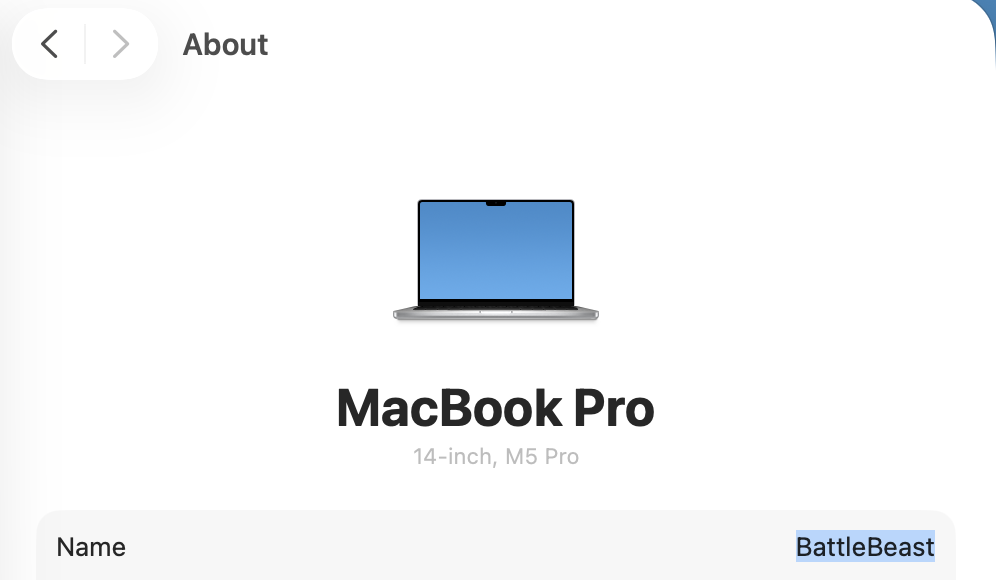
Incidentally, at this point, I’ve given my new laptop a name: BattleBeast. I think the name fits its intended purpose.







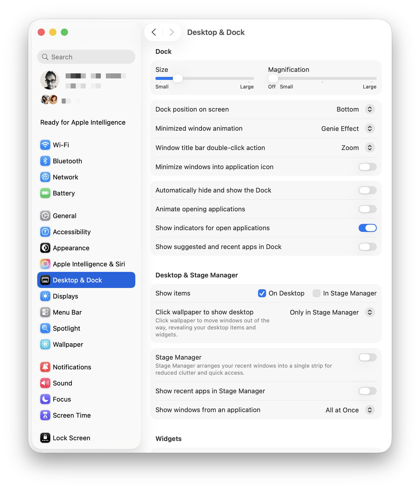 I’ve turned off all defaults, leaving Show indicators for open applications. I also turned off Stage Manager. I absolutely despise Click Wallpaper to Show Desktop, so I’ve banished that option to Stage Manager, so I’ll never need to deal with it again. I understand what Stage Manager is supposed to do, but I find that it gets in the way of my work. In its current state, it feels half-baked.