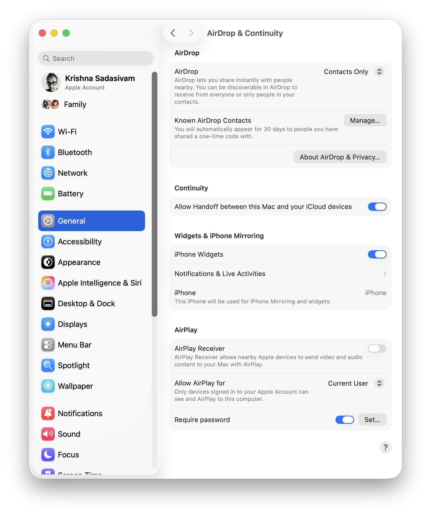
The last two major settings I’m interested as part of setup is AirDrop and FileSharing. In AirDrop, I’ve turned AirPlay Receiver OFF as I have no intent or interest in having my other devices send over video and audio.
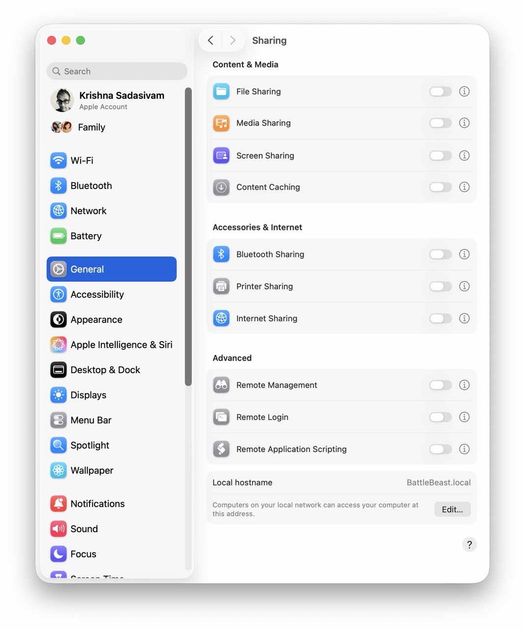
Under Sharing, I’ve turned File Sharing OFF. I prefer to have it turned on ONLY when I have a need to share files between my Macs. The plan is to implement a script (like I did in Alfred) to toggle File Sharing without having to visit System Settings each time.
And that basically concludes my macOS System Settings setup for FrugalMac. The FrugalMac series will continue, as I examine the third party applications I’ll need to make the most of using my new Mac.
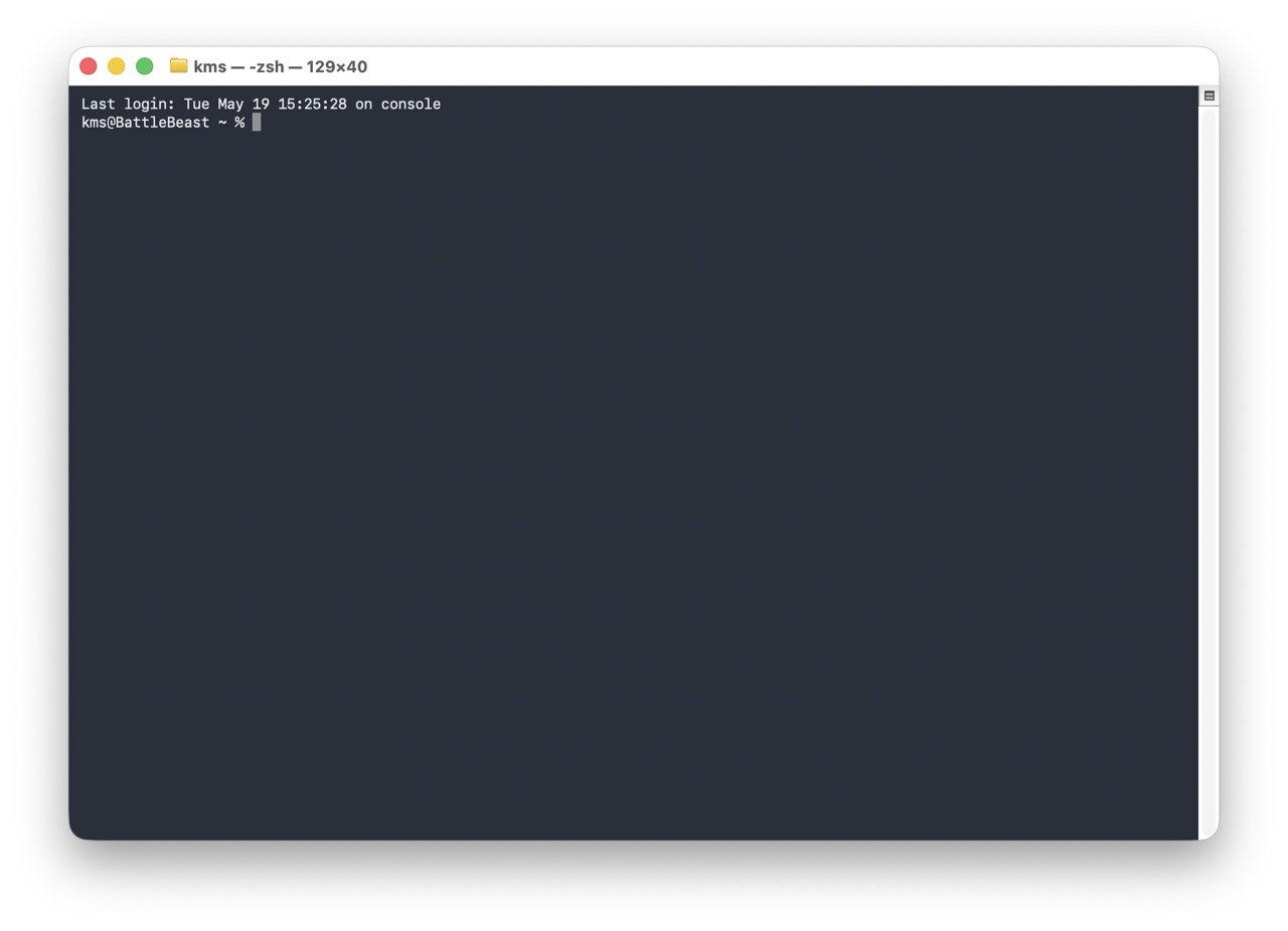
This post will focus on how I configured the macOS Terminal from its default settings. Here’s how it looks, on first launch from a fresh macOS install. The type is unbelievably tiny (for me).
Let’s get started.
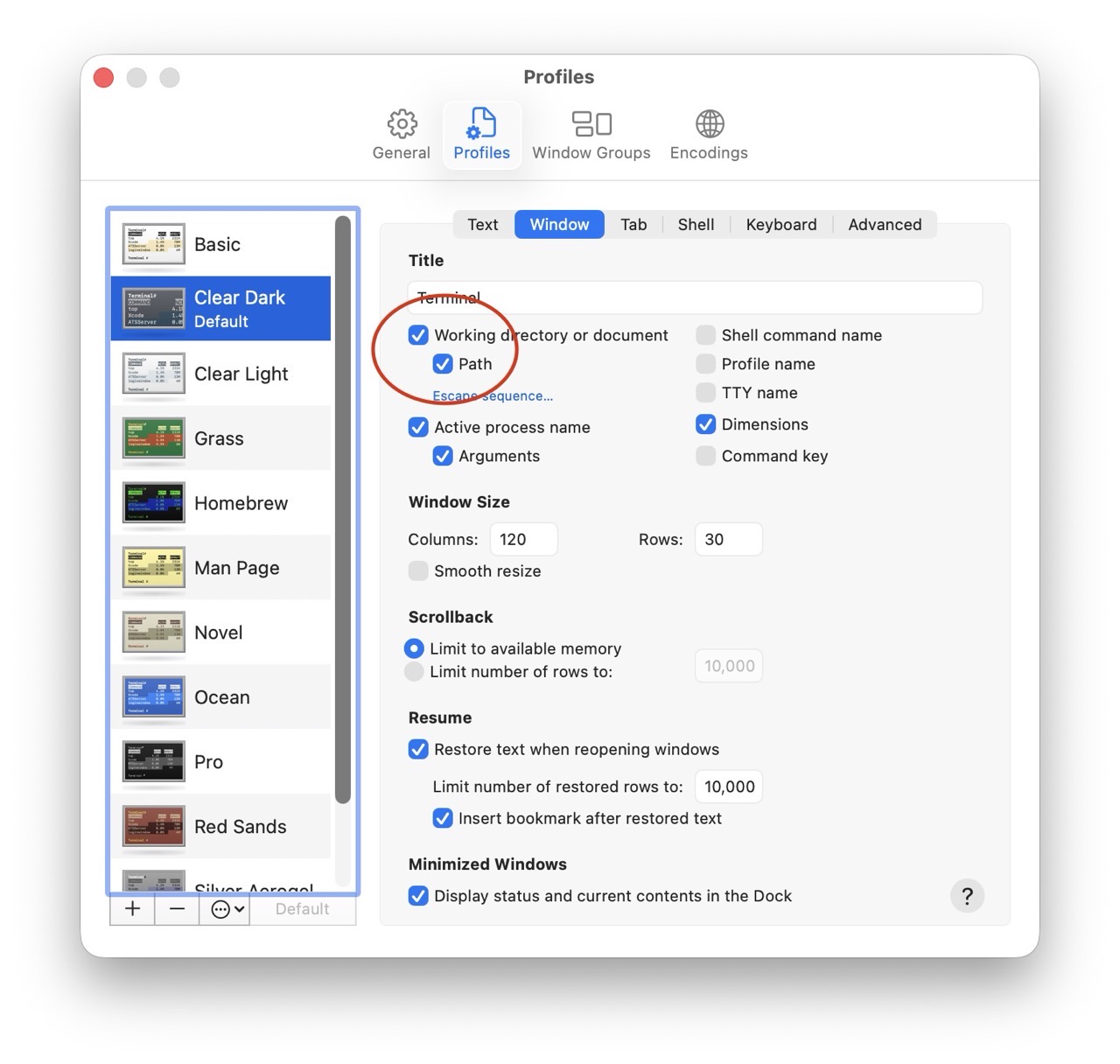
In Terminal’s Settings panel, I have checked “Working Directory” and “Path”. These parameters will show up on the Window title bar for a new Terminal session, making each Terminal window more descriptive.
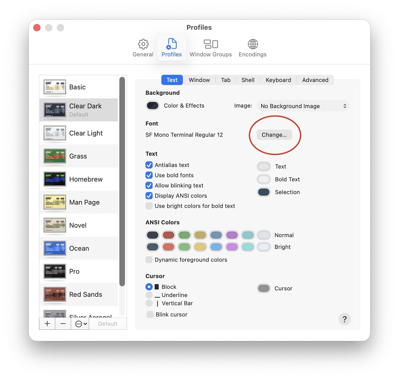
Next, let’s increase the size of the terminal font. (12 pt is too small, so I’ve bumped the size up to a respectable 18 pt.)
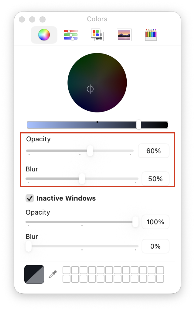
Next, I’ll tweak the appearance of the Terminal window itself, making it slightly more transparent (and less blurry).
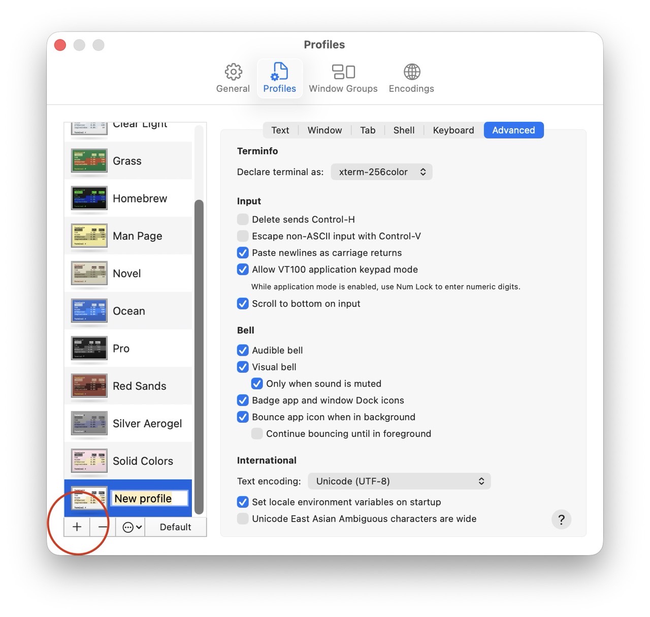
With the new Terminal appearance settings in place, they must be saved. (I recommend saving them into a new profile.)
More often than not, I want two Terminal windows open at the same time. macOS Terminal does offer this option, but it’s not super obvious.
Here’s how I set it up.
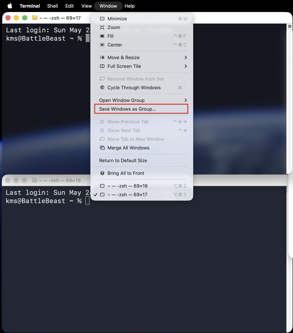
1) Open two terminal windows. Adjust the window size for both windows as needed. (I’ve stacked them vertically, one atop the other.)
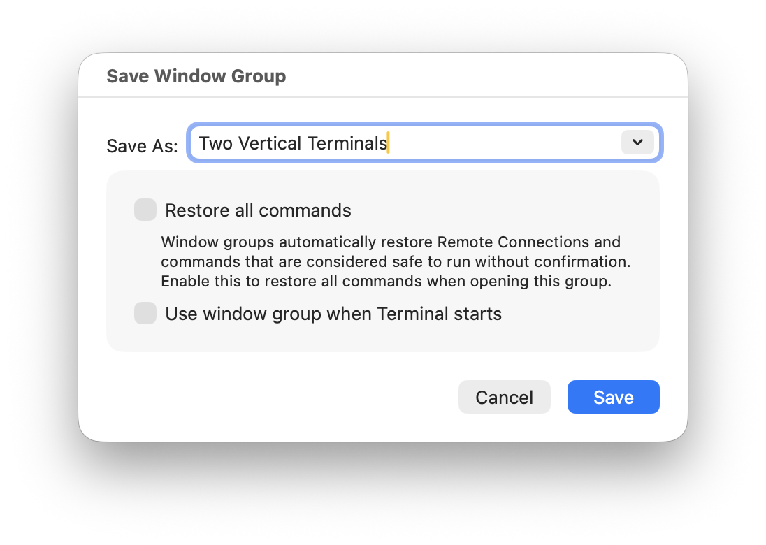
2) In the menubar, select Window > Save Windows as Group and provide a descriptive name.
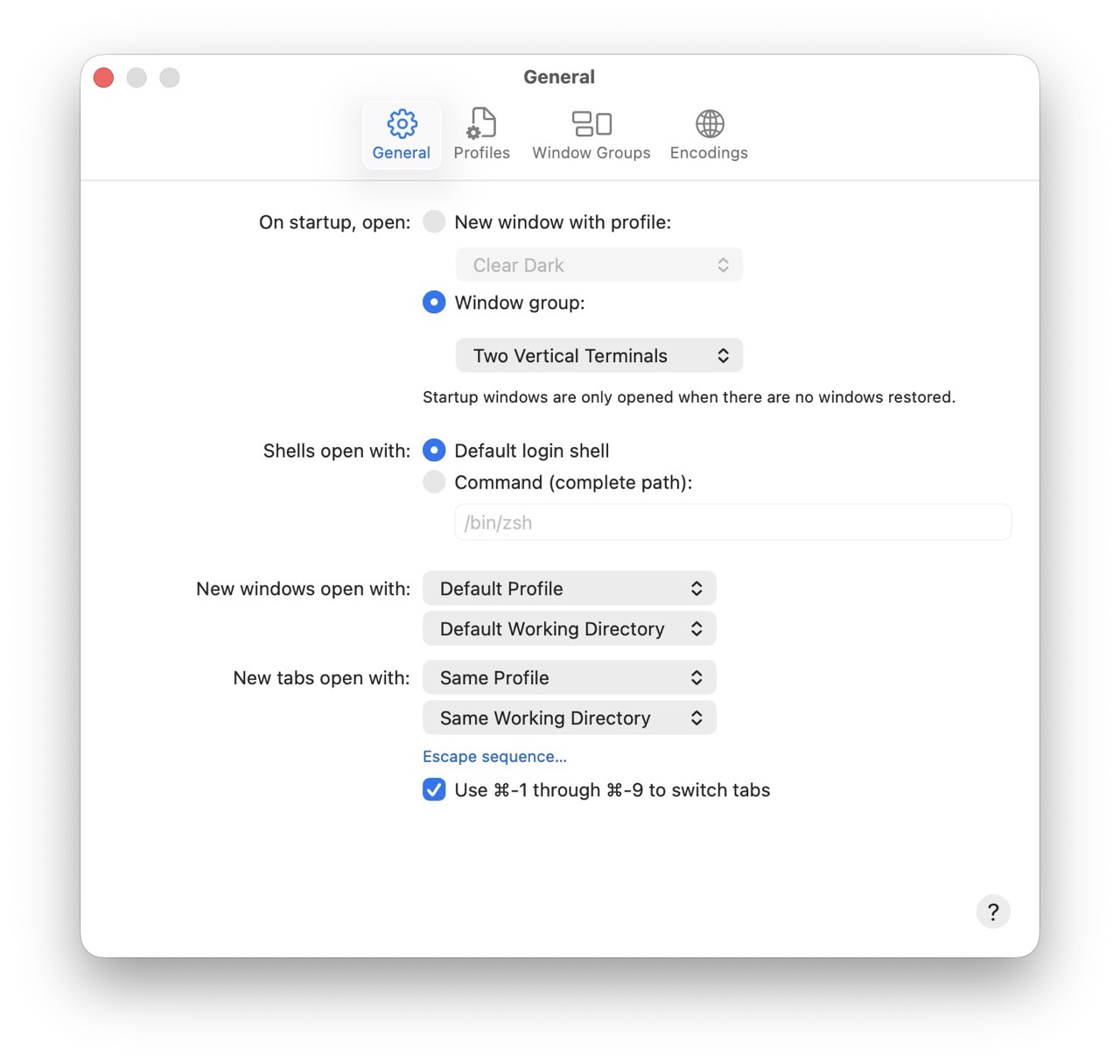
3) Lastly, set this Window Group to automatically open on startup.
Each time I launch the Terminal, I’ll now see two vertically stacked Terminal windows. There’s plenty more configuration left to do within the Terminal itself, but I’ll save that for a future post.
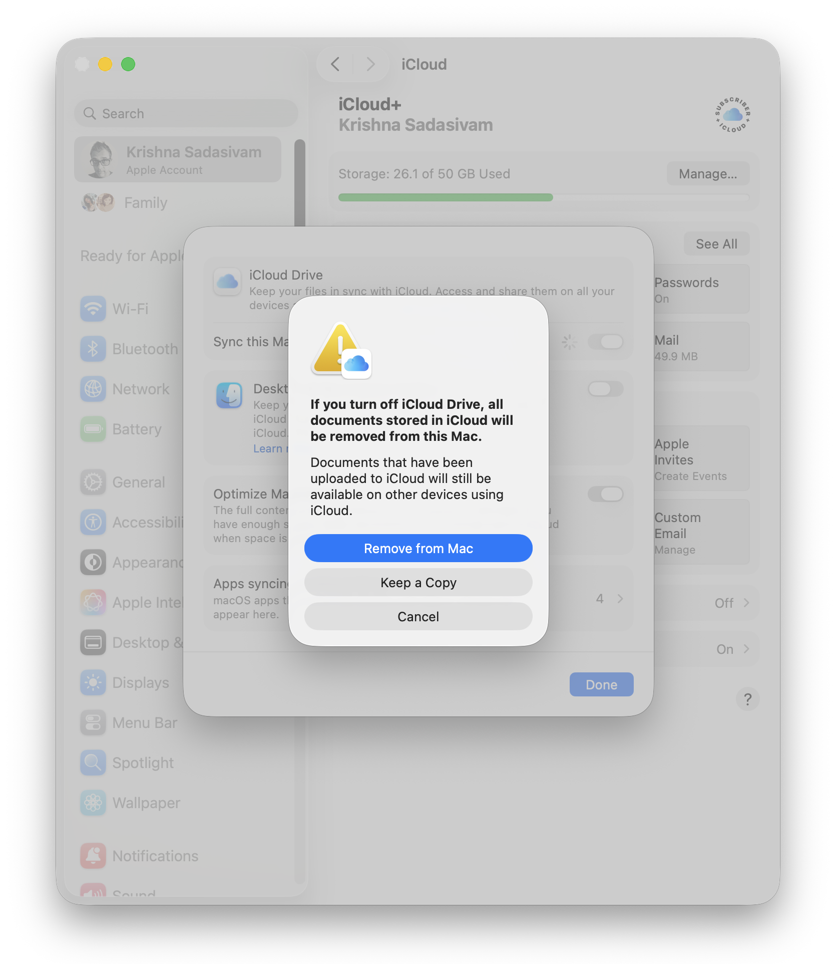
Cloud-based syncing via iCloud is generally pretty good, but right now, during setup: it’s a distraction. The FrugalMac setup is all about intention, so I’m turning it off until I’m ready. To do so, go to your Apple account, click iCloud and turn off iCloud Drive. This will remove iCloud Drive files from my M5 Pro – keeping the iCloud contents themselves intact (in the “cloud”).
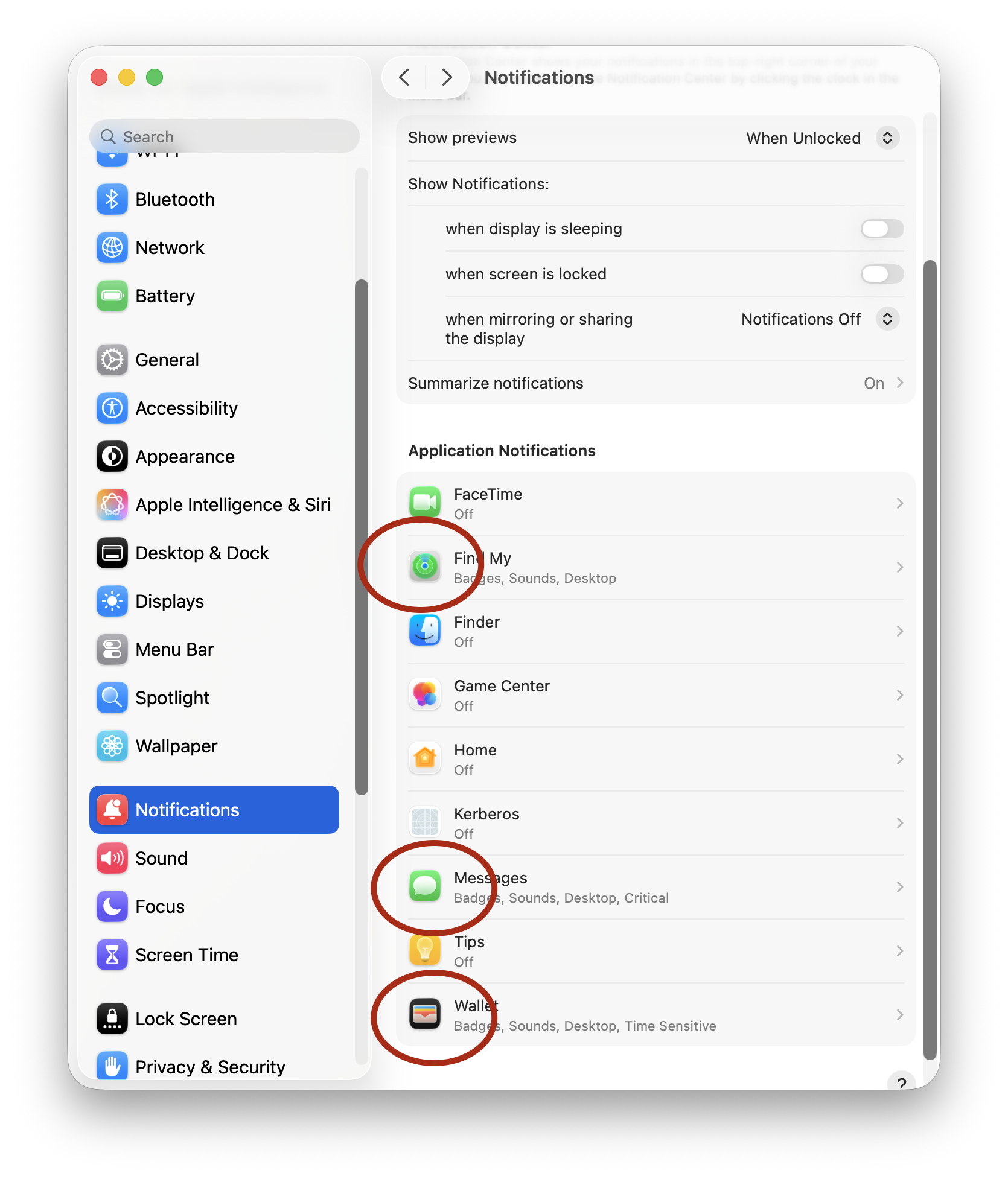
Notifications:
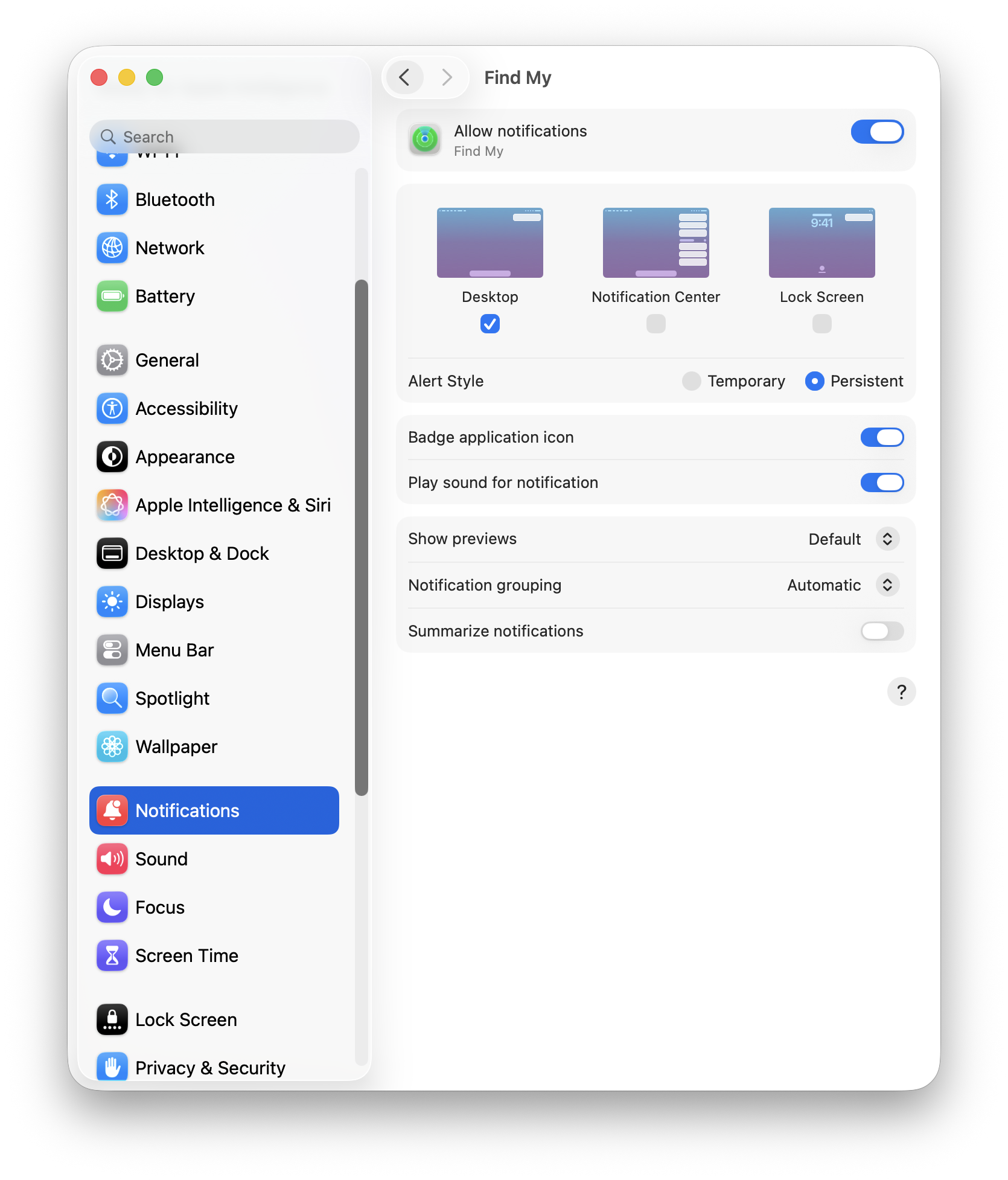
Notifications are useful, until everything becomes a notification. My default stance on notiications is “no notifications”. But there are some exceptions to that rule: Find My, Messages and Wallet. These notifications appear on my Mac, and stay until I dismiss them.
Notifications that I deem important will show a badge and play a sound.
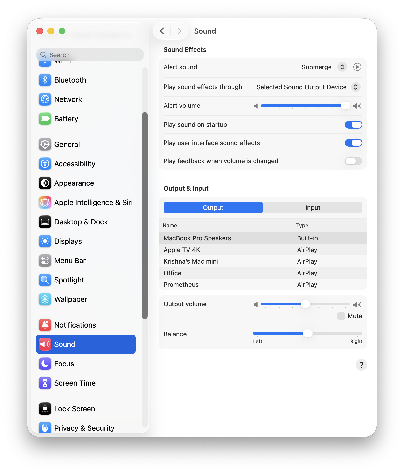
Sound:
The only change I’ve made here is the selection of “Submerge” as my Alert sound.
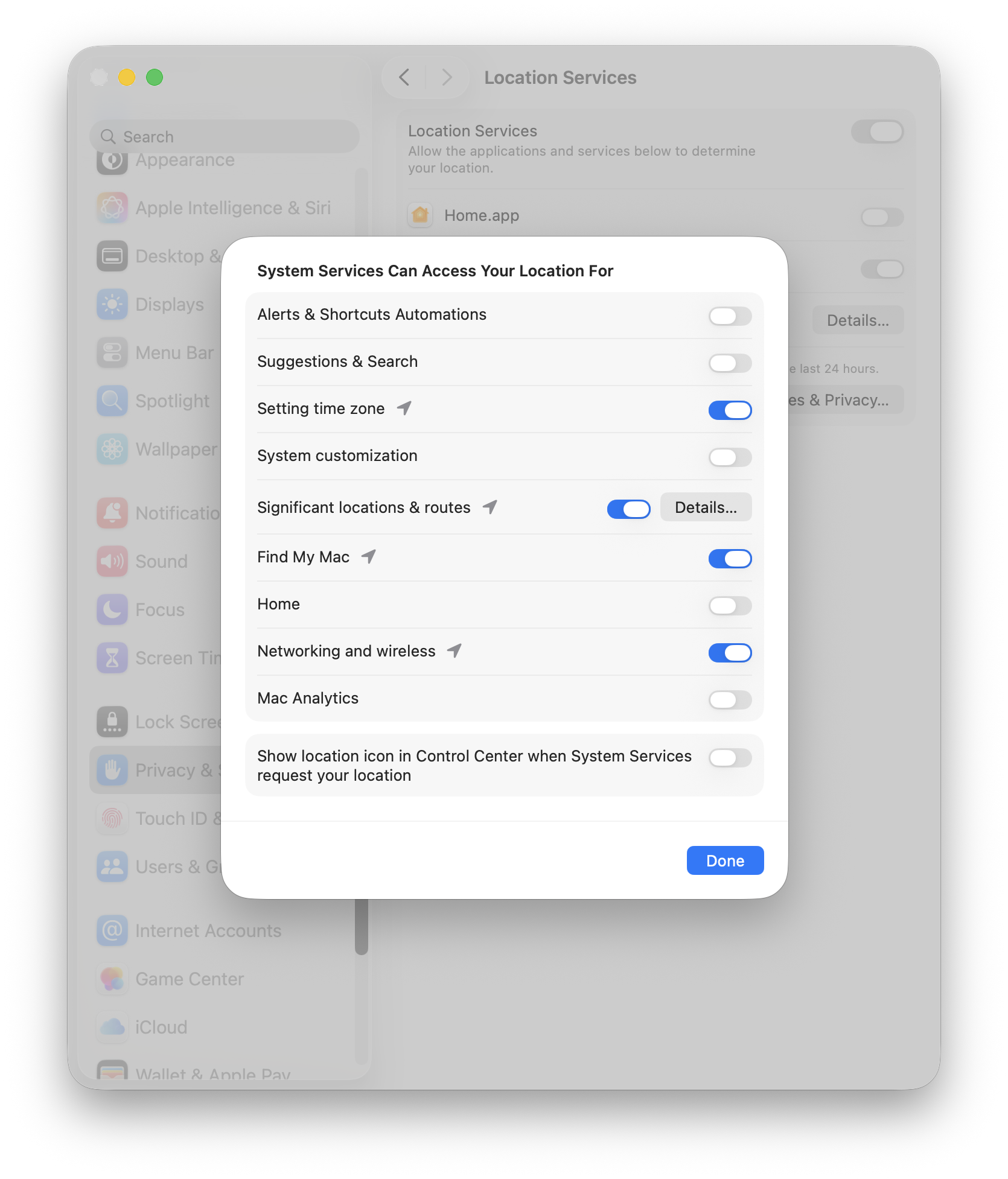
Location Services:
Location services are allowed access for setting the appropriate time zone, Find My and Networking. That’s it.
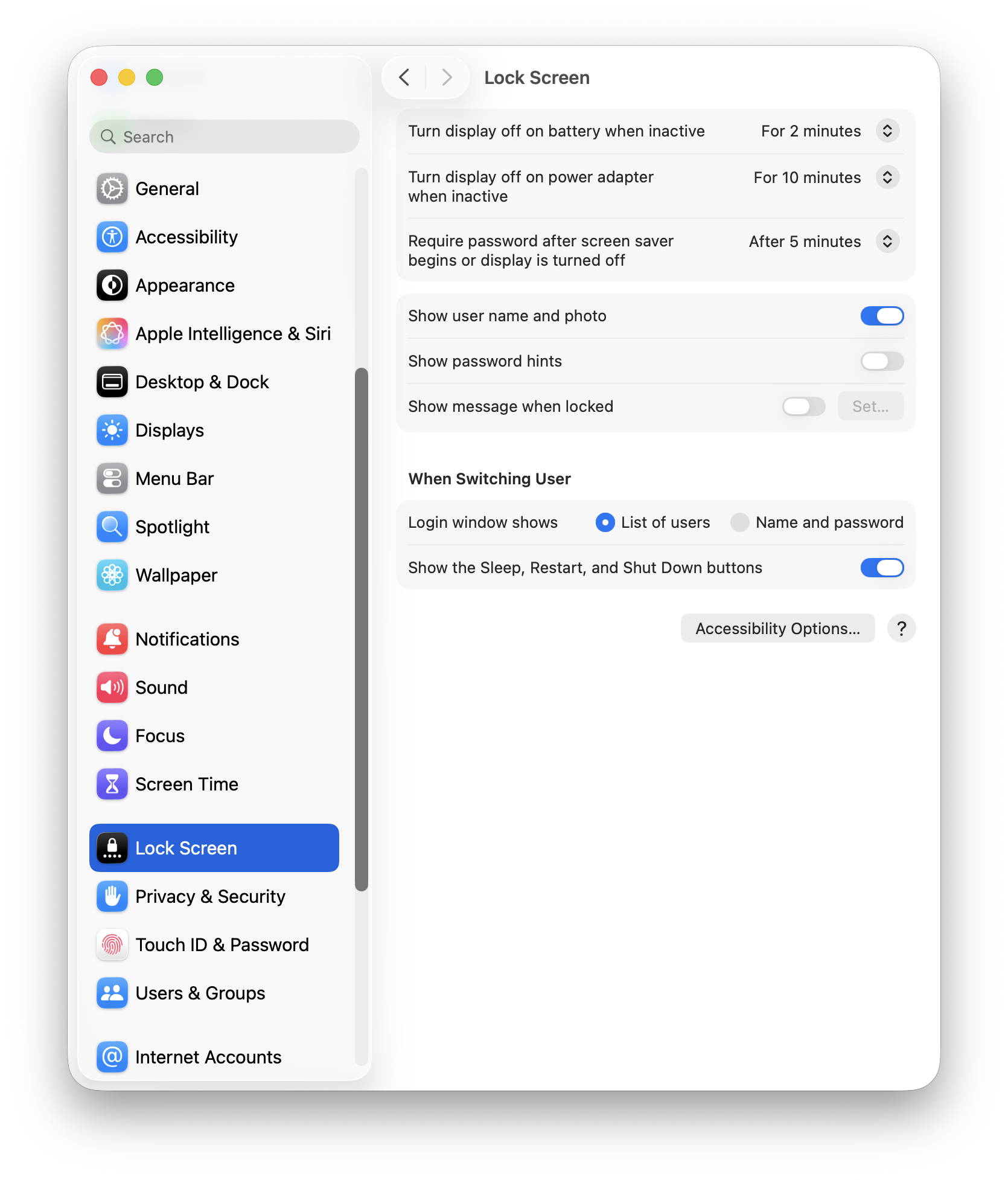
Lock Screen:
I take my laptop with me where I go, so having the Lock Screen active is imperative. No password hints.
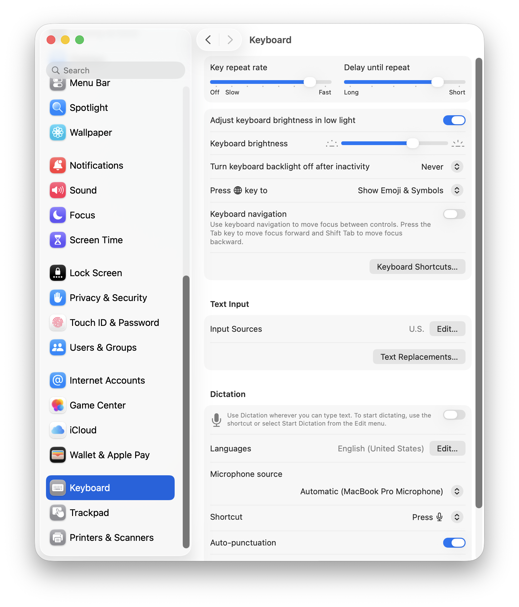
Keyboard:
I prefer a higher key repeat rate (press a letter and it repeats with just a hint of delay).
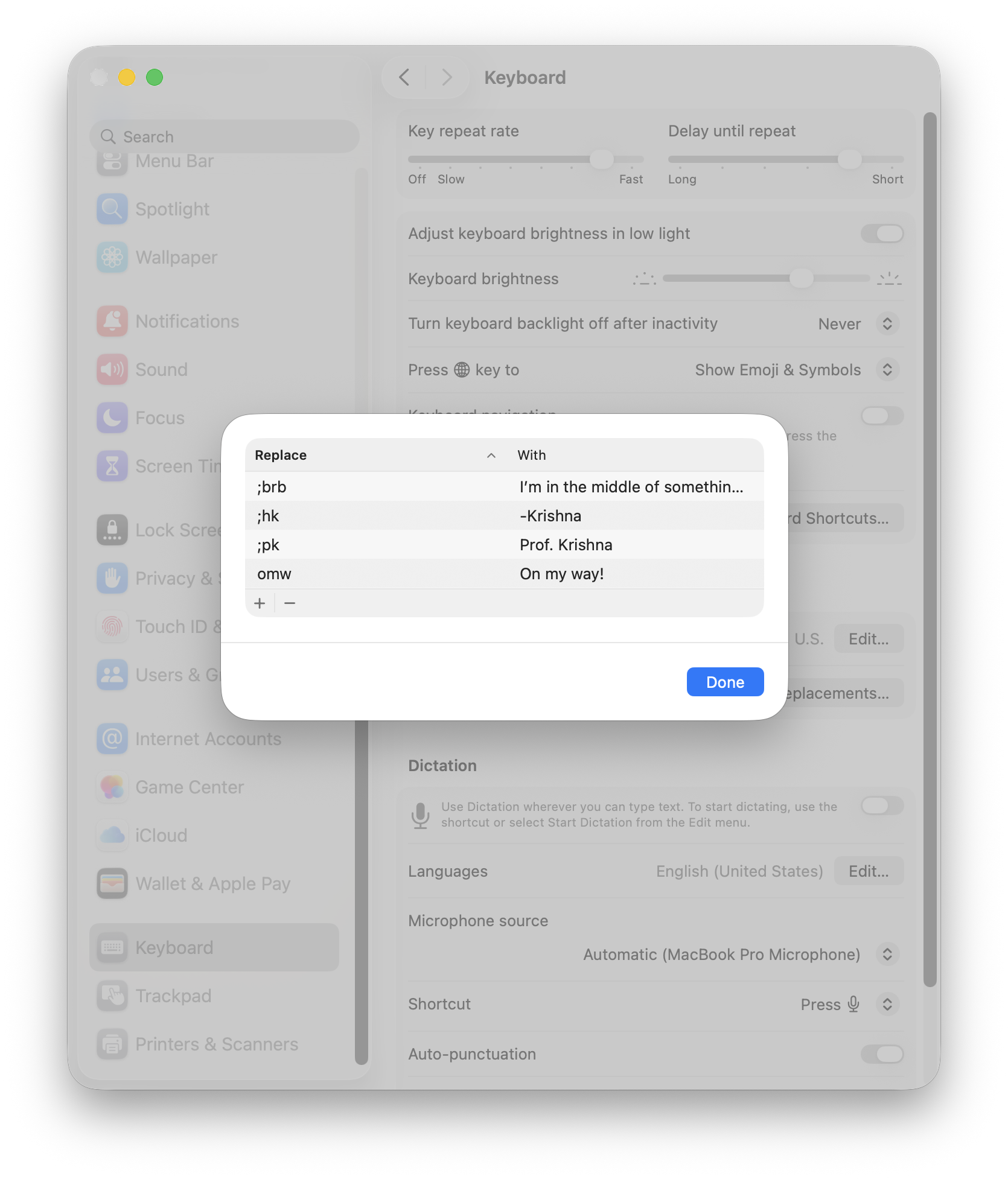
Under Text Input, I have a few hard coded text replacements, mostly for sign-offs and canned text replies. This will work, for now.
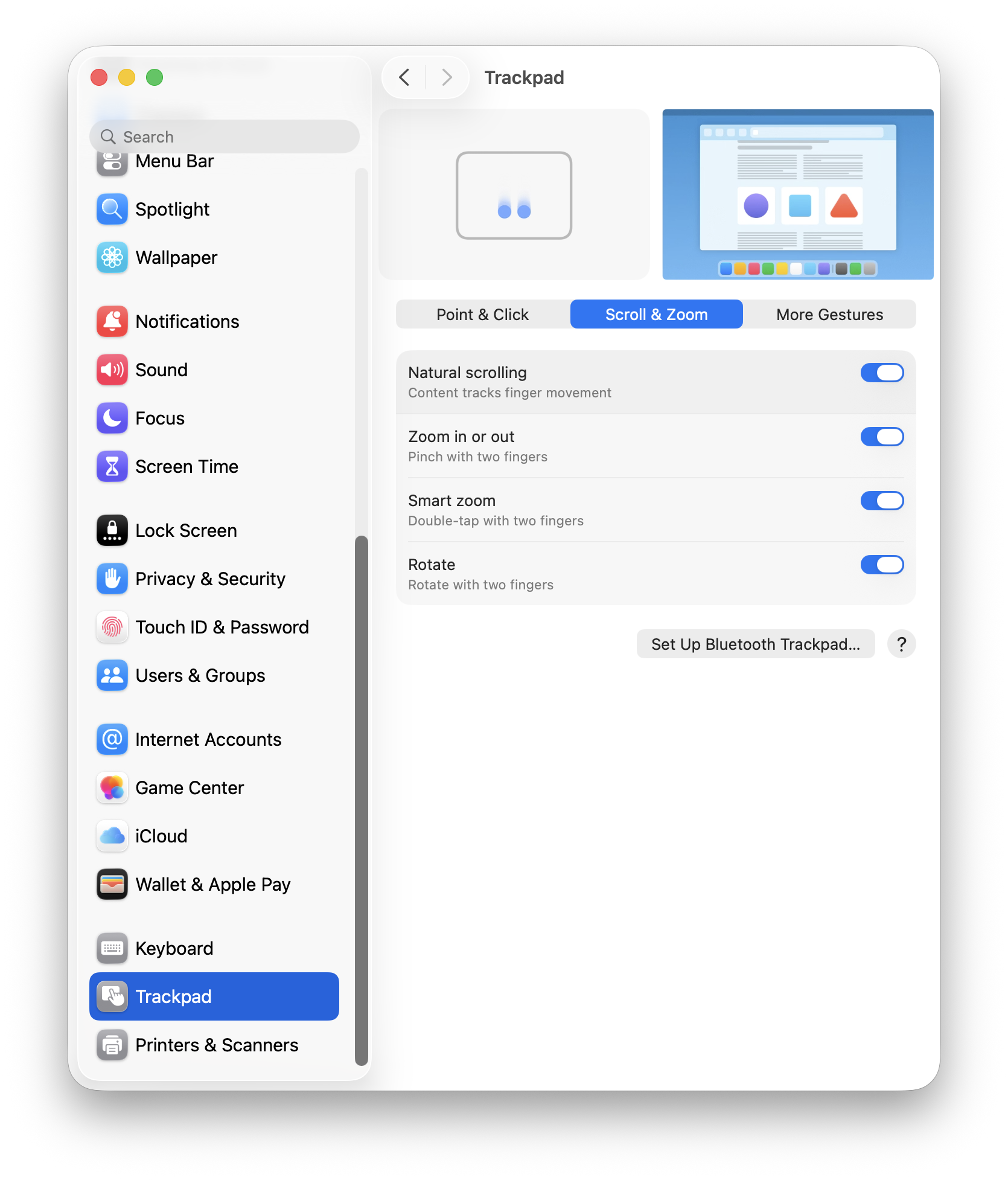
Trackpad:
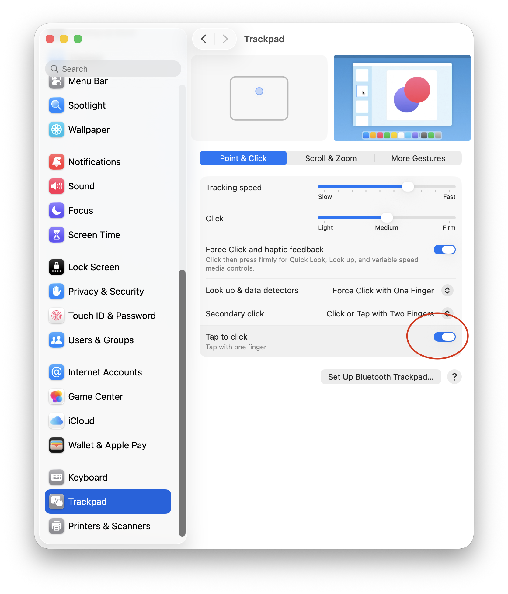
I’m more of a mouse user than a trackpad user. When I’m at the office or working from home, I always use a Logitech MX Master 3S mouse as my main peripheral. For Point & Click, I like a faster tracking speed and Tap to Click.
For trackpad scrolling, I have kept the defaults. I tried using the Mac without “Natural scrolling” but it felt wrong, so I stuck with the defaults.
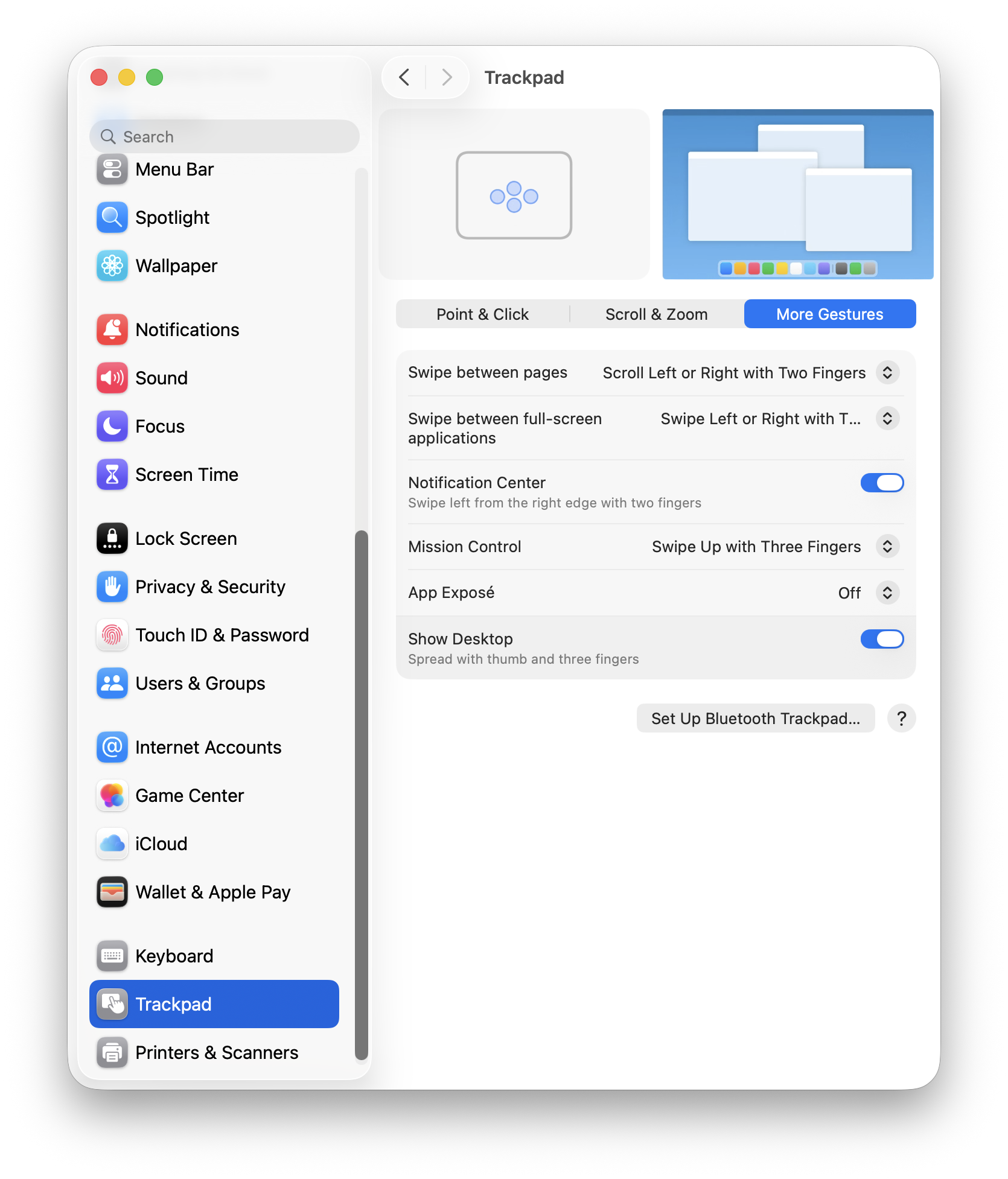
I haven’t used the trackpad extensively to take full advantage of trackpad gestures, so I’ve kept the defaults as is.
At this point, FrugalMac has a solid base-line setup. Next, I’ll look at AirDrop & Continuity, Sharing, Login Items and Passwords.
I’ve skipped more than a few System Settings. I’ve also left off e-mail and browser configuration, but I’ll be using both stock Apple Mail and Safari for those tasks, respectively.
As a long-time Mac user, macOS’s customization options have slowly improved. (More customizing options are still needed.) Let’s start with some basic appearance tweaks, found within Settings > Appearance.
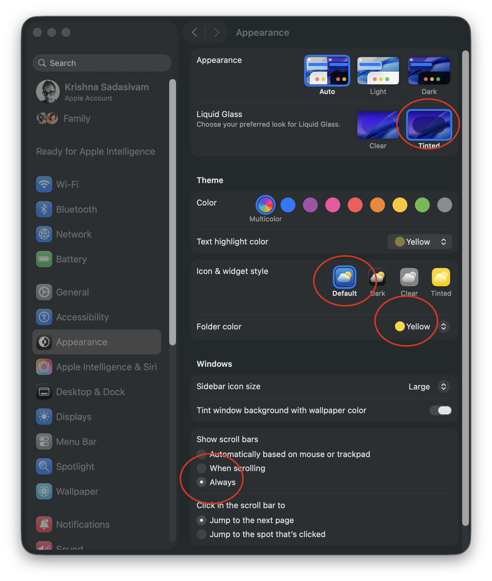
From the top, I’ve chosen Auto to have my Mac change from light to dark mode, based on time of day.
However you feel about Liquid Glass, it can’t be replaced in macOS 26. The Tinted option is what I prefer, to improve contrast. I’m sticking with the Default Icon and widget style because, for me, color distinction is critical for quick icon identification.
I’ve set my default folder color to yellow, while scroll bars are set to Always. I’m not a fan of Tahoe’s thick scroll bars, but having them always visible lets me know that more options are available if I scroll. While I’m here, I will make the sidebar icon size Large.
I hope that one day soon that users will have the ability to influence more window color options beyond light and dark variants. (I’m not holding my breath.)
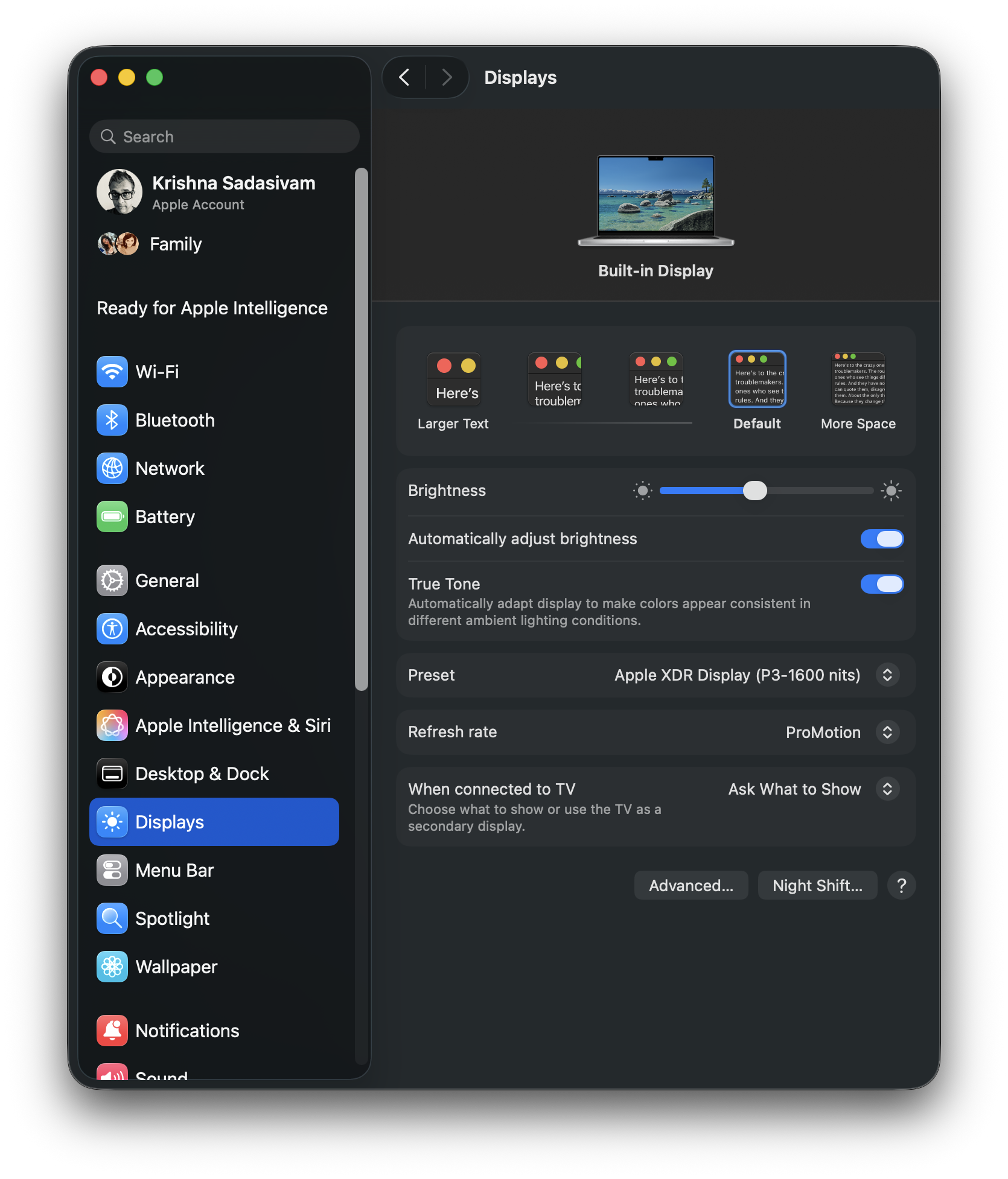
Onto System Settings > Displays, where I have kept most of the default settings. Clicking the Advanced button reveals additional options for showing specific screen resolutions.
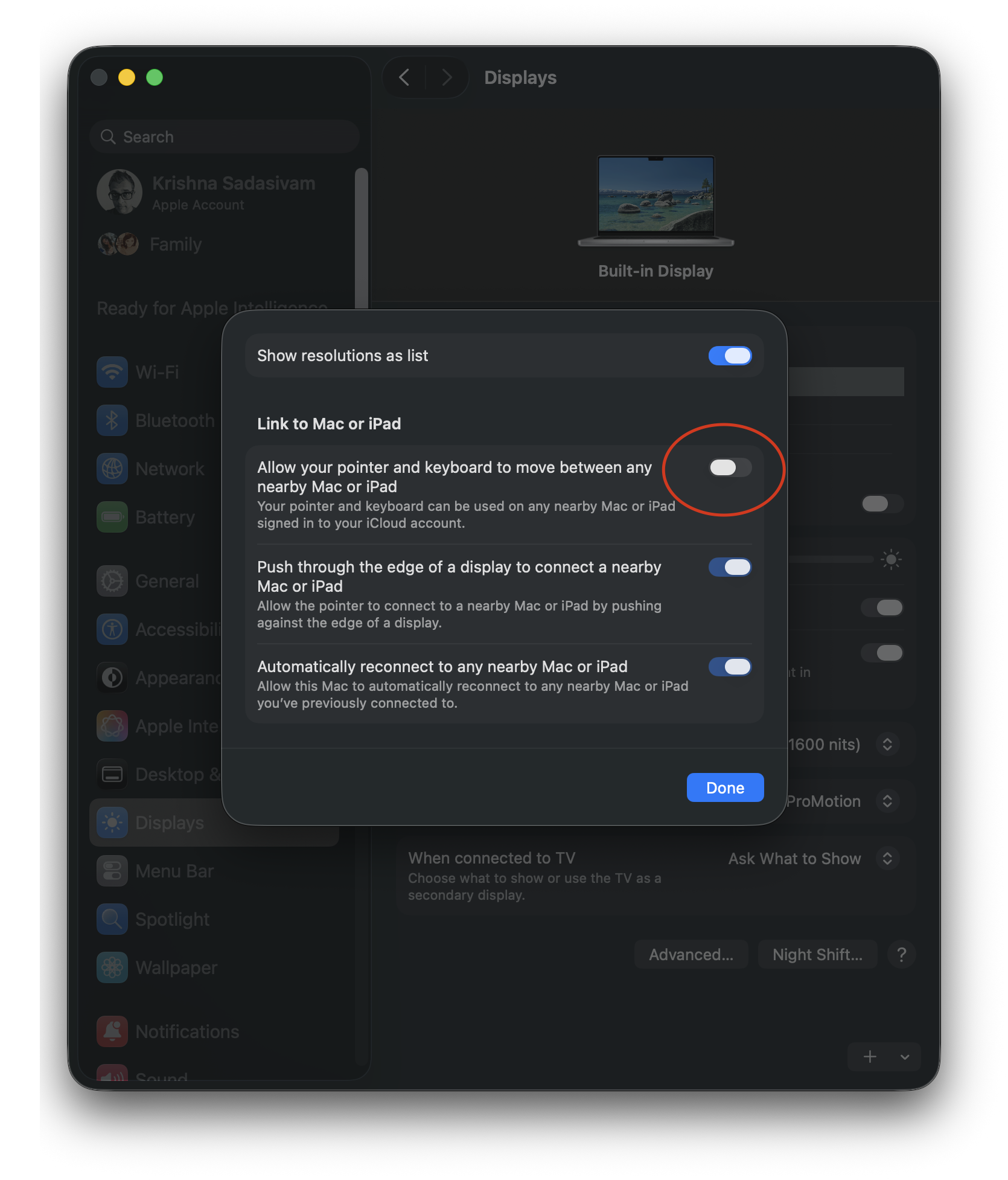
Show resolutions as list is ON, and “Allow your pointer and keyboard to move between any nearby Mac or iPad” is turned OFF. Bizarely, the remaining two options cannot be toggled OFF.
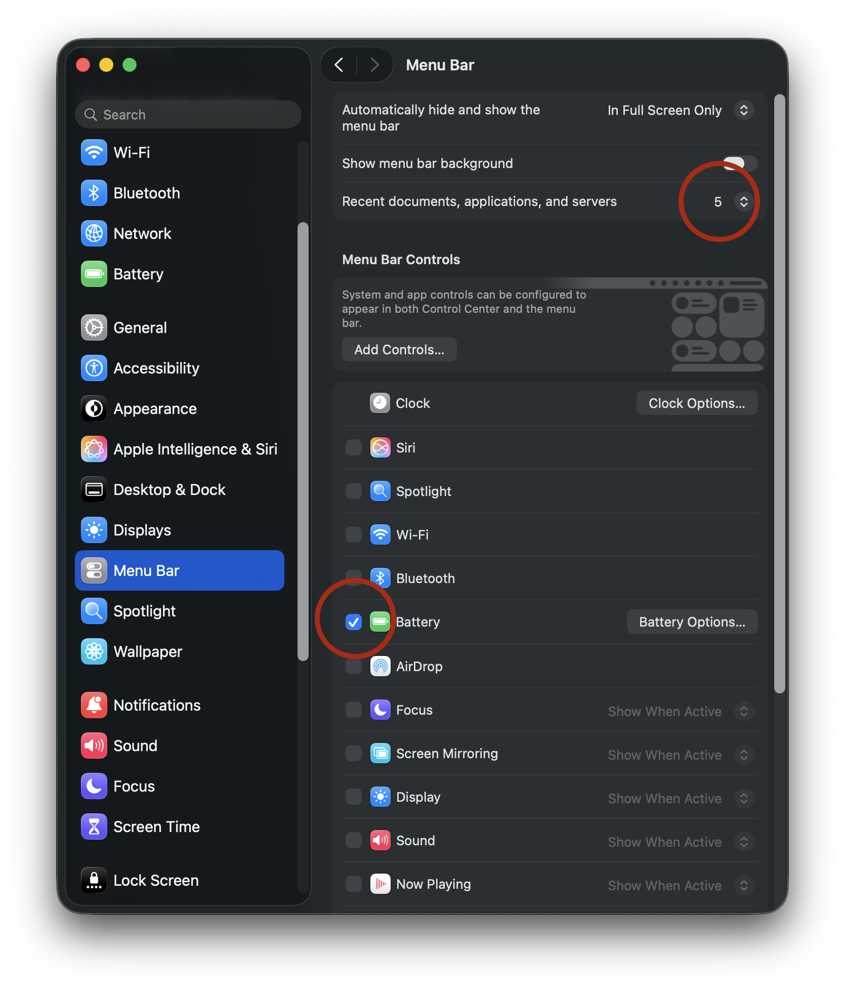
For System Settings > Menu Bar, I limit the number of recent documents, apps etc. to 5 instead of 10. I’ve also turned off all menu bar controls, save for Battery. (Some of the menu bar options that are OFF, such as Wi-Fi and Bluetooth, will be placed in Control Center.)
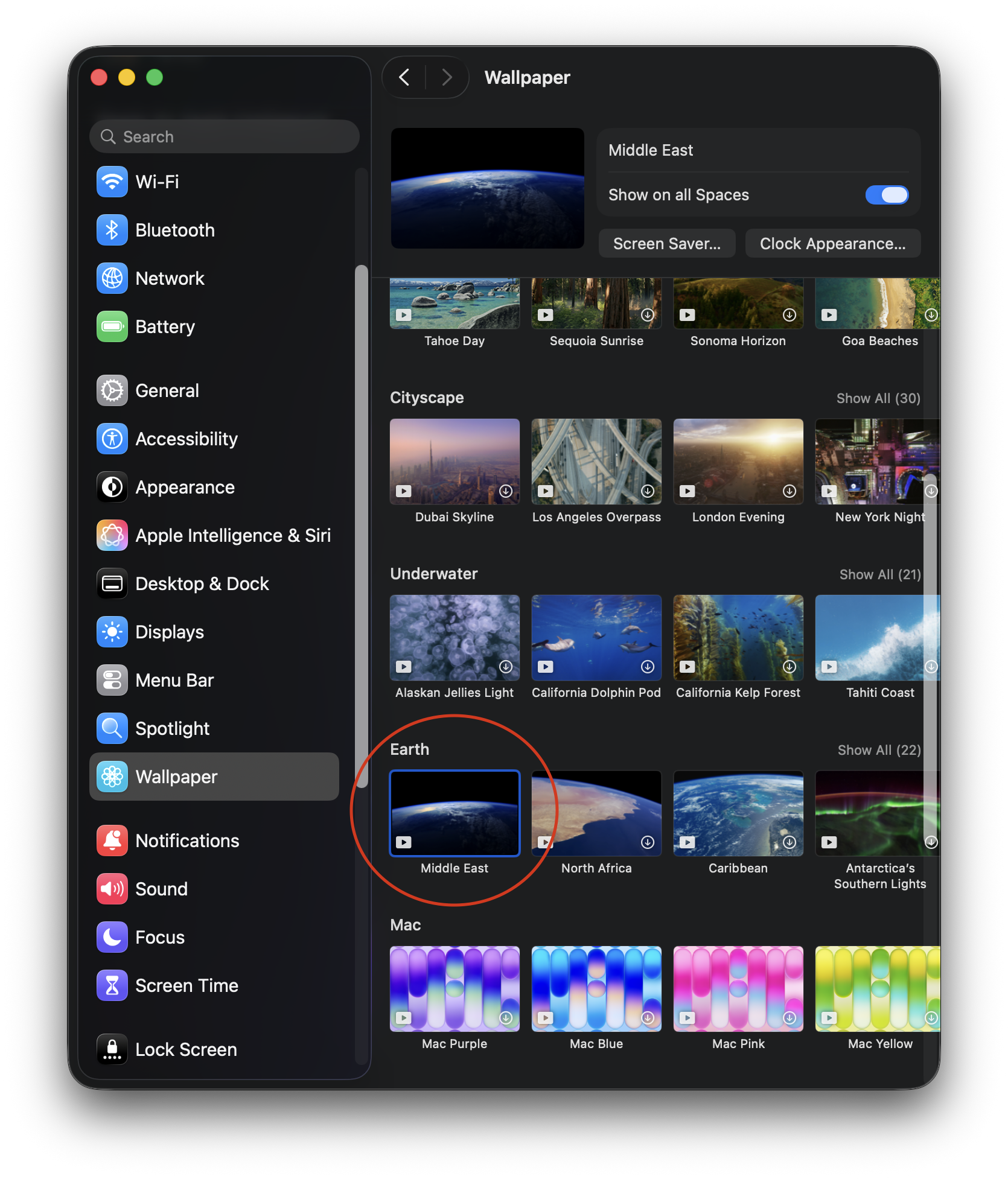
Wallpaper and screensaver settings will change later, but for now, I’ve selected a simple time-based wallpaper (Earth > Middle East), only because I like the contrast between the dark background and the icons on my Desktop.
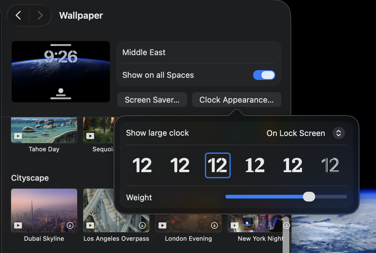
The same wallpaper will be used for the screensaver. When my Mac is locked, the screensaver will display an animated wallpaper, with a large floating clock in the top center. Clicking on the Screen Saver button provides options for customizing the Clock appearance.
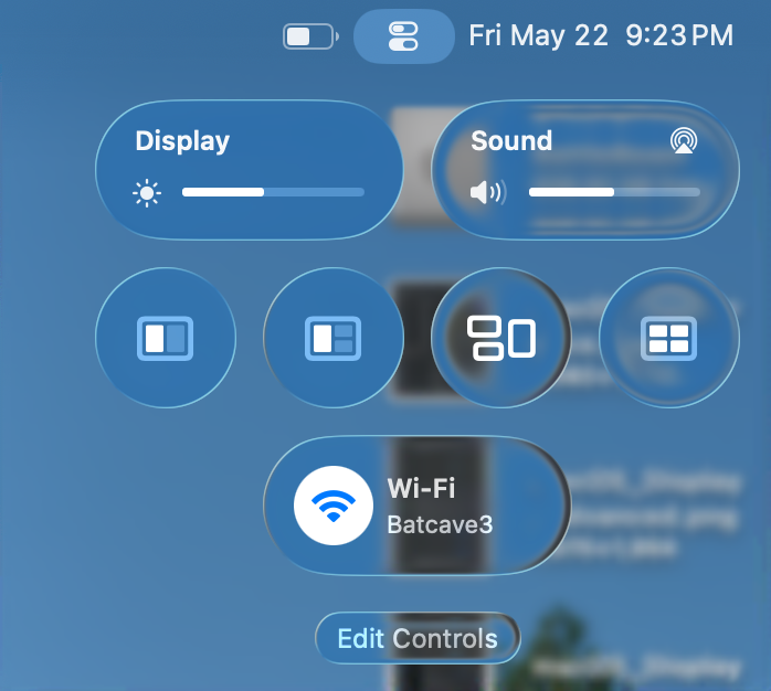
Finally, I’ll configure Control Center, by first removing everything and adding the settings I actually find useful: Display, Sound, window management (including Mission Control) and Wi-Fi. Even if you are configuring your Mac differently than mine, the idea is that the decisions are made with intention and purpose.
Next up: Notifications, Sound, Focus and ScreenTime.
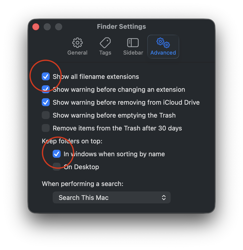
Perhaps the title is a bithyperbolic. I’m not fixing the Finder’s windows, I’m configuring them to work best for me. But first, let’s go to Finder Settings > Advanced and turn on Filename Extensions and Keep folders on top. I routinely share files between different platforms, so having visible file name extensions are a must. I also like to keep my Folders separated from my files.
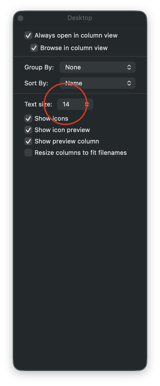
Next, let’s go to View > Show View Options, where I will increase the text size and sort items by name.
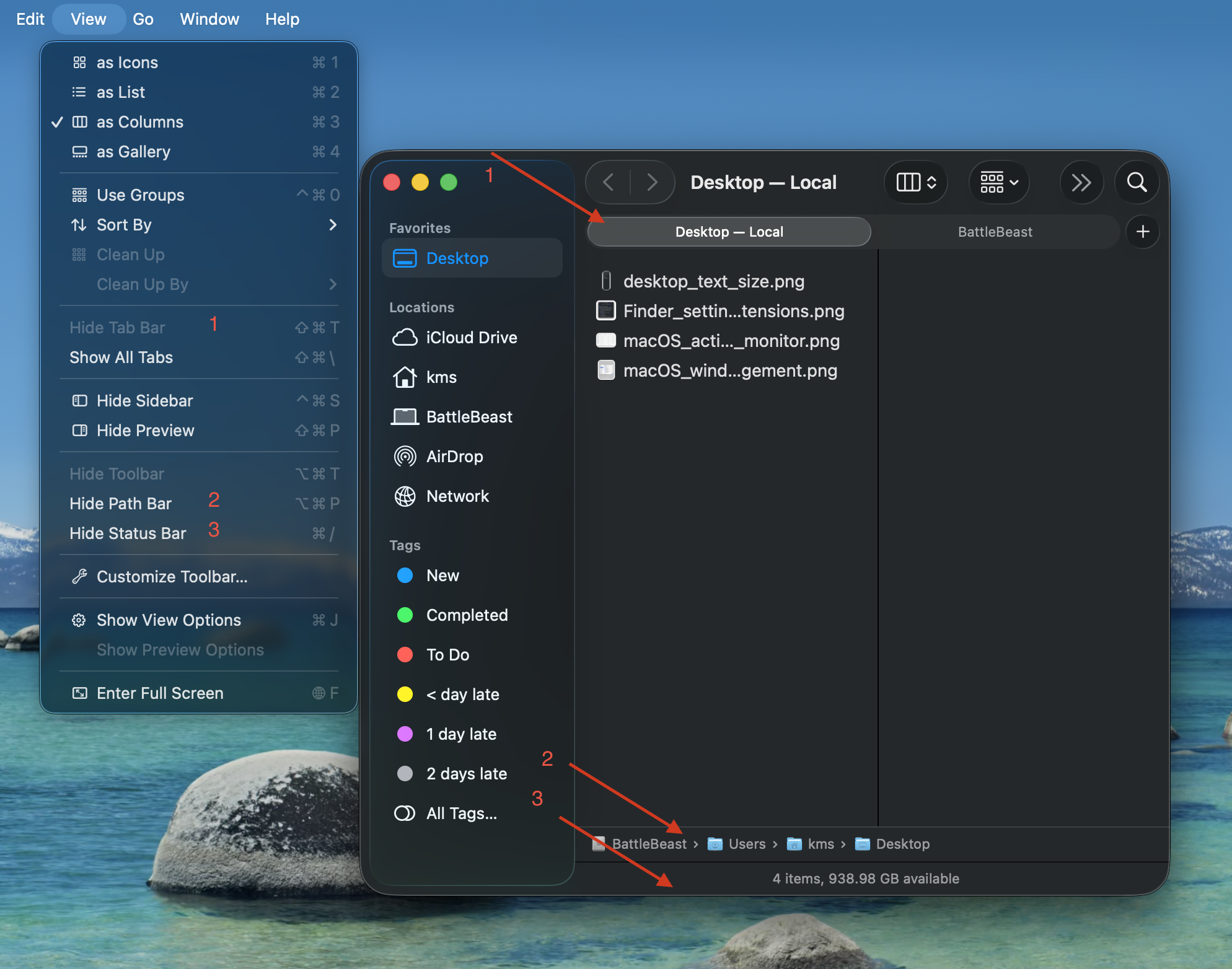
Now let’s move to the Finder window settings. I have “Show Tab Bar”, “Show Path Bar” and “Show Status Bar” active. The first option will let me quickly move between two different Finder locations in one window. The second option will show a breadcrumb trail of where I’m at within the file structure. The third option gives me an item count and overall remaining space. Of the three options, I feel that “Show Path Bar” should be the default setting from Apple, because it makes the most sense.
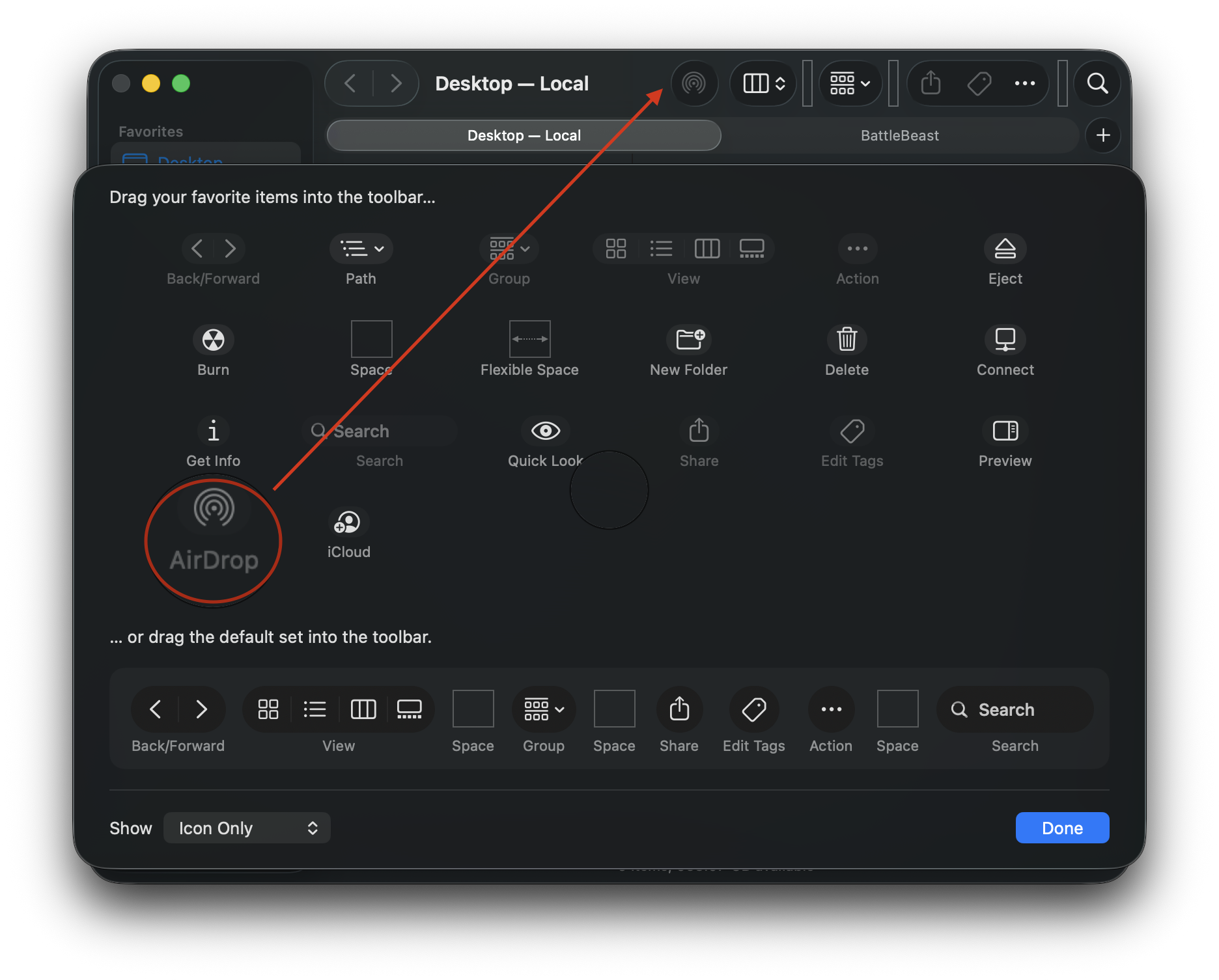
To configure the Finder window’s toolbar, go to View > Customize Toolbar. I keep the default settings, with the exception of adding AirDrop. Dragging the AirDrop icon into the toolbar gives me quick access for sharing files and folders from each and every Finder window.
Finally, the Finder is somewhat useable.
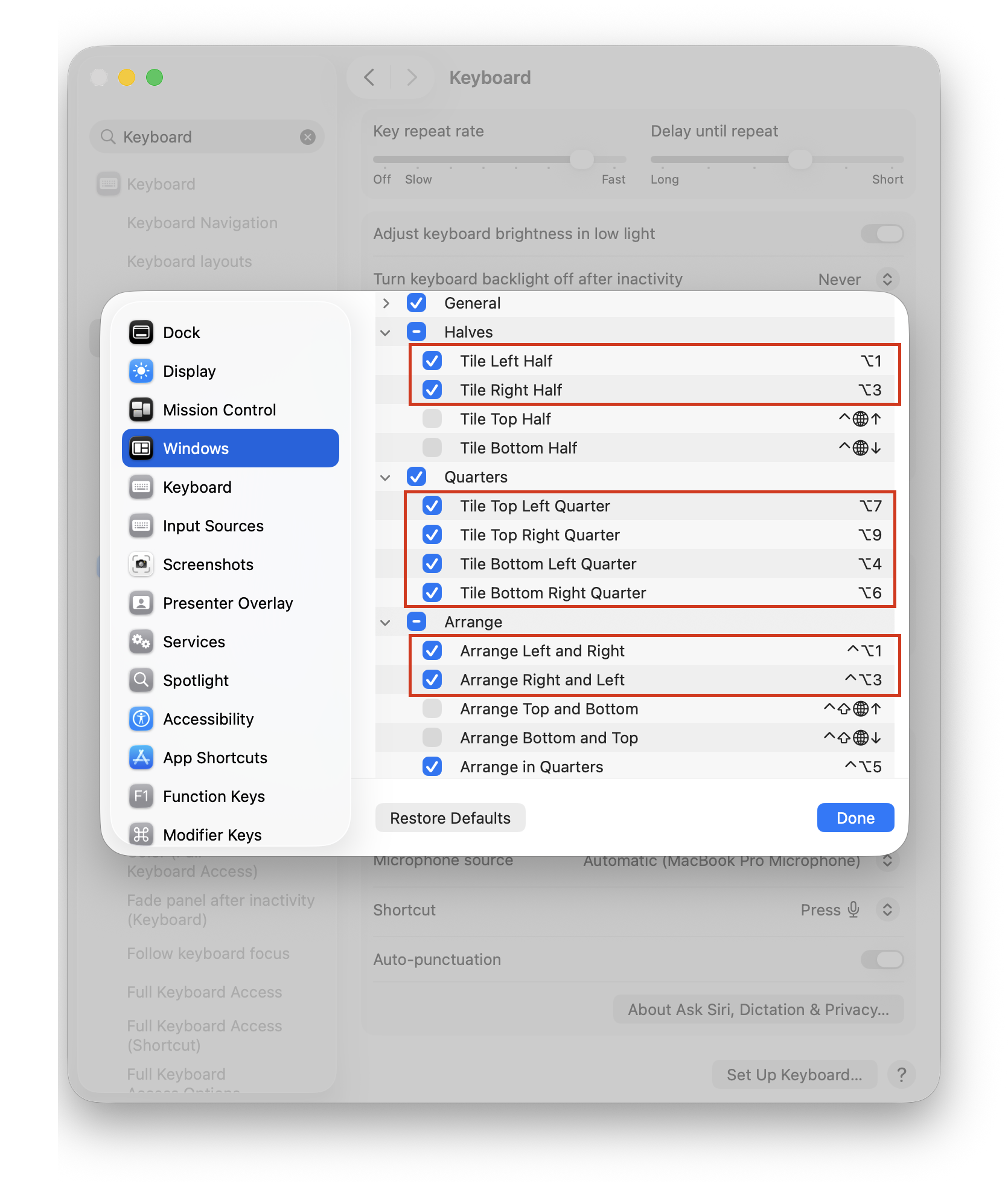
One more thing… let’s configure useful hotkeys to make the window management experience less painful. In System Settings, search for Keyboard Shortcuts. Then, scroll down to Windows. Below are my custom hotkeys, replacing Apple’s defaults. These are the same hotkeys I’ve used when managing windows with Raycast. The Arrange section lets me switch / flip windows from left to right or vice versa.
(Alas, macOS does not include any built-in option for moving a window to a different display via hotkey. This is a hole that I will have to remedy with third party window management software.)
Incidentally, I have yet to add any new piece of software to this Mac. My FrugalMac approach is to work with what I have first. When I run into limitations that go beyond the scope of what the vanilla macOS experience provides, I will investigate appropriate third party solutions.
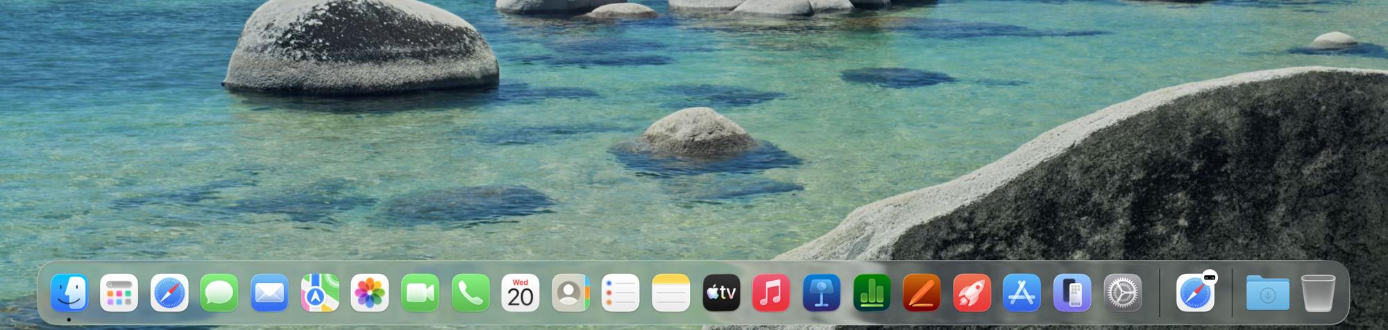
The default macOS Dock is littered with application icons, many of which I don’t use. And most of which I don’t care to see. Below is the macOS Tahoe Dock in its default state:
Hideous, right?
Let’s remove the clutter.
Ahh! Much better.
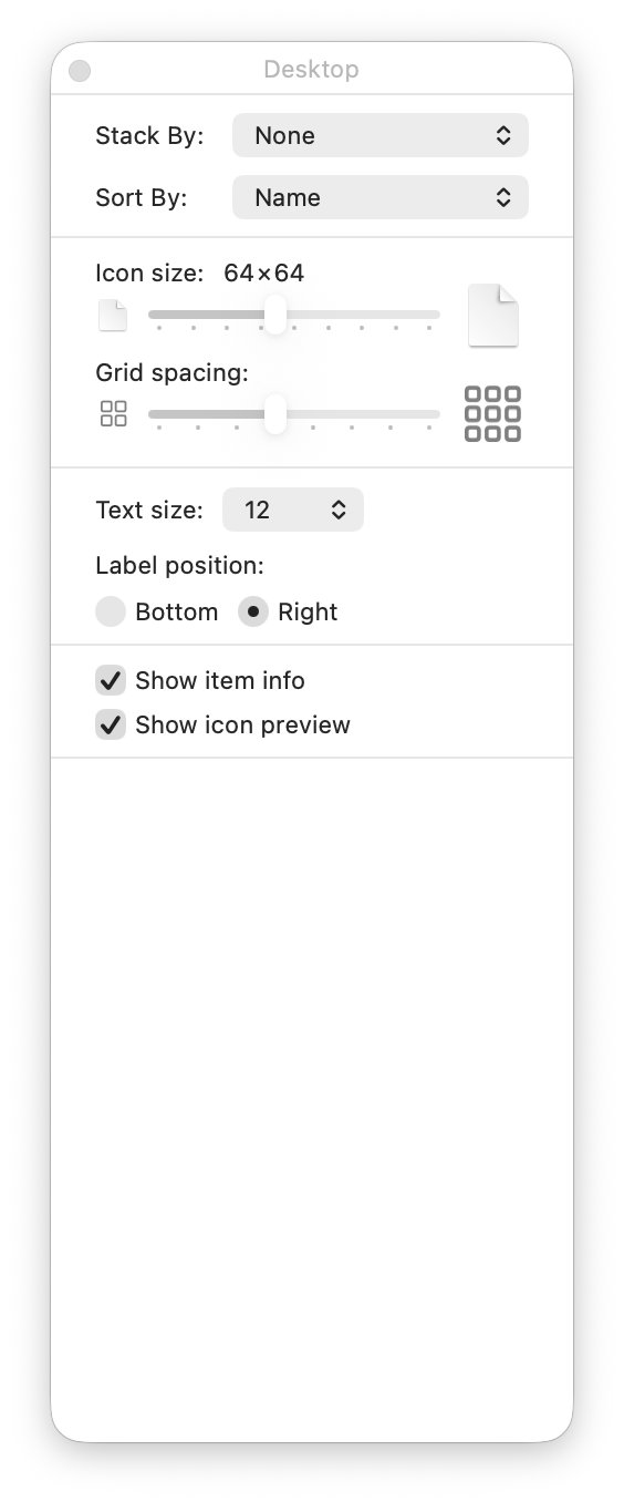
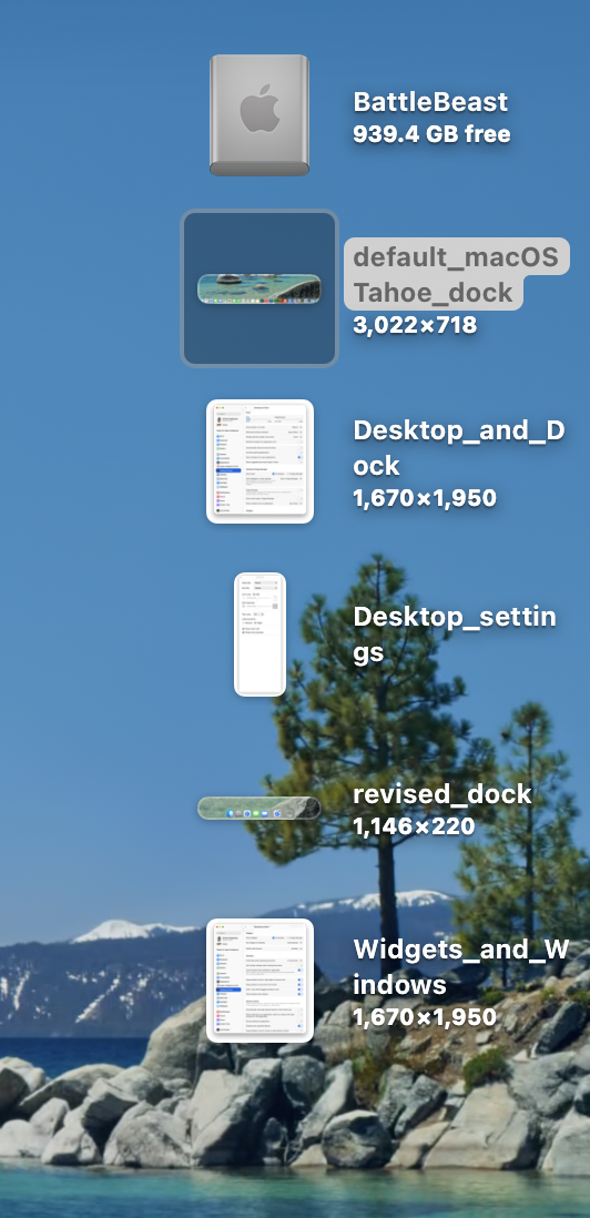
Next, let’s tackle the Finder Desktop settings, under View > Show View Options. I prefer items sorted by Name, and keeping text to the right of the icon. Why? Because I use long file names and I want to see them in all their glory. Showing item info let’s me see image sizes, without having to guess.
Next, let’s turn our attention to the Desktop and Dock. To modify its settings, we must visit Settings > Desktop and Dock. I’ve turned off all defaults, leaving Show indicators for open applications. I also turned off Stage Manager. I absolutely despise Click Wallpaper to Show Desktop, so I’ve banished that option to Stage Manager, so I’ll never need to deal with it again. I understand what Stage Manager is supposed to do, but I find that it gets in the way of my work. In its current state, it feels half-baked.
Scrolling down, I’ve left most of the options ON for both Widgets and Windows. I rarely use Mission Control or Spaces, so those options were unchecked.
Over the last few posts, I’m acutely aware of certain areas of friction as I work with the default macOS Tahoe setup.
1) AirDrop is tucked away inside a nested context menu, visible only when I right-click on a file or folder. I use AirDrop constantly to move files between my Macs, and SuperCharge gives me the option to have AirDrop visible directly when I right-click.
2) Keyboard-based window management in macOS Tahoe is set up differently to what I’m used to with Raycast. (If I can modify the keyboard shortcuts within the OS, I may not need to have Raycast installed.)
The first stop in changing the default Finder experience is Finder > Settings….
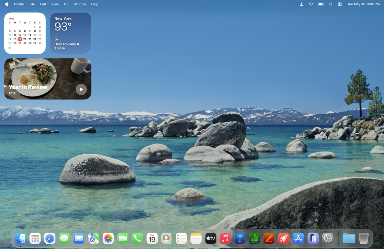
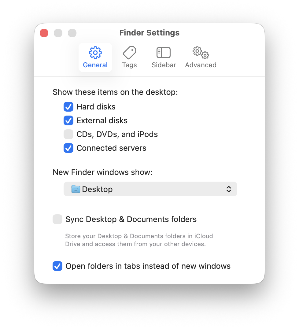
In the General tab, I have Hard disks, External Disks, and Connected Servers checked to be visible on the macOS Desktop. I also prefer having new windows open to show the Desktop.
Next, let’s examine the standard Finder window sidebar. In its default configuration, it’s overwhelming.
I prefer to keep the sidebar as minimal as possible, only adding items that I absolutely need. Off to the Sidebar tab we go then.
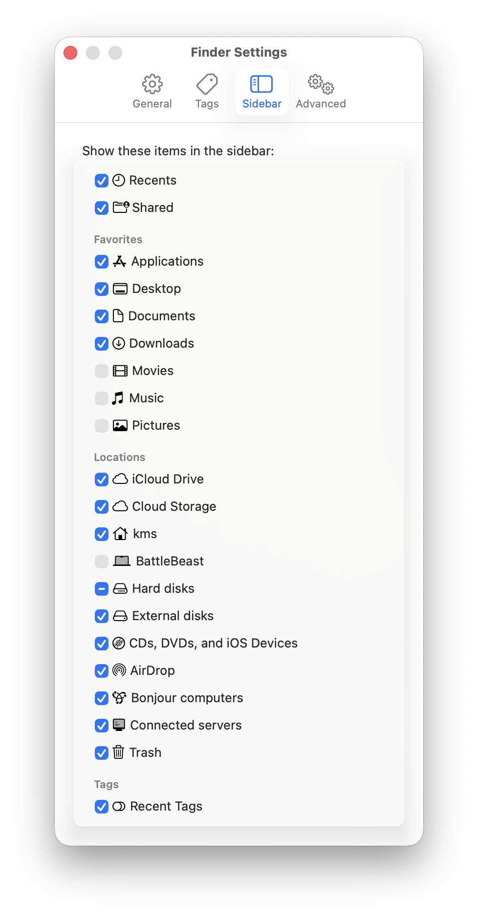
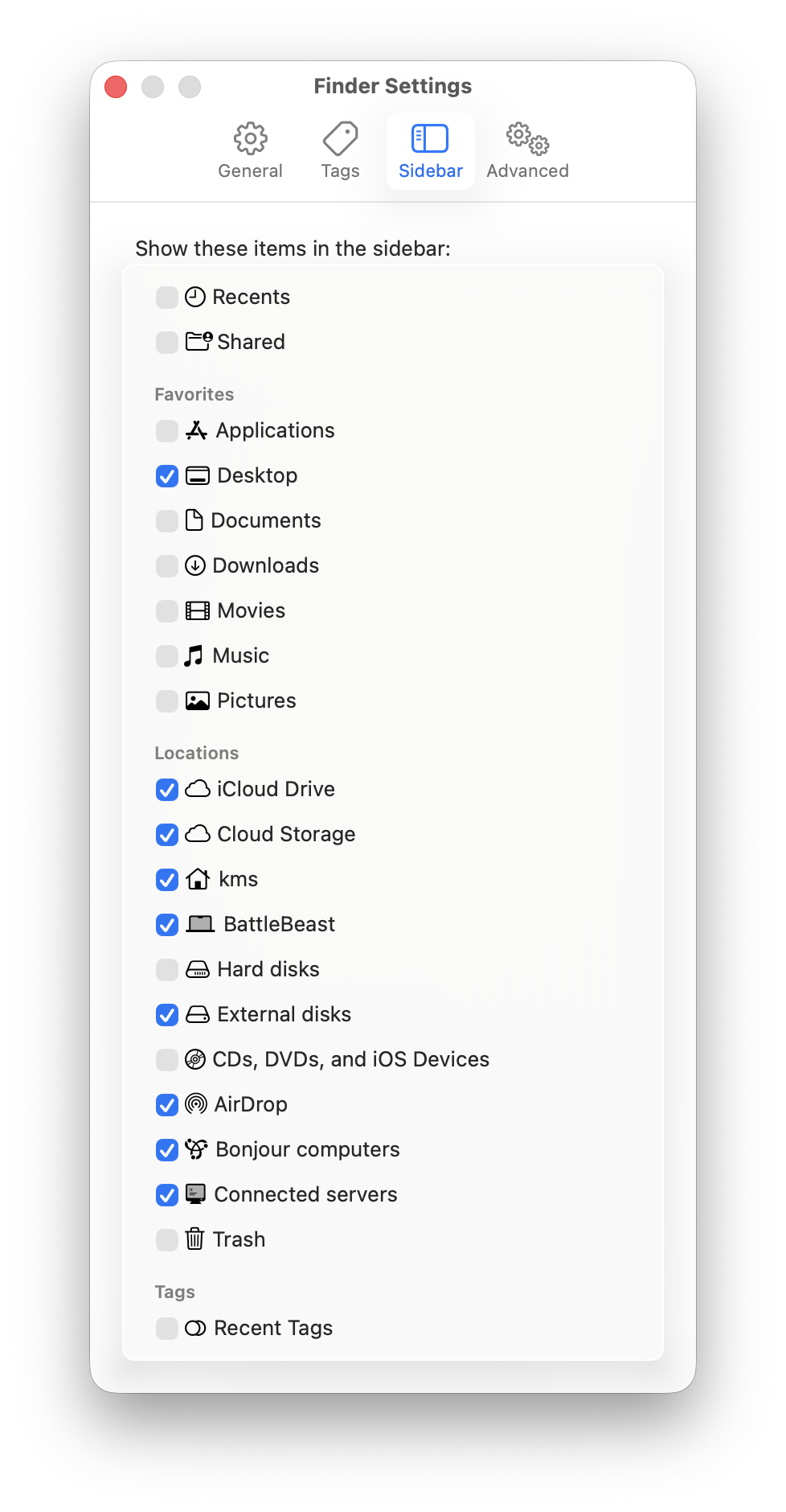
Everyone has their specific preferences, so adjust accordingly. Here’s what my Sidebar settings look like.
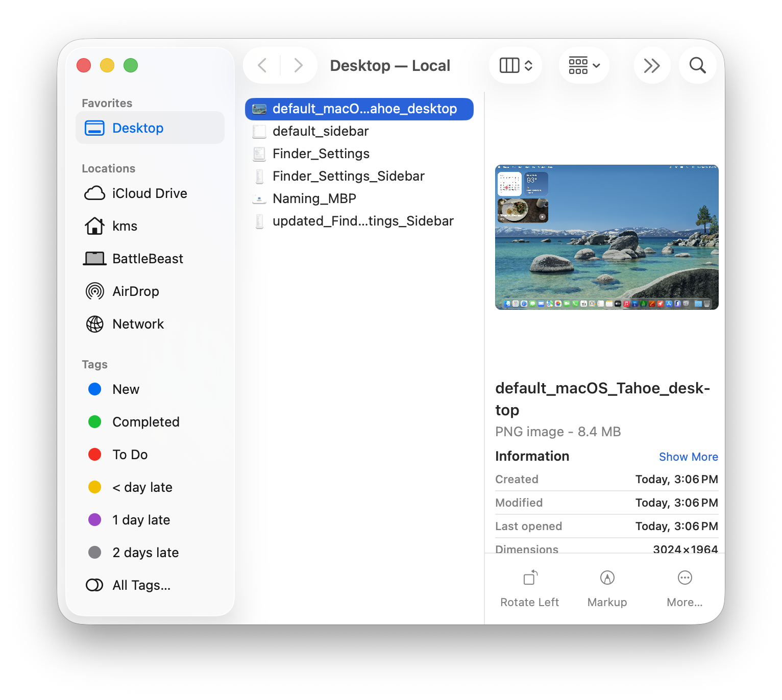
My Sidebar favorites only includes the Desktop as a visible option. I have several Locations checked, mostly to facilitate file access and file transfer between other machines on my local network.
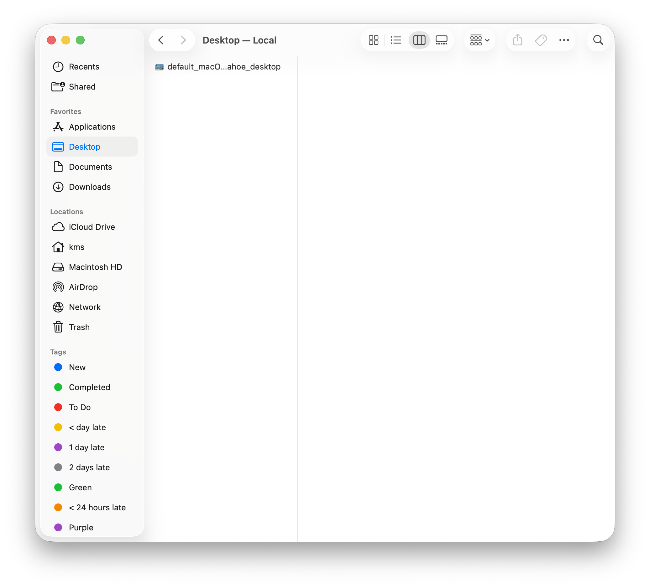
Here’s what my Sidebar looks like now:
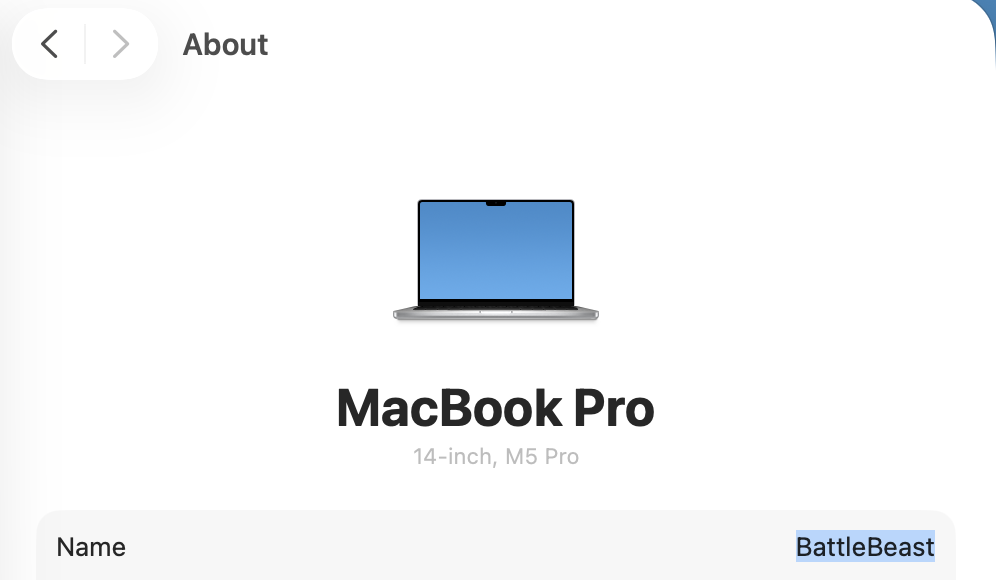
Incidentally, at this point, I’ve given my new laptop a name: BattleBeast. I think the name fits its intended purpose.
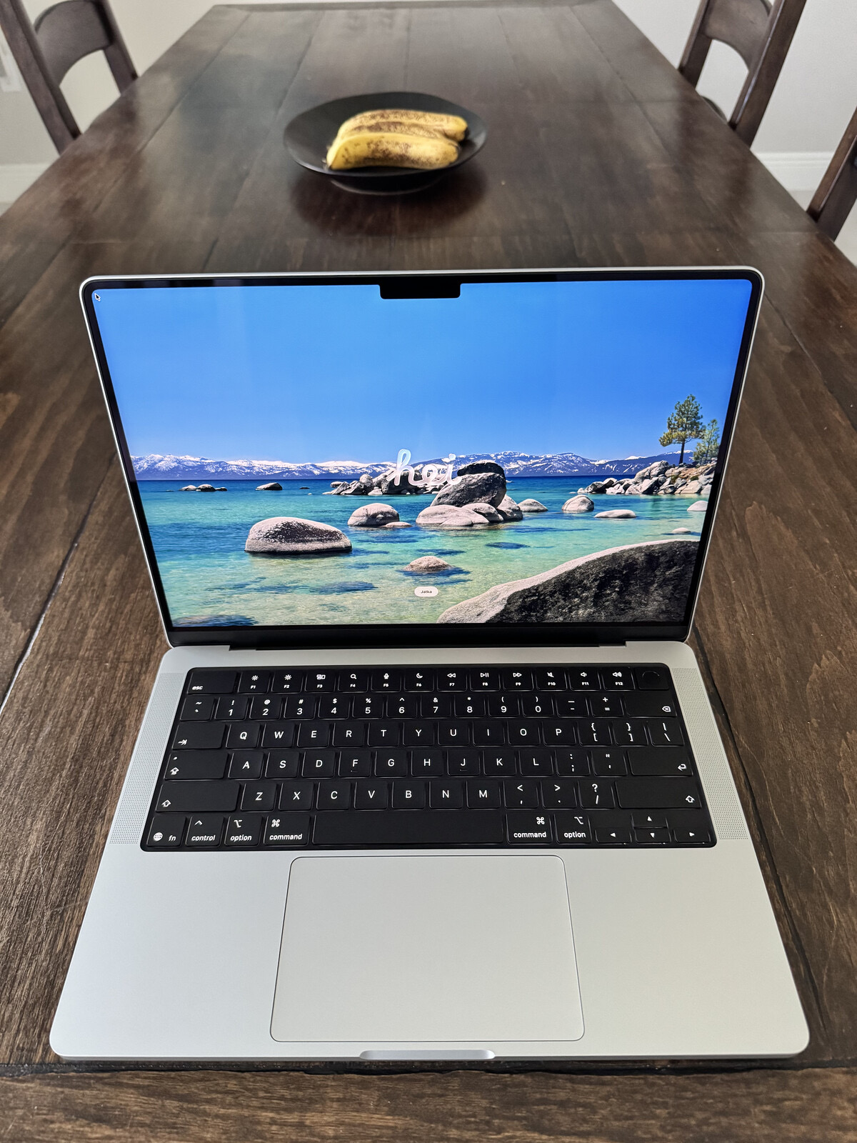
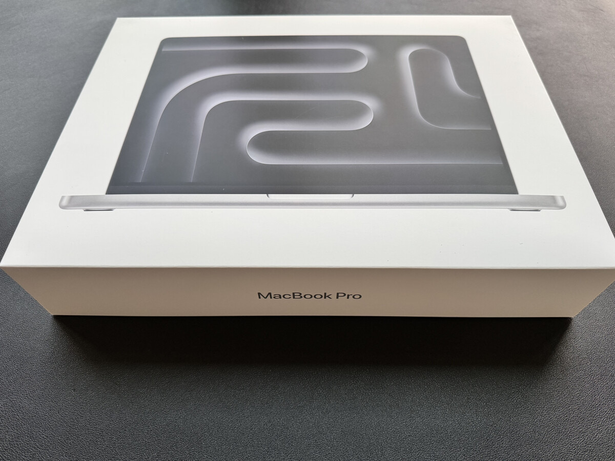
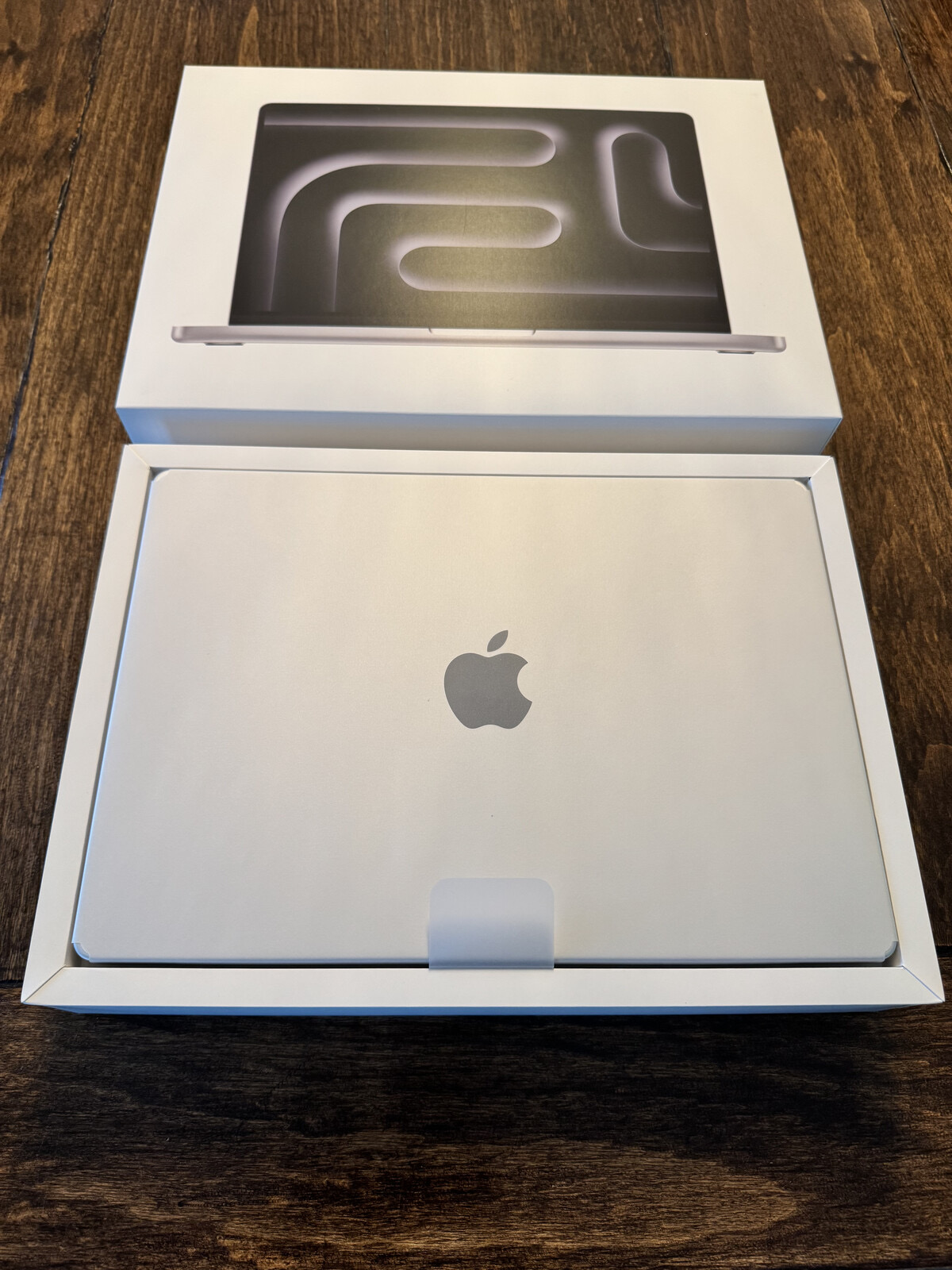
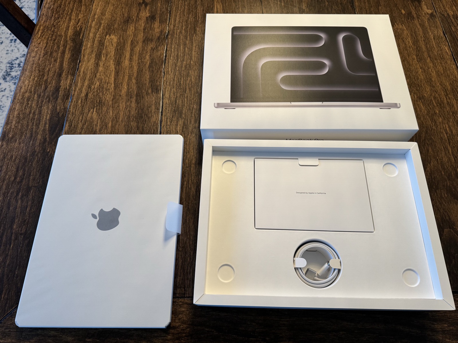
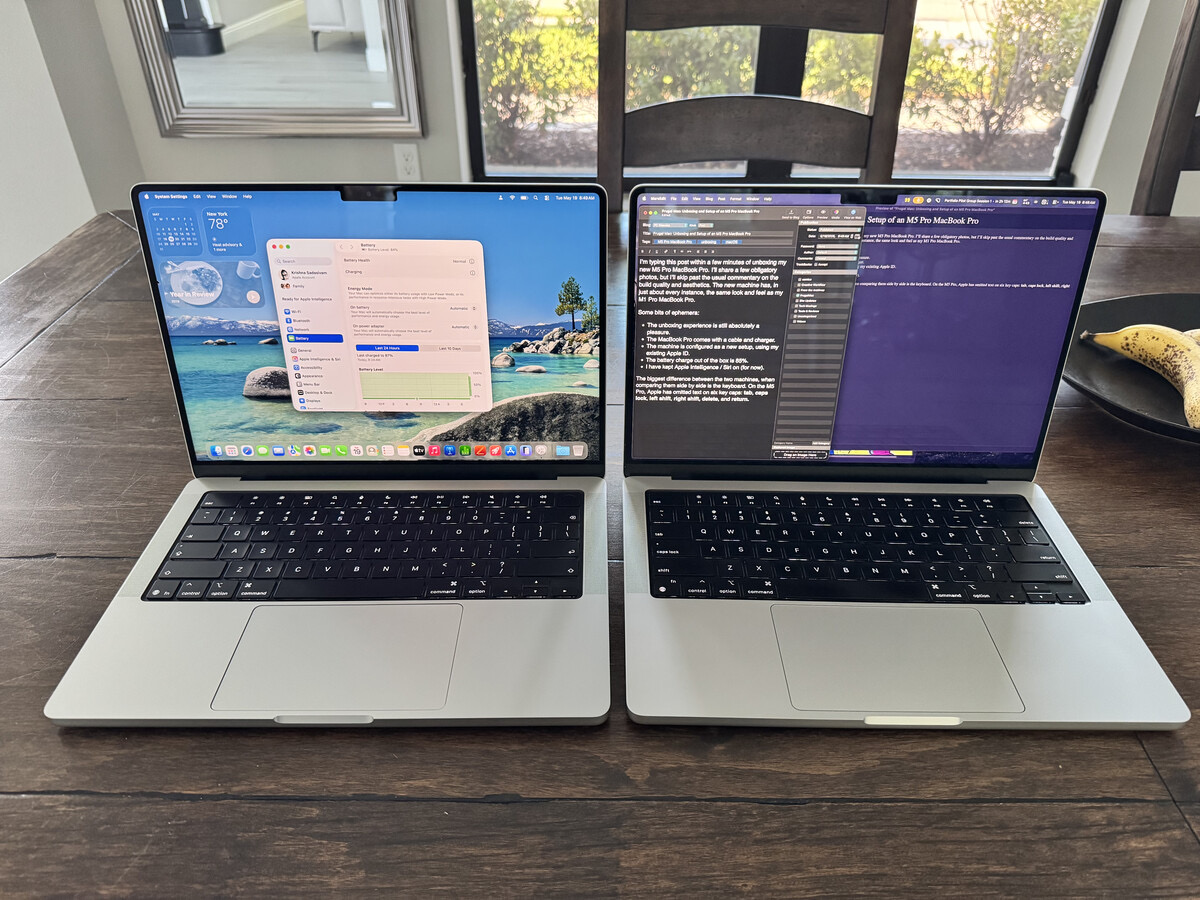
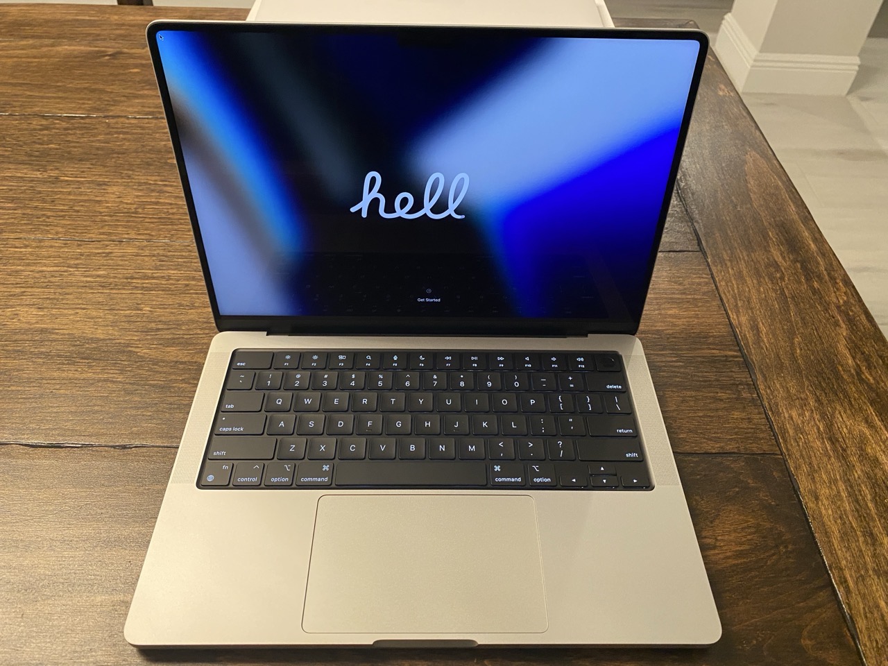
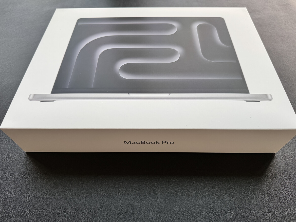
I’m typing this post within a few minutes of unboxing my new M5 Pro MacBook Pro. I’ll share a few obligatory photos, but I’ll skip past the usual commentary on the build quality and aesthetics.
The new machine is, in just about every instance, identical to my M1 Pro MacBook Pro.
A few bits of ephemera:
The unboxing experience is still absolutely a delight.
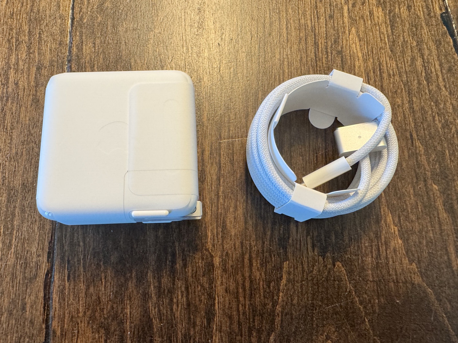
The MacBook Pro comes with a braided USB-C cable and charger.
macOS Tahoe 26.4 is installed.
Apple presents only two update options: Update Automatically or Only Download Automatically.
The machine will be configured as a new setup, using my existing Apple ID.
The battery charge out of the box is 85%.
I have kept Apple Intelligence / Siri on (for now).
In Settings, the Mac is already set for Optimized Battery Charging.
The only observable difference between both two machines, when comparing them side by side, is the keyboard. On the M5 Pro model, Apple has omitted text on six key caps: tab, capslock, leftshift, right shift,delete, and return. While it does give the keyboard a cleaner look, I prefer the original layout. (Veteran Mac users will not have any issue, but new users, particularly those coming over from Windows, may encounter some friction.)
In my next post, I’ll share my thoughts on the default macOS Desktop experience. Spoiler alert: I hate it.
Tasks and errands got the best of me for most of the day, which means I still haven’t opened the box containing my new M5 MacBook Pro. (It will happen tomorrow, I promise.)
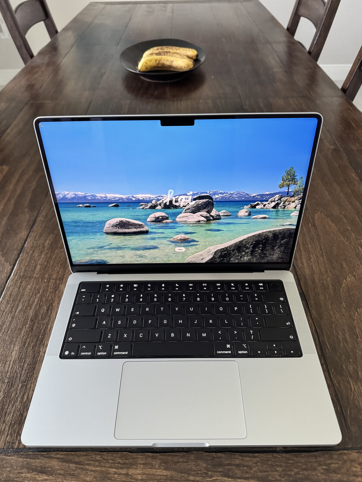
(Incidentally, the featured image for this post is of my M1 Pro MacBook Pro, shortly after it was unboxed.)
In my last post, I wrote about why and how I plan to use this new laptop. Today I wanted to share the rationale for the specific configuration I chose for my new Mac laptop.
1. Silver vs. Space Black
I chose Silver over Space Black after much internal debate. The Space Black MacBook Pro model looks sleek and sophisticated. I seriously considered it, but two things held me back: fingerprints and scratches. I take great pride in keeping my Macs pristine. Reports from users on various Mac reddit groups suggest that although Space Black looks good, it takes more upkeep to maintain. I suppose I could deal with a fingerprint-laden case, but visible scratches (from rings, watches, and plugging peripherals in and out) made Space Black a no-go for me.
2. 14” vs. 16″
I value portability over screen size. If I need to use a bigger screen, I can do so by plugging my laptop into an external display. Therefore, the 14” model was an easy pick. At work, I have access to a 16” M3 Max MacBook Pro. Despite it’s larger screen size, it’s far too big and bulky for me to tote around.
3. 48GB RAM
My M1 Pro MacBook Pro was outfitted with 32GB of RAM. I plan to use the M5 Pro MacBook Pro for at least five years or more, so I bumped RAM up to what I was comfortable with. Truthfully, for the work that I do, I could have probably settled for 24GB of RAM. But I didn’t feel like settling. Besides, I’ve never, ever regretted having more RAM in any one of my Macs.
4. 1TB storage
I’m very selective when it comes to the applications and files that live on my MacBook Pro’s internal drive. I have never used more than 350GB of storage space for apps / files on the M1 Pro’s 1TB drive. (Most of my files live on external drives.)
5. Binned vs. Non-Binned
I opted for the Binned variant CPU/GPU, largely based on the test results conducted by several YouTubers. For the type of work I do, I’m fine with waiting a few extra seconds. The extra cost for the non-binned CPU didn’t seem worth springing for. The 15 CPU cores and 16 GPU cores in the M5 Pro will be a massive step up from the 8 core (6 Performance and 2 efficiency) setup I have in the M1 Pro.
Extensive research and careful deliberation led me to this decision. Soon, I’ll be putting my new machine to the test. Now if you’ll excuse me, I’ve got a box to open…
In early May, I pulled the trigger on a custom-configured M5 Pro MacBook Pro.
Its specifications are as follows:
14″ Silver
48GB RAM
1TB internal storage
15-core CPU
16-core GPU
It arrived this past Thursday. It’s Sunday as I write this, and much to both my wife and daughter’s surprise, I haven’t opened the box yet.
I rarely purchase new computers, so I want to savor the experience of settling in with my new laptop. The plan is to open it tomorrow.
My last MacBook Pro was purchased in late 2021, shortly before starting my current teaching post. At the time, I really needed a new portable machine. My 2014 MacBook Pro, with its measly 8GB RAM and 256GB SSD, was too anemic for regular use.
I took possession of the late 2021 MacBook Pro a few weeks before the academic term started. It was put to full use as a curriculum-development machine before I could really set it up properly.
Five years on, my M1 Pro MacBook Pro still runs well, but it does have a few minor hiccups here and there. It is also well overdue for a fresh install of macOS. I’m positive this approach will excise some of the detritus and cruft that still lingers within the machine. A clean install is something I have scheduled for this summer.
For now, the M1 Pro will continue to handle my academic tasks. The new M5 Pro will be used as my daily driver for design-focused work. At some point in the near future, I’ll pass the M1 Pro laptop over to my wife and employ the M5 Pro as my main academic and design workhorse.
But that’s only after I get everything set up properly from scratch.
And if you’re following this blog, I’ll be documenting the entire configuration process along the way.
With this new machine, my goal is to keep the quantity of third-party applications and add-ons to the absolute minimum. I will also be prioritizing free, open-source, and low-cost software options whenever I can. Along the way, I’ll share what I install, what I skip, what I replace with free or low-cost tools, and what is actually worth paying for.
I’m dubbing this approach FrugalMac.
FrugalMac doesn’t mean buying the cheapest Mac. It means buying the right Mac once, setting it up thoughtfully, and avoiding unnecessary bloat wherever possible.
In my next post, I’ll explain the rationale for the specs I chose — and hopefully, by then, I’ll have the new machine out of the box.



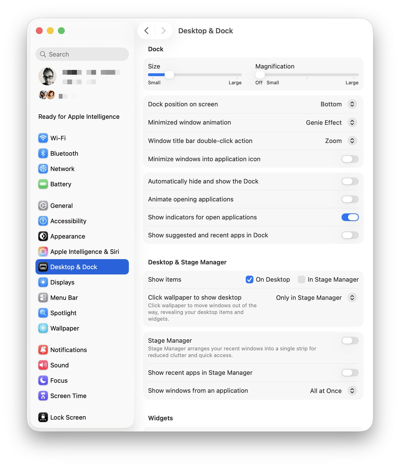 I’ve turned off all defaults, leaving Show indicators for open applications. I also turned off Stage Manager. I absolutely despise Click Wallpaper to Show Desktop, so I’ve banished that option to Stage Manager, so I’ll never need to deal with it again. I understand what Stage Manager is supposed to do, but I find that it gets in the way of my work. In its current state, it feels half-baked.