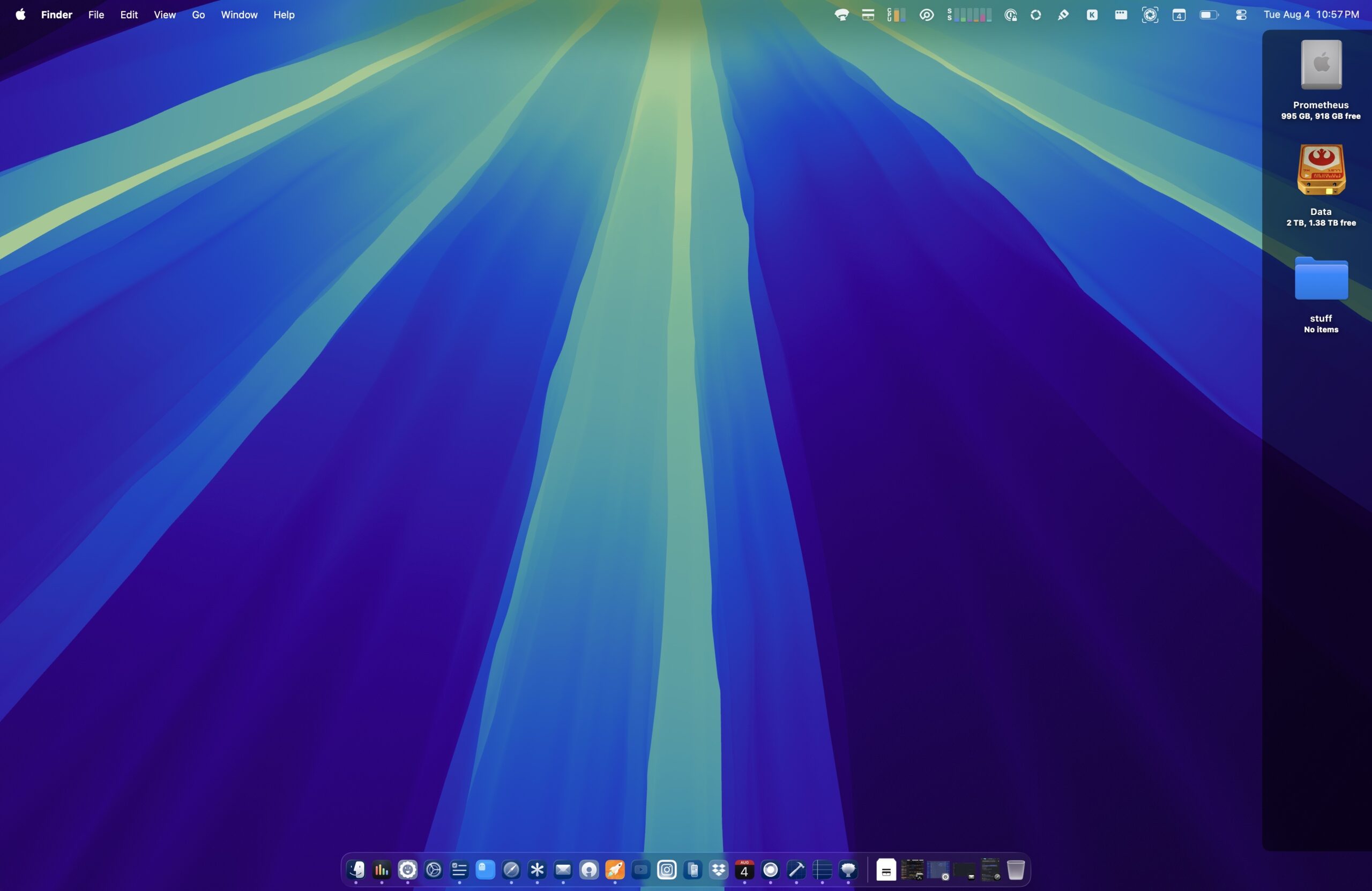
Earlier this week, I alluded to an app I’ve been developing. That app now has a name: IconShade!
I’ve always found macOS desktop icon labels difficult to read on bright wallpapers. Rather than changing my wallpaper, I decided to build a lightweight utility that places a subtle translucent shade behind the desktop icon column. The result is surprisingly effective. Desktop icon labels become much easier to read while preserving the look of your wallpaper.
As they say, a picture is worth a thousand words.
Before:
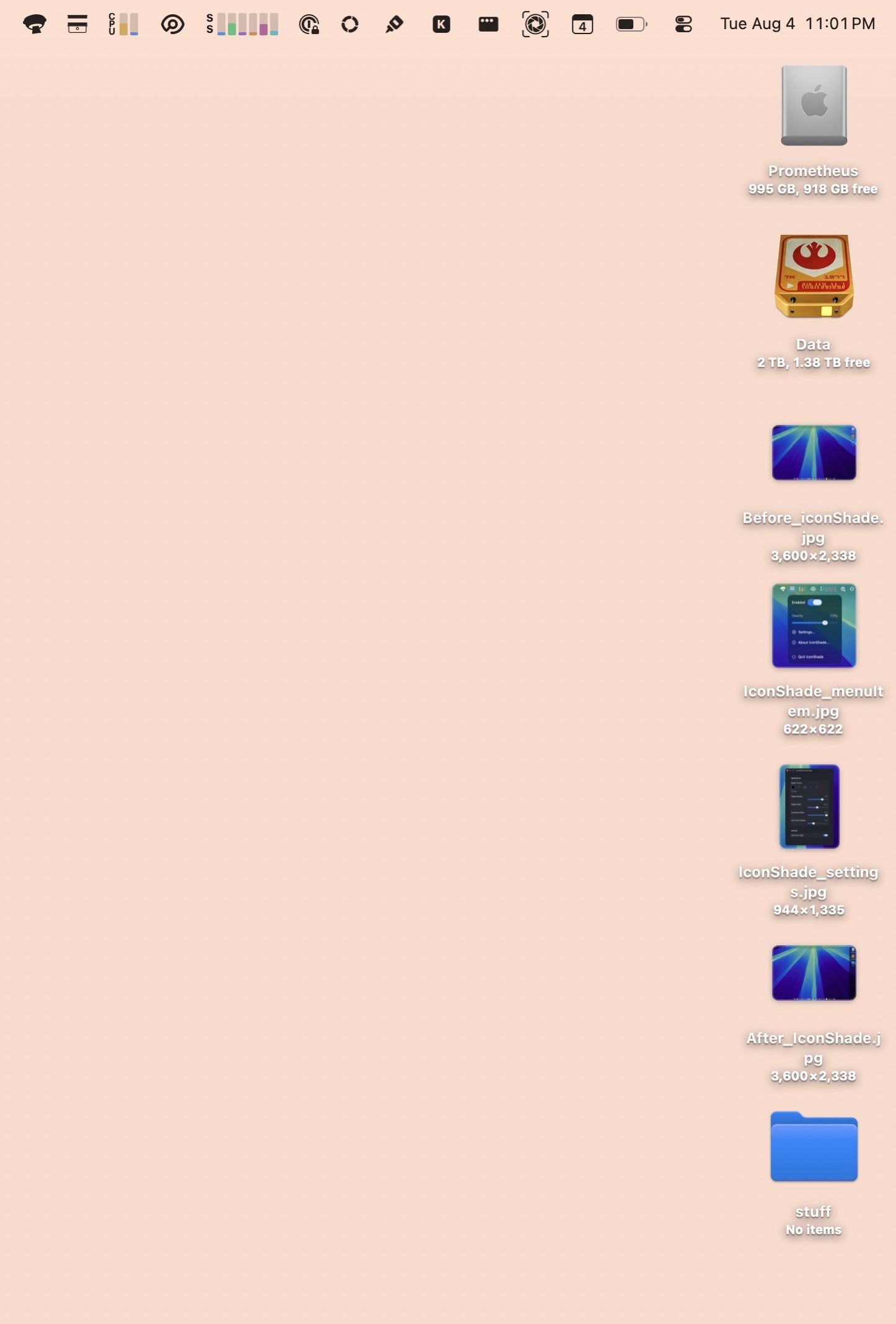
By default, macOS displays desktop icon labels using light colored text. Against bright or detailed wallpapers, those labels can be surprisingly difficult to read.
After:
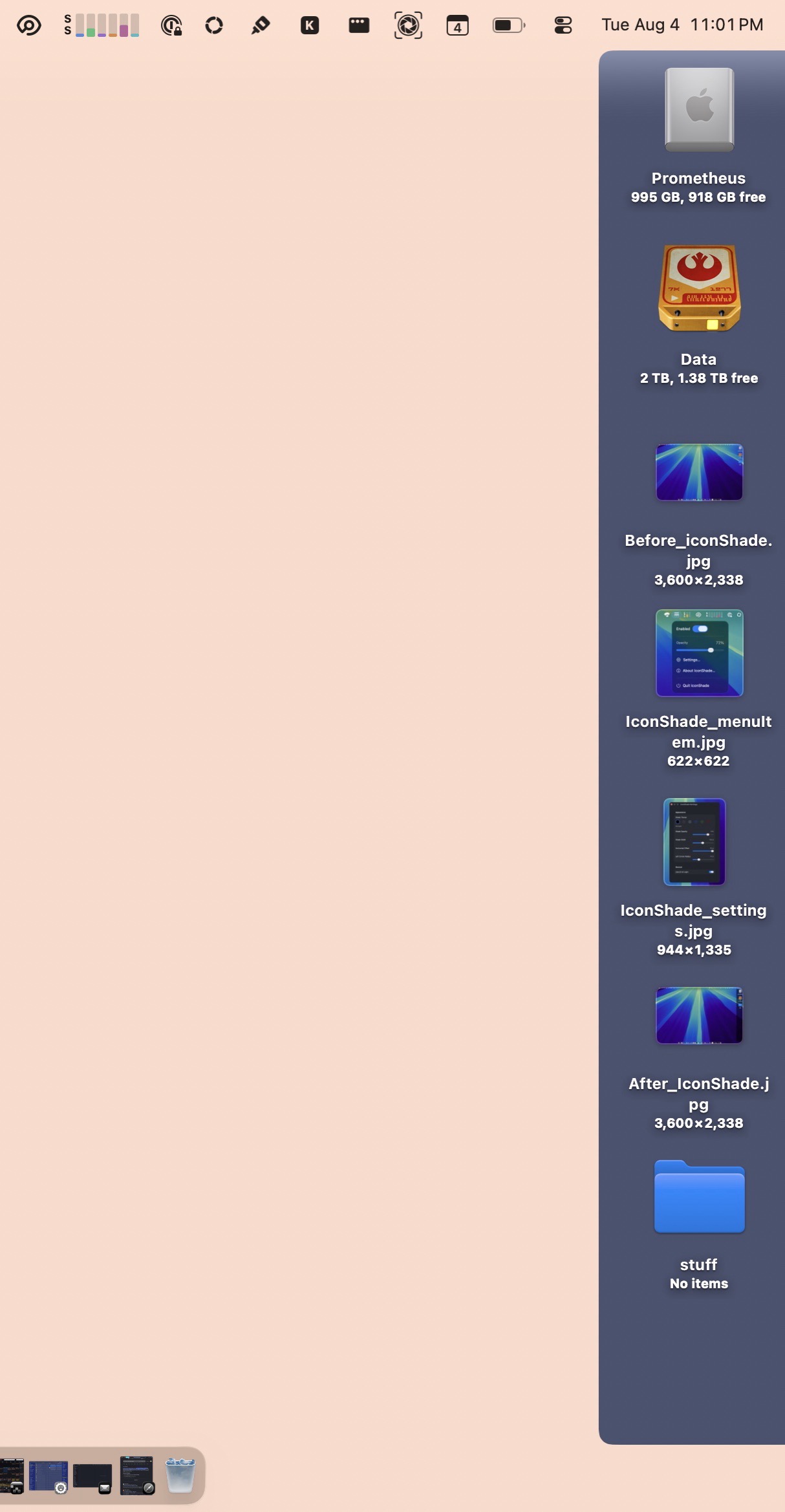
IconShade places a subtle translucent shade behind the desktop icon column, dramatically improving the readability of desktop icon labels without covering your wallpaper.
The shade is fully customizable. You can adjust the its transparency, color, left corner radius and horizontal position.
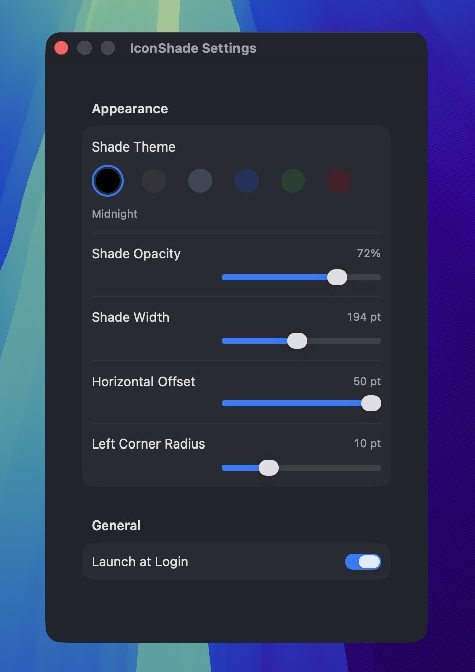
Other features include:
- Automatic Launch at Login
- Multiple built-in shade themes
- Automatic support for multiple displays
- Automatically follows the current primary display
- Native Apple Silicon and Intel support
I’ve been testing IconShade daily across three different Apple Silicon Macs, including systems connected to multiple external displays. So far, it’s been rock solid.
The next step is expanding testing.
I’m looking for 3–5 Mac users who would be willing to try IconShade for a few days and let me know what works, what doesn’t, and what you’d improve before the first public release.
If you’re interested in helping, please reach out to me on Mastodon. I’m @KrishnaDraws.
-Krishna