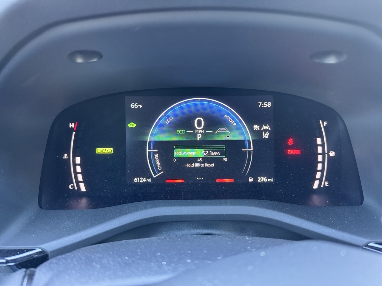
Look carefully at the image above. It’s from the dashboard of a 2025 Toyota Camry. Littered across the cluster are a cacophony of icons, measurement gauges and more. It’s a mess. Sure, the speedometer, engine temperature and gas guage are useful – but even within a few of those elements, there’s a lot going on.
As I drove last week, my car’s dash made a sound. An audible “ding”, quite similar to a smartphone chat notification. I’ve heard this ding appear before, at seemingly random times while on my commute. I have no idea what this “ding” signifies. Not one clue.
Maybe the “ding” coincided with a visual cue on my dash? I’ll never know. Because the dash cluster has little in the way of hierarchy. Because I’m too focused on driving to glance down to decipher what’s seeking my attention. Or maybe it’s just bad UI/UX.
And don’t even get me started on the Camry’s propensity to randomly drop its Bluetooth connection to my smartphone.
Modern car instrumentation is a minefield of distraction. Give me old fashioned analog buttons, gauges and knobs any day.
How did we get here? Why is modern car UI so darn awful?
-Krishna