No matter how much memory you have on your computer, it seems that Photoshop always wants more. And when Photoshop exhausts all available RAM on your machine, it uses your computer’s internal storage. This can become an issue of your computer’s internal boot drive is almost full. The less space you have on your boot drive, the moreperformance degradation will occur, culiminating in the dreaded “Scratch Disk is Full” dialog.
To prepare against this inevitability, I strongly recommend having a dedicated Scratch Disk connected to your computer. A Scratch Disk acts as temporary virtual memory that can be used to store, read and write project data. Instead of writing this data to my Mac’s internal drive, Photoshop will write to an external storage device connected to my Mac. The sole purpose of this drive is to act as a Scratch Disk. For the type of work that I do, a 512GB SSD more than suffices.
Most Adobe applications include the option to assign a dedicated Scratch Disk, so the very same storage device I’m already using for Photoshop can serve as a scratch disk for Illustrator, Premiere, After Effects etc. Visit your Photoshop > Settings > Scratch Disks tab to assign your Scratch Disk. If need be, more than one scratch disk can be assigned. This can be helpful if you’re working with really, really large or complex files. If Photoshop can’t find your dedicated scratch disk (because its unplugged, etc.), it will use your computer’s internal drive.
The second key setting I recommend adjusting is under Photoshop > Settings > Performance. You’ll want to adjust these settings based on your intended use case. I typically work with files that are 9” x 12” at 600ppi. The largest size canvas I work with is 24” x 36”. As such, I have provisioned Photoshop to use half of my system’s memory. For History and Cache, I opted for the “Web / UI Design” option, electing to have 20 History States instead of 50. (History states refer to the number of Undos available.) The larger the number, the more the RAM usage.
Your mileage (and settings) may vary. But it’s important to be aware of these factors as they can play a dramatic role in how Photoshop performs.
When publishing content online, whether it’s for this blog or social media channels, I prefer to work with an image that’s no wider than 1000px. (Smaller images load faster.)
Before this automation, the process involved several manual steps:
1) Select the image.
2) Right-click on the image to see the context menu.
3) Choose Quick Actions > Convert Image.
4) Interact with the following modal dialog to perform the conversion.
Automation is the chief reason I prefer macOS over other platforms. The Mac has a wide range of third party automation tools, but it also includes a few of its own that ship with the OS that often go overlooked.
Chief among them is Automator. With it, I have created a simple automation that will resize any image to the preferred size I’m after. (No programming required.)
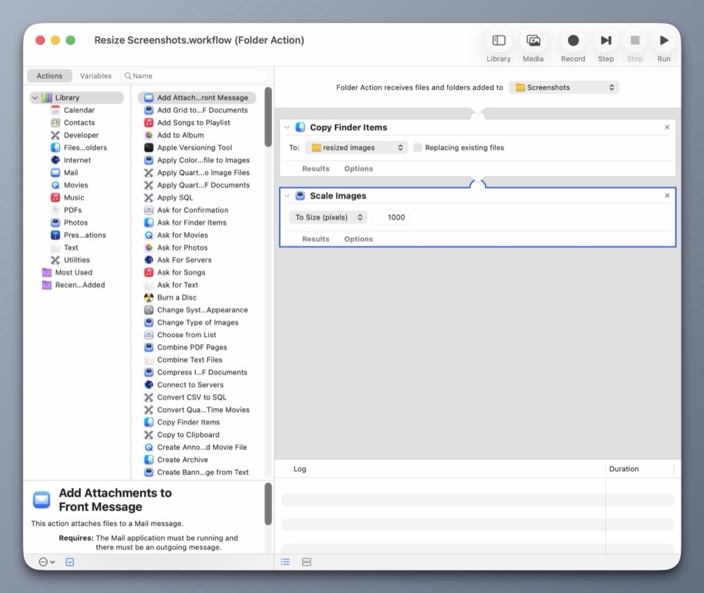
Automator includes Folder Actions, a handy construct for automating actions on files within specific folders. In this case, it’s my Screenshots folder.
Here’s how it works:
My Folder Action automation will copy any new files from the Screenshots folder and place them into the resized images folder. It will then scale the copied images down to 1000px wide, leaving the originals intact.
Each time I take a new screenshot (like the ones for this post) they are automatically saved into my Screenshots folder. Automator detects the new images in this folder and automatically scales them down. It’s a big time saver. Best of all, I did it all using the provided automation tools within macOS.
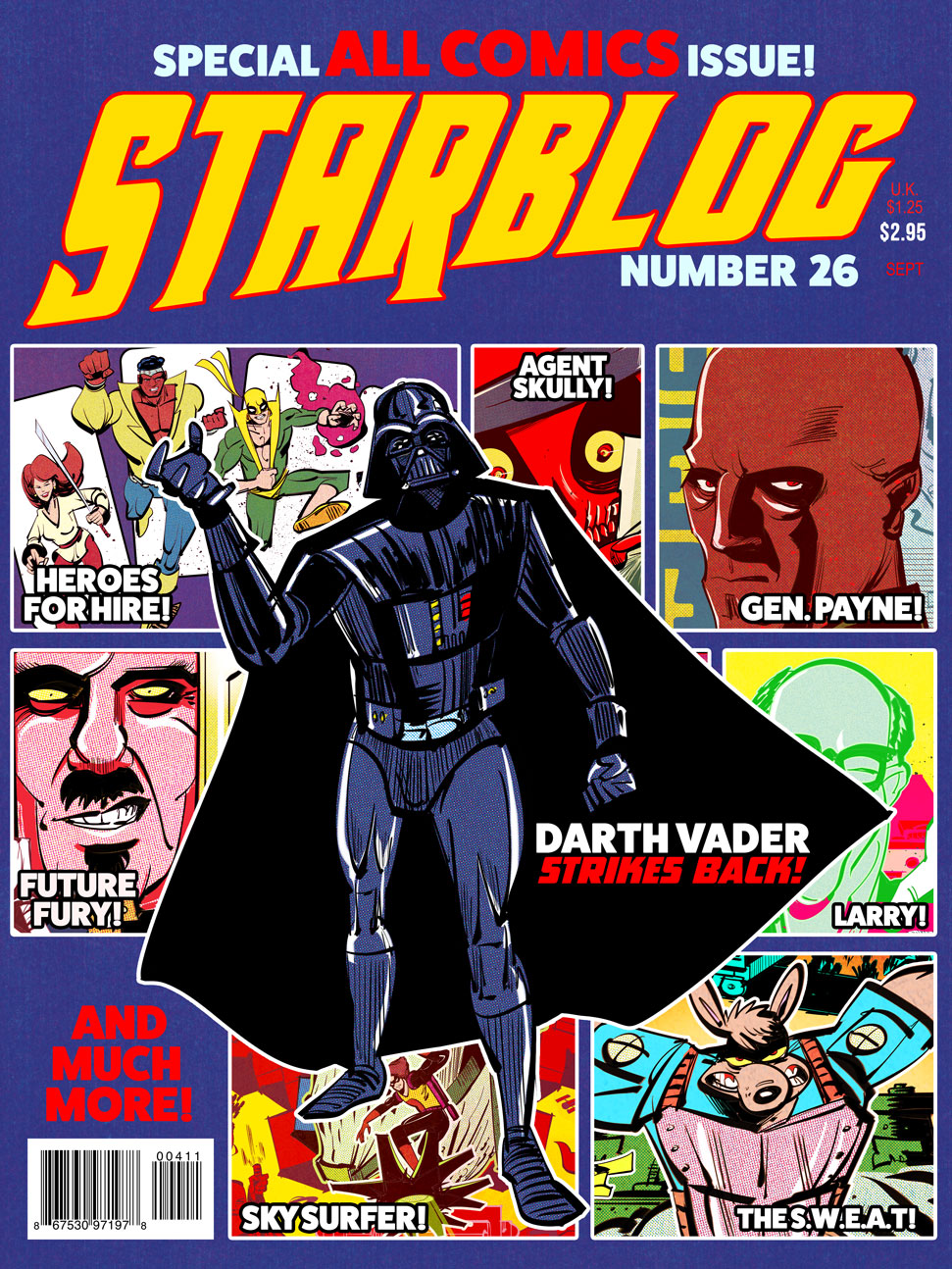
My newest instructional video focuses on using Illustrator’s Shape Builder tool (Shift M), coupled with Effect > 3D and Materials > Extrude and Bevel and Effect > Distort and Transform > Transform tools to create interesting head gear (among other things).
I used this technique to create the following illustrations below.
The number one mistake I see artists make is not accepting that they run a business. If you cannot accept and even embrace this simple fact, you are totally hosed. It is hard to start a business; it is way harder to do it by accident.
The author makes so many notable points on the realities that come with working as a full-time artist. As someone who freelances part-time, it’s not just about creating, it’s also about managing a business as an ongoing concern. As a creative freelancer, one must embrace marketing, promotion, and accounting.
There is so much wisdom in this essay, particularly on finding one’s style, and the image-market fit that keeps many artists from achieving success.
If you enjoy making art, ask yourself why that is not enough? Why do you need to make money from this activity? Why do you need to do it with more of your time? Can it not perhaps give you more joy remaining a hobby?
I used to struggle between making work that I like and having to make work to please others. But with each passing year, I’m coming closer to the conclusion that maybe what I create for myself is all I need.
In terms of learning new skills, we live in a glorious time. The Internet is chock full of excellent, actionable design tutorials that go way beyond what a classroom environment or textbook could provide.
Incidentally, much of what I know about Photoshop comes from reading books and applying the techniques into my own work. (Aside: Scott Kelby’s “Photoshop Down and Dirty Tricks” and Matt Kloskowski’s “Layers” books are two excellent resources for hands-on learning.) This was in the days before YouTube, so options were limited.
While I’m very comfortable with many aspects of Photoshop, I’m using this summer to really shore up my Adobe Illustrator skills. I have a good working foundation of vectors, anchor points and the like, but I want to go beyond OK and become highly proficient.
Enter social media.
I use my Instagram’s algorithm to surface tutorials on Illustrator. The more tutorials I like, the more Instagram learns what I’m interested in. The Instagram format provides me a space where I can be exposed to a wide gamut of Illustrator techniques. Some of the more helpful instructional reels show two contrasting approaches, amateur and pro. Seeing side-by-side comparisons in this way, allows me to build on what I know and improve my skill. My only critique is that some of these videos are a bit too fast; I have to watch a video multiple times in order to absorb the technique.
When I watch a particularly useful video, especially one that includes accompanying keyboard shortcuts, I’ll take a screenshot of it on my iPhone and send it over to Apple Notes. I’ll then organize my screenshots into one Apple Notes file, for quick access. Because Apple Notes synchs across all my Apple devices, I have a collection of foundational tutorials that I can easily refer to when I’m at my Mac.
Viewing and capturing tutorials is only part of the learning equation. Practicing them on a new personal project helps reinforce what I have just learned. I also take the new skills I’ve learned and teach it on my YouTube channel. (The old adage rings especially true: “The more I teach, the more I learn.”)
Make no mistake, Illustrator has a steep learning curve. Go into learning with an open mind. I recommend going to YouTube to learn the basics. From there, I recommend watching one or two Instagram tutorials a week, to get slowly exposed to new workflow techniques. Don’t overwhelm yourself.
Practice what you’ve learned and find ways to inject that knowledge into a few of your own personal works, to build that muscle memory. Scaffolding what you know with what you are learning gives room for absorption and a sense of accomplishment; two traits that are vital to learning.
Lately, I’m experimenting with the idea of incorporating vector elements within my raster-based digital art. I’ve been a serious Photoshop user for over 20 years; it’s a tool I’m very comfortable with.
While I’ve used Adobe Illustrator before, I’ve always kept my vector work separate from my raster art. My latest instructional video goes over two techniques in Illustrator that I use to manipulate vector shapes. Once I’m happy with the result, I can bring the vector work into Photoshop as a Smart Object for further alteration.
I plan to make a few more videos on this subject, and look forward to sharing my discoveries.
This month marks my 20th consecutive year of teaching design courses at the college level. I only started to reflect on my academic journey a few days ago, with the completion of our college’s Spring semester.
I fell into teaching backwards. It was never my goal. I started my career as an electrical engineer, working in the field of chip design. And even that was never my true ambition.
From a young age, my biggest dream was to be an artist. My second love was computers. On paper, these two items seemed worlds apart. But over the years, technology and art have become very much intertwined. For me, digital media represents a perfect combination of technology and design; I get to play with computers and make art.
Learning new things is fun, sharing what I’ve learned with others brings about true satisfaction. While I never took any formal courses in teaching, I had a good idea of how I wanted to position myself as an educator.
Here are a few tenets that have served me well:
1) Be organized. Have a structure to each class. For each meeting, I have a clear, written agenda that I follow. Lesson plans are created in advance. Organization and competency go hand in hand.
2) Be timely. Arrive and set up before class starts. I’m usually in the classroom at least 30 minutes before class starts. I check the classroom tech, have handouts at the ready and greet each student as they arrive. In my view, there’s nothing worse than entering a class full of waiting students.
3) Be impartial. This one’s tough, but I make it a point to let students know that I can’t bend the rules for them. Life happens, and I do have to make exceptions, but I insist on having the students provide me with written documentation should there be any mitigating issues that come up.
4) Be available. I keep office hours on campus but I’m also available to my students via e-mail. Students often write with questions, and I make it a point to be timely with my responses. I also have set boundaries, when I don’t check my email. This gives me a healthy balance between work and home life.
5) Be flexible. The best laid plans sometimes go out the window, whether it’s a classroom technology issue, a problem during a demo, or school closure during a hurricane event. I’ve learned the importance of how to pivot and adjust.
6) Be authentic. I’m human. I make mistakes. Sometimes I’ll get tripped up during a demo. It’s OK. Nobody’s perfect. I think it’s important for students to know that their teachers can make mistakes. But what’s even more important is how the teacher can carefully think through the issue and get back on track.
These are just a few of the things I’ve learned in my 20 years of teaching. It’s been a struggle at times, but also been immensely satisfying. I’m glad I fell into teaching.
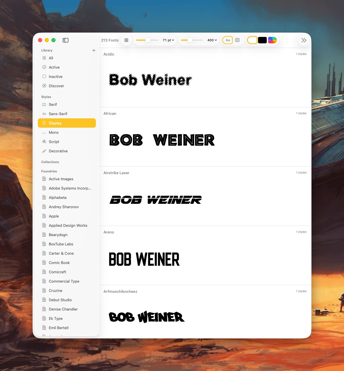
Pica is a new font manager for macOS. With it, you can easily view, categorize, and preview your Mac’s collection of typefaces. I’ve spent a day playing with it and wanted to share my first impressions.
First, Pica is fast!
It takes full advantage of all the benefits that come with being natively written for the Mac. (This isn’t some janky Electron app.) Even the installation process is filled with whimsy and delight. Notice the beautiful attention to detail in the Installer below.
After installing Pica, you’ll be treated to series of falling typefaces that fill up your Mac’s screen. Unexpected, but delightful!
Pica lets me organize my typefaces the way I want; I can group typefaces into Serif, Sans-Serif, Display, Mono, Script or Decorative categories.
Pica offers several thoughtful customization options for viewing fonts. For example, I can view a typeface in black, white, or as any other HEX color value. This is great for designers!
I can also quickly change the background color of the app to see how it works with the typeface. With Pica, I can see what a green typeface looks like placed in front of a yellow background. (It’s not so great, as it turns out.)
Pica offers full OpenType support, one-click font activation and something called Watch Folders.
Here’s how it works: Select a folder for Pica to “watch”, and each time the folder gets a new font update, Pica will display it. Translation:Pica lets me view typefaces that are not actively loaded onto my Mac.
Why use Pica when macOS already comes with Font Book?
In a word: customizability. Pica not only lets me preview custom text across every typeface I have on my Mac, it lets me quickly adjust font size and font weight independently via two top-located sliders. Typefaces can be viewed as a grid or stacked vertically.
Font Book, by comparison, is pretty basic.
Pica extends beyond the fonts you have locally on your Mac. Click the “Discover” option and you’ll be treated to bold and unique typefaces created by some of the world’s best font foundries.
Pica is a native Mac application, which means it takes full advantage of macOS’s underlying architecture. Best of all, it’s free.
If you spend considerable time working with fonts on your Mac, Pica’s a no-brainer download.
Let’s talk about macOS File Sharing, an option I use almost daily. On macOS, File Sharing lives under:
System Settings → General → Sharing → File Sharing
That method works fine if you only need to toggle it occasionally. But I need File Sharing ON when I bring my laptop home, and OFF when I’m about to take it with me when I leave for work. Visiting the System Settings each time to toggle File Sharing was getting tiresome.
So I decided to do something about it.
Below is a custom Alfred Workflow I made called File Sharing Toggle that I’ve tested on both Macs at home.
My Alfred Workflow has three options:
Turn File Sharing ON
Turn File Sharing OFF
Check File Sharing Status
The ON/OFF actions toggle File Sharing appropriately and displays a dialog box showing the current File Sharing state. A separate Status action displays a dialog box showing the result of a query on the current File Sharing state.
My workflow uses macOS shell commands and will ask for your administrator password when turning File Sharing on or off. (It’s a small price to pay for the convenience.)
Step 1: Create a New Alfred Workflow
Open:
Alfred Preferences → Workflows
Click the + button and choose:
Blank Workflow
Name it something like:
Toggle File Sharing
Step 2: Add a Keyword Trigger
Right-click in the workflow canvas and choose:
Inputs → Keyword
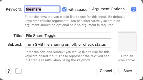
Use these settings:
Keyword: fileshare
Title: File Sharing Toggle
Subtext: Turn SMB File Sharing on, off, or check status
Argument: Argument Optional
Screenshot
Click Save.
Step 3: Add a List Filter
Right-click the canvas and choose:
Inputs → List Filter
Connect the Keyword object to the List Filter.
Set the Keyword to fileshare and Argument Required. Then add these three list items.
Item 1
Title: Turn File Sharing ON
Arg: on
Item 2
Title: Turn File Sharing OFF
Arg: off
Item 3
Title: Check File Sharing Status
Arg: status
Screenshot
Click Save.
Step 4: Add a Run Script Action
Right-click the canvas and choose:
Actions → Run Script
Connect the List Filter to the Run Script action.
Use these settings:
Language: /bin/zsh
with input as: argv
Paste this script:
#!/bin/zsh

ACTION="$1"
MESSAGE=""

case "$ACTION" in
  on)
    osascript -e 'do shell script "launchctl enable system/com.apple.smbd; launchctl bootstrap system /System/Library/LaunchDaemons/com.apple.smbd.plist 2>/dev/null" with administrator privileges'
    MESSAGE="File Sharing turned ON"
    osascript -e "display notification \"$MESSAGE\" with title \"File Sharing\""
    ;;

  off)
    osascript -e 'do shell script "launchctl disable system/com.apple.smbd; launchctl bootout system /System/Library/LaunchDaemons/com.apple.smbd.plist 2>/dev/null" with administrator privileges'
    MESSAGE="File Sharing turned OFF"
    osascript -e "display notification \"$MESSAGE\" with title \"File Sharing\""
    ;;

  status)
    if /usr/bin/pgrep smbd >/dev/null 2>&1; then
      MESSAGE="File Sharing is ON"
    else
      MESSAGE="File Sharing is OFF"
    fi
    osascript -e "display dialog \"$MESSAGE\" buttons {\"OK\"} default button \"OK\" with title \"File Sharing\""
    ;;

  *)
    MESSAGE="Unknown action: $ACTION"
    osascript -e "display dialog \"$MESSAGE\" buttons {\"OK\"} default button \"OK\" with title \"File Sharing\""
    ;;
esac

echo "$MESSAGE"
Click Save.
Your final Alfred Workflow Object Chain should look like this:
Step 5: Test the Workflow
Bring up Alfred and type:
fileshare
You should see three options:
Turn File Sharing ON
Turn File Sharing OFF
Check File Sharing Status
Select Turn File Sharing ON. macOS will prompt for your administrator password, and you should see a notification:
File Sharing turned ON
Select Turn File Sharing OFF to disable it, and choose Check File Sharing Status to see a dialog with the current state.
Status Dialogs
Switching File Sharing states (ON/OFF) will show a dialog indicating the updated state. Checking File Sharing status will show the current File Sharing state.
How the Script Works
The workflow interacts with the macOS SMB service:
com.apple.smbd
To enable File Sharing:
launchctl enable system/com.apple.smbd
launchctl bootstrap system /System/Library/LaunchDaemons/com.apple.smbd.plist
To disable it:
launchctl disable system/com.apple.smbd
launchctl bootout system /System/Library/LaunchDaemons/com.apple.smbd.plist
Status is determined by checking if the SMB daemon is running:
/usr/bin/pgrep smbd
Final Result
Toggle file sharing on with a simple Alfred command.
Now you can type fileshare on in Alfred to quickly toggle File Sharing ON. Similarly fileshare off turns File Sharing OFF. And fileshare status will check its current state— no need to root around inside System Settings.
(I did use AI to help me in writing the shell script.)
My launcher of choice is Alfred, which I use for a variety of tasks: launching apps, file navigation, running terminal commands,searching the web, etc. As a power user, it’s efficient (and, dare I say, liberating) to perform these operations entirely from the keyboard.
Alfred’s power comes in the form of its extensibility, thanks to the (optional) Alfred Powerpack. Think of the Powerpack as a turbo-charger that integrates seamlessly with Alfred’s main engine. I’ve used Alfred for almost a decade; I can’t imagine sitting at a Mac that doesn’t have it.
So if Alfred’s the cat’s meow, why use Raycast?
Simply put: window management.
Raycast includes several useful window management configurations; each can be assigned a customized hotkey.
Why not switch from Alfred to Raycast then? Raycast lacks the ability to traverse my Finder files in the same way that Alfred does.
For visualization purposes, I’ve mapped my custom window management hotkeys to a numeric keypad (see below). They also work fine when used with a standard keyboard.
In my Raycast configuration, pressing Option-1 moves the active window to take up the left half of my Mac’s display. Option-3 moves the active window to the right half. I use these two hotkeys the most, so they are configured for easy reach. (I use keyboards with built-in numeric keypads.)
In my view, hotkey assignments are only useful if they’re memorable. The quadrant hotkeys are easy to remember because they are spatially correlated. On a numeric keypad, 4 is in the lower left, 7 is on the upper left, 6 is on the lower right, and 9 is on the upper right.
I use multiple displays with my MacBook Pro, both at home and at work. To move an active window to the screen on my left, I press Option-2. Pressing this keystroke successively will cycle the window counterclockwise across each of my three displays. Likewise, pressing Option-8 will move an active window to the screen on my right. Option-5 (not shown above) puts the active window in the center.
I’ve gotten so accustomed to using my keyboard to move windows around my Mac that manually selecting and sizing an active window with my mouse feels downright barbaric.
Alfred is free. The Alfred Powerpack is a paid upgrade (well worth it, in my opinion.) Raycast has free and pro versions, but the free version meets my needs.
If you find yourself needing more than what Spotlight gives, you have options.