The Importance of Context and Composition in Design Portfolios
Presenting design work shouldn’t be boring, and yet I see it all the time when I am reviewing portfolios. Yes, it’s about the work. But investing a little time in design can give your work an added context and really stand out. A portfolio page is essentially a composition, whether it’s a stand alone piece or a few images showing process work. For me, *how* a design is presented is just as important as *what* is being presented. Design elements, when used effectively, can really add value and polish to what you are showing.
I like to treat each page of my portfolio like a composition.
A good composition has three things:
- a focal point
- a balance between negative and positive space
- visual interest and appeal through color, type and layout
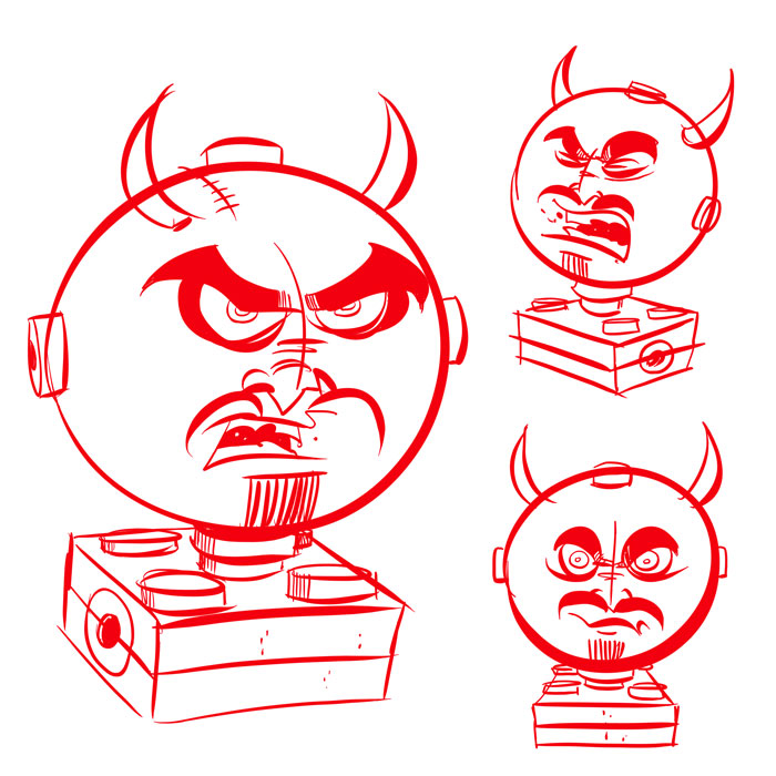
Take the image below. Visually, it communicates the information of three character sketches, but it’s nothing exciting. It lacks context.
I took the same set of images and created a focal point, by putting the largest image on top of a yellow background. The subtle drop shadow effect is used to make the yellow background look like a sticky note resting on a surface. Next, I used a gradient effect on the purple background to reinforce the focal point by making the center of the image lighter than the edges. Adding a purple color effect to the smaller images makes the larger image stand out even more (contrast). Add a title and a subtle screen texture, and BAM! – the same set of drawings have a completely different look now. Now the drawings have some context – that is, there is a relationship formed between all three images.
If your portfolio isn’t getting much notice, you may have to think about how you are presenting your work. Remember: the work needs to be strong first and foremost. Type, color scheme, layout are all important components of a design portfolio that shouldn’t be overlooked.
-Krishna


No comments yet. Be the first!