Creating a Flexible Comic Strip Panel Layout using Adobe Photoshop
If you make a comic strip on a regular basis, chances are strong that you have a standard panel template file that you use for all your strips. (And if you don’t, you should!)
On PC Weenies I have been using the same four panel layout for the past 4 years, with minor tweaks here and there.
Lately, I’ve re-examined my template file. While it works, it’s fairly rigid. There are occasions where I’d like to have a three panel strip, or maybe even a single panel comic (like the old days), but to create those formats, I’d have to make 4 separate templates (one for each format).
Instead of keeping four separate template comic strip files, now I use only one. This new comic strip template file lets me easily switch between a myriad of panel layouts.
In this blog post, I’ll show you how I’ve set my comic strip template and talk about some specifics on prepping your file:
Size Matters
If you’re making a comic online, you’ll want to consider print. Yes, you may never make a book with your comic – but you might – and it’s always a good idea to plan ahead.
Always work at the largest size possible. The dimensions for my Photoshop file are 7.5 inches wide and 2.5 inches tall, with a resolution of 600ppi. I work in RGB space.
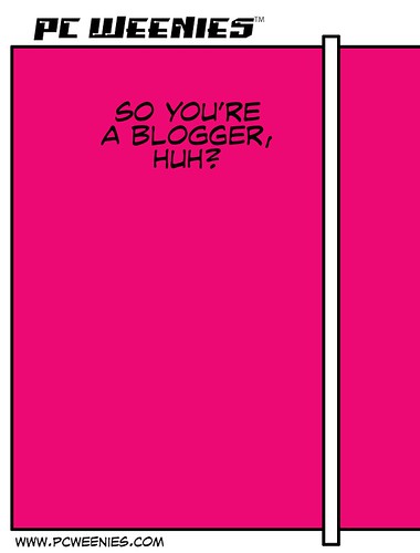
Using guides, I measure off a square (shown in maroon, below), keeping in mind margins for all four sides. Next, I apply a 10 pixel inner stroke (via Edit > Stoke) around the maroon box. In my template file, I make sure to include the title, my website address and my name.
Creating the Panel Borders
Next comes the “gutters” – the separators that make and isolate each panel within the strip. On a new layer, above the maroon panel, I use the rectangular selection tool (keyboard shortcut: M) to make a thin, vertical rectangle. Once I’m satisfied with its thickness, I flood white inside the rectangle (Option-Delete) add an inner 10 pixel stroke around this rectangle. (Inner strokes give you crisp, pointy edges.)
Above the “gutter” layer that I just created, I make two more rectangular selections, to cap off the borders that extend beyond the panel. I flood these selections with white, the results which you see below:
Make sure to label this “gutter” as Gutter1 or something along those lines. From here, all you have to do is duplicate the gutter layer (Command-J, with the gutter layer selected) and position it as desired. Here’s what my layer structure looks like, if you’re curious:

In addition to 4-panel layouts, I can now quickly reconfigure my comic strip to three, two and one panel formats quickly and easily.
 Save the file out and you’re in business!
Where to go from here?
Feel free to download my comic strip template and tweak it for your own use. If you use it, a link back to pcweenies.com would be sweet.
And there you have it!
-Krishna


The Code Crimson
October 12, 2012 at 12:40 amThat’s some great advice. We tend to vary our page layouts quite a lot, but we still use templates to keep in mind page borders for bleeds and the like for when we print each issue. I’m definitely going to start setting this up as a photoshop action. Thanks for sharing!
Krishna
October 12, 2012 at 7:52 amThanks, Code Crimson! This technique, I imagine, would work just as well for page style comics too.
Auroura
October 13, 2014 at 4:28 amHi, I found this really useful , but what photoshop did you use? I mainly use Adobe Photoshop Elements 9 for all my photoshopping needs, but it would be great to find out what you used
Krishna
October 13, 2014 at 6:17 amhi Auroura: I’m using the regular edition of Photoshop (of which CC would be the latest version).
Auroura
October 14, 2014 at 1:22 amOkay, thanks!