
PC WEENIES
Tech Musings and Comics.

A webcomic and blog about technology, digital life, creative frustration, and the weird humor of living with machines.
Latest posts:
-
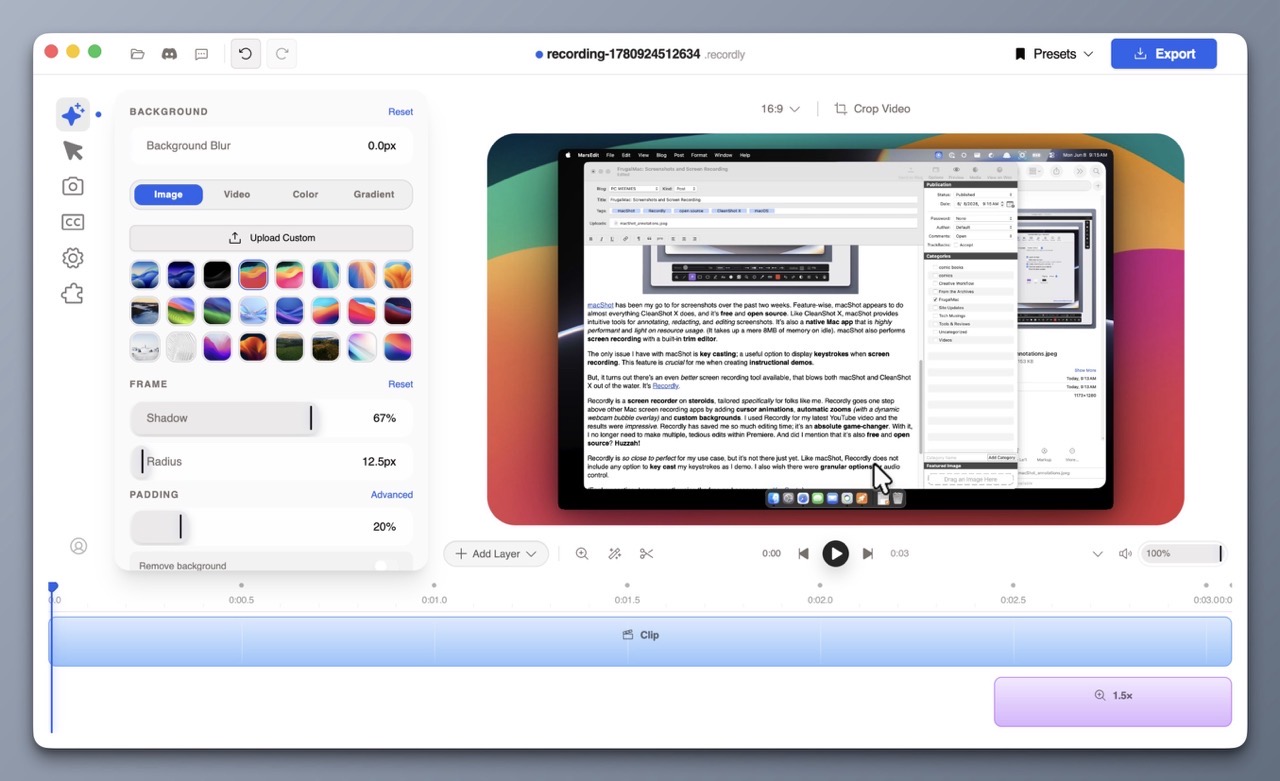
FrugalMac: Screenshots and Screen Recording
One of my main goals with setting up a new Mac is to be more intentional with my software selections. I want to choose the best software that suits my needs. This involves reevaluating what I currently use to see if my selections are still valid. Although what I have currently works – I’m always…
-
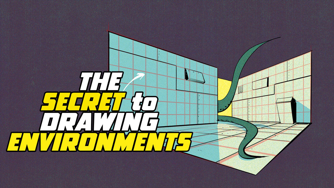
Video: The Secret to Drawing Environments Part 1
Perspective drawing can be difficult, but if you have digital tools, you have easier options. My latest instructional video focuses on the power of grids, and how they can be used to create interior or exterior structures. I look at techniques to make grids quickly and also how to use Photoshop’s Vanishing Point tool. -Krishna
-

Cable Confusion, Mac Specs, and Two Handy Tools for Smarter Buying
I wanted to share two fantastic resources that I came across recently that will be helpful for Mac users. First up is Glenn Fleishman’s Apple Specs Database which lets you search technical specifications by model — iPhone, iPad, Mac, Apple Watch, and more. But the really interesting feature that I haven’t seen elsewhere is search…