Rage Against the Icon
Chapter: Random
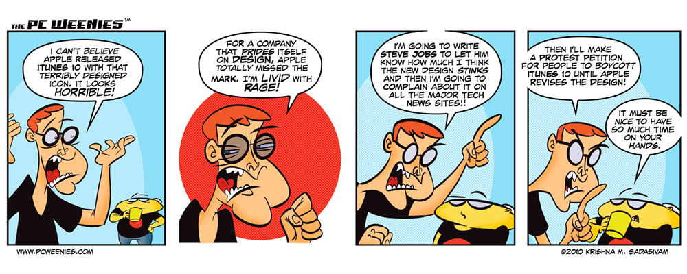
When iTunes 10 was announced last week, there was a figurative surge of hatred towards the new app’s new icon. One individual went so far as to write Steve Jobs himself to voice his displeasure.
Blog posts were made, new “enhanced” designs were quickly drafted, much to the chagrin of a now sentient iTunes10 icon, who’s voicing its own rebuttal on Twitter.
Me?
I think the whole thing’s blown out of proportion. Hate the icon? No problem – you can change it to whatever you like.
-Krishna
Inks and colors will happen added. Today’s bonus PCW strip is just one way of thanking you, dear reader, for your overwhelming support in making it possible for me to attend two eagerly anticipated indie comic shows. Thank you!


Adam
September 4, 2010 at 9:12 pmI’m not really that bothered by the Icon. Maybe YOU could channel your artistic skills and make a new one? Then sell it to Apple and they’ll give you a cut for each time iTunes is downloaded. That’s how graphic design works…right?
Krishna
September 4, 2010 at 11:50 pmwhile I myself am not crazy about the icon, I don’t see what the whole furor is over certain folks who are obsessed about such things. Why complain when it’s something very easy to replace?
Adam
September 5, 2010 at 11:23 amOut of all the issues with iTunes this is the simplest to fix. Maybe this is Apple’s way to divert attention from their “exciting” new feature that finally brings together the two biggest forces of the 21st century: Social Networking, and Apple advertisement.
Philip
February 6, 2023 at 9:12 amNo it isn’t unfortunately. Apple uses inhouse design teams.
Kevin Rubin
September 6, 2010 at 2:20 pmI noticed the new icon when I tried to figure out what program was running… It took a few minutes. I don’t like it, but I’m sure I’ll get used to it and it’ll end up simply being the symbol that iTunes is running.
It’s just an icon…
Steve
September 6, 2010 at 3:25 pmI noticed the icon, said yuck, and replaced it with the iTunes 9 icon, it’s not that big of an issue, the thing that bothers me more about iTunes 10 is the minimize/maximize/close buttons, what’s up with that?
Calmplex
September 9, 2010 at 7:19 pmIt is pretty bad though isnt it LOL!!! It looks like it should be on a fisher price toy! oh well id rather see them change there Search functions first! Hey man i love how intense your expressions on your characters WOW!!!!