One Man’s Struggle
Chapter: Random
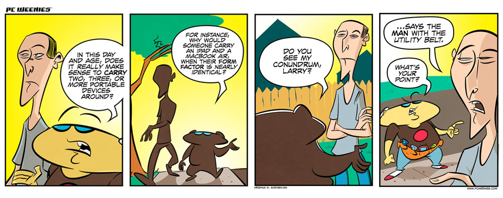
I’m testing out a new layout for the comic. The new format will give me more “breathing” room between the characters and dialogue.
What do you think?
Update: The New Readers page has been revised to include a summary of the epic Maude Weiner storyline, which started here.


Chris
July 12, 2012 at 3:15 pmThe ‘latest’ one is much better than the gigantic one posted earlier.
Krishna
July 12, 2012 at 3:27 pmThanks, Chris. Feedback much appreciated.
Logan
July 13, 2012 at 3:21 amI very much enjoyed the different layouts. The last one is tempting, as you have more space for text and action. Just keep on experimenting.
Caveat: If you continue to publish books, you have a problem. Too many high rows decrease the amount per page and increases page count and printing cost. Reducing in size leads to more margin right and left, so everyone sees, you reduced the big picture(s).
How about a healthy mix of high and normal cartoons – except those great stories, you hopefully continue to present us – so you still have at least three cartoons per published page.
We Germans have a word for that: Zukunftsmusik (future music). It describes thinking about something that is still far away, like starships or a new published book. Well, I don’t know about starships. See here: http://www.buildtheenterprise.org.
Thomas
Krishna
July 13, 2012 at 9:58 pmGreat observations, Thomas. The slightly taller format I have up above seems to lend itself better to fitting more text in. Now that the Maude storyline has wrapped up, I’ll be aggressively working towards completing PC Weenies Book 2. I’ll have to find creative ways of making the different layouts work together.