Falling Flat
Chapter: Random
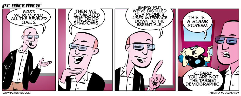
I’m not really a fan of the flat icon movement, exemplified by iOS7. It represents change for change’s sake, IMHO. But, it’s also my understanding that the design isn’t finalized…
What are your thoughts on the new ‘flat’ design movement in user interfaces? Sound off in the comments below!
-Krishna


Jake Eskel
June 14, 2013 at 8:17 amYes, but you also have good eyesight. A flat icon is easier to see, less difficult to focus on. When I am exhausted, I can hardly tell the difference between two ‘shiny’ icons,but flat icons, sure. But they should have settings… like skins!
Krishna M. Sadasivam
June 16, 2013 at 6:39 pmactually, my eyesight isn’t so good (I wear glasses) – and IMHO, the text under the icons in iOS7 are more difficult to discern (thin type coupled with lack of contrast against the background). The latter can be fixed by changing the background, but I’m not so sure about the former…
Jake Eskel
June 17, 2013 at 9:36 amThen I retract my presumption, I was obviously mistaken (although I have had people tell me the drop-shadows were confusing to them at 2 AM)