The Mentor Experiment: Week 4: Kyndra’s Critique

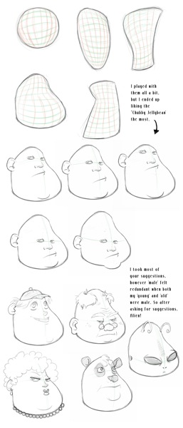
Today we’ll look at Kyndra’s submission for the week. She did a really nice job with this exercise, starting off with exploring volumetric forms on the top.
Next, she varied the eye-line height, keeping the male character’s features the same. I really like the variety in her head designs – particularly when constrained
to using the same shape.

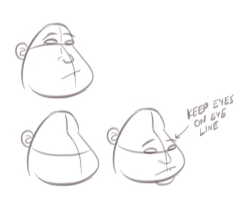
The one bit of advice I’d suggest is to keep the character’s eyes resting on the eyeline. In a few of her drawings (4th row), we can see the foreshortened eye a little lower than the eye that’s closest to us. All in all, Kyndra did a great job!
How did you do?
-Krishna


Barry Buchanan
February 2, 2012 at 1:25 amGreat job Kyndra. I’m a little jealous of your talent. I hope to see some of your work online sometime soon. Is there a webcomic in your future? Great work again. Must go draw now. ;)
Kyndra Osterholt
February 2, 2012 at 3:25 amThanks, Barry! You’re improving a lot in just a few exercises; there’s nothing to be jealous over. We’re both here to improve!
I have projects in mind! I’m just shy. It’s impressive you and Krishna can be so dedicated for these comics. @~@ Do all the arts!