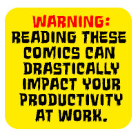
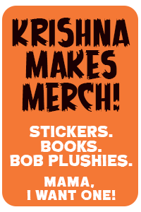
My new business cards for 2010
It was time for me to design a new batch of business cards. This time I opted to go with the double-sided design shown below. What do you think?
As a rule of thumb, I only print 100 cards at a time. This allows me to change my card every few months.
Here’s how the last few looked:
2007:
2008:
and 2009:
One of the more popular requests I receive as a freelance artist is business card design. Are you looking for a new business card design that gets your products or services noticed but don’t want to break the bank budget-wise? If you answered yes, I may be the designer you are looking for.
-Krishna


timelawd
March 19, 2010 at 10:17 pmunreadable. focus.
too many capital letters. (e-mail, web)
drawings on white background ?
go soberly …
krishna
March 20, 2010 at 5:51 amI added a stroke around the text for Grampa’s side of the card to specifically counter any issues with readability. I think there is enough contrast to read the info – especially at standard business card size. But thanks for the feedback, tl.
Charles
March 19, 2010 at 10:58 pmThese are cool Krishna…I’m definitely a fan. What company are you using to print these out with?
krishna
March 20, 2010 at 5:52 amI’m going with overnightprints.com – they’ve done me right before. Gonna use ’em again :)
Darryl
March 19, 2010 at 11:11 pmI design business card where I work and the main thing a business card should have is your name, what you do and where to reach you. you score on all three. The only change I would make is to drop words email and web redundant these days and left justify one address and right justify the other allowing you to make them larger. I think the graphics and use of color are great.
krishna
March 20, 2010 at 5:52 amthanks, Darryl! Good points.
qka
March 19, 2010 at 11:47 pmThis may or may not be an issue in your line of work, but there is something to be said for a plain white backside where your prospective customers can take notes about you, your rates, services, etc.
krishna
March 20, 2010 at 5:47 amthanks, qka – I’m only making a batch of 100 of these (as I always do). Most of the time I stick with a single sided card – I opted for a double-sided card just to change things up.
Chris
March 24, 2010 at 12:49 amAre they sporting the same info on both sides?
I dig them, and I agree with @Darryl, I think his comments about the web and email and realignment are spot on.
I sorta like the rounded corners in the 2007 version though. Are you doing square cut corners this time around?
Krishna
March 24, 2010 at 5:32 amyep, same info on both sides. I’m going with square cut this time, too. My cards should arrive this week. Can’t wait to see how they turned out!