The Double Whammy
Chapter: The Story
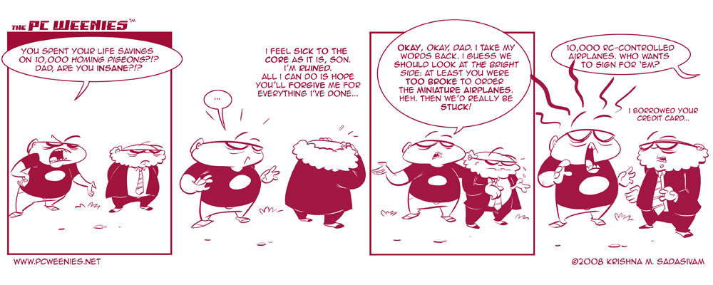
Eliminating the coloring process really speeds up my cartooning workflow. All in all, I’m pretty happy with the way this comic looks. I even decided to tweak the word balloons to make ’em more oval. What do you think?
Don’t forget to come back on Sunday for another bonus PCW toon.
-Krishna


John Doe
April 5, 2008 at 3:30 amNice one!
I only wish you’d continue with the adventures of Bob and Augustus for a few more weeks!
But we all know you aren’t going to, are you? :-(
krishna
April 5, 2008 at 3:54 amnever say never, John….
C
April 5, 2008 at 7:14 amhave you considered B&W during the week and maybe a ‘special’ color comic on sunday like many others do? maybe even a single-panel…
something felt different, glad you mentioned it, i had become used to the rectangular word balloons as the PCW style, although either works.
Great job as always!
Jason Reed
April 5, 2008 at 11:31 amHey Krishna,
Even though it wasn’t in color it looked good. At first I thought I needed to adjust my monitor because it looked red instead of the standard black and white.
I think it looks good and I agree with C maybe you should look into doing b&w during the week and then maybe once a week do a color.
krishna
April 5, 2008 at 5:40 pmThanks, Jason. :)
MacTen
April 8, 2008 at 2:06 pmThe colour is good for comics. Reminds me of Belgian comics from the 50s which had alternating printed pages in sort of this colour and a blueish CMYK 73 3 13 16 .
Nice!
Adam
January 29, 2009 at 5:35 amErr..he got 100,000 pigeons in the previous strip. What happened to the other 90,000?