Files&Folders Pro: First Impressions
As long-time Windows users know, File Explorer has only evolved gradually with each major version of Windows. The basic concept of displaying files/tiles, thumbnnails, etc. in a window with menus and tools across the top and a file navigator on the left has been around since Windows 95 (I suppose you could make the case that the “file manager” of Windows 3.0 was the first iteration of this approach, too). A lot of stuff has been added or adjusted, but the basic layout, minus the various stylistic changes–from blocky, to glassy to ultra-flat–has stayed pretty much the same.
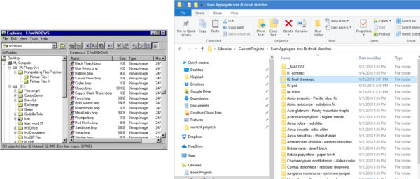
While the Windows 10 version of Explorer looks decades removed from the chunky old 95 version, a close inspection reveals that change has only been evolutionary, not revolutionary.
Before I write further, the old adage “If it ain’t broke, don’t fix it,” comes to mind. After all, some designs are just the best of all possible solutions. You don’t see many three-wheeled cars on the road, for instance. But I guess I’m not entirely convinced that the current explorer design wouldn’t benefit from a well-thought-out overhaul. One of the things I commented on in my recent post about Windows 10 is how certain elements of the GUI seem to be at odds with one another. Although the flat, clean look of the current File Explorer looks decent enough, it lacks the sophisticated look of the “modern” elements of the GUI. But I don’t think a major redesign will be in the works anytime soon. Other than hinting that they may be adding tabs (which would be cool) and rolling out a dark version of Explorer, previews of the next build of Windows show pretty much the same old thing.
If you want a glimpse of the possible future of Windows Explorer now, there are third-party apps available in the Microsoft Store that may just satisfy that desire for something more contemporary. One of the highest rated apps, in reviews I sampled, is Files&Folders Pro, by Finebits.
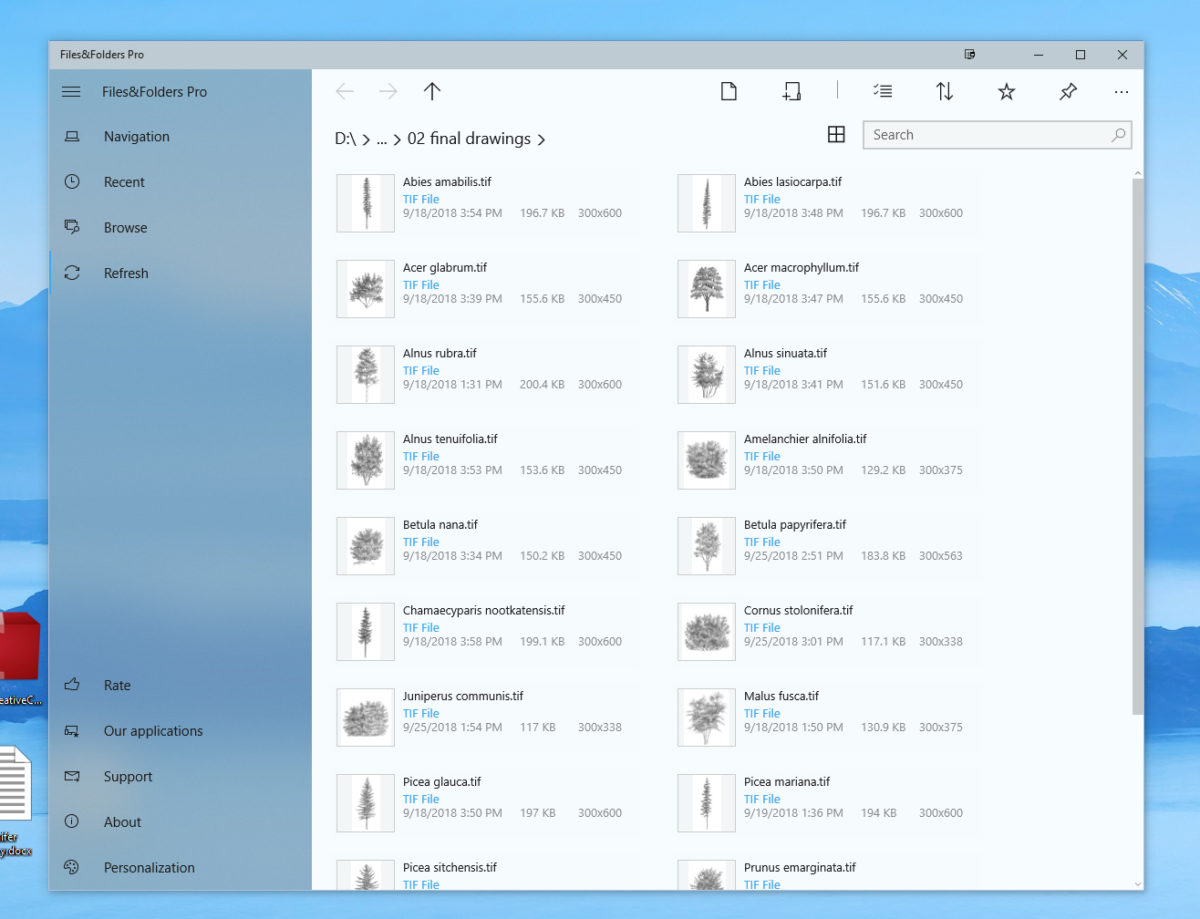
After plunking down all of $1.99 (it was on sale- normal price is $9.99), the app was installed directly through the store and I was rarin’ to go. At first glance, it certainly looks like a good match to the modern design elements in Windows 10. This newest version mimics some of Microsoft’s “fluent design,” evidenced in the above view by the “acrylic” effect on the left side-bar.
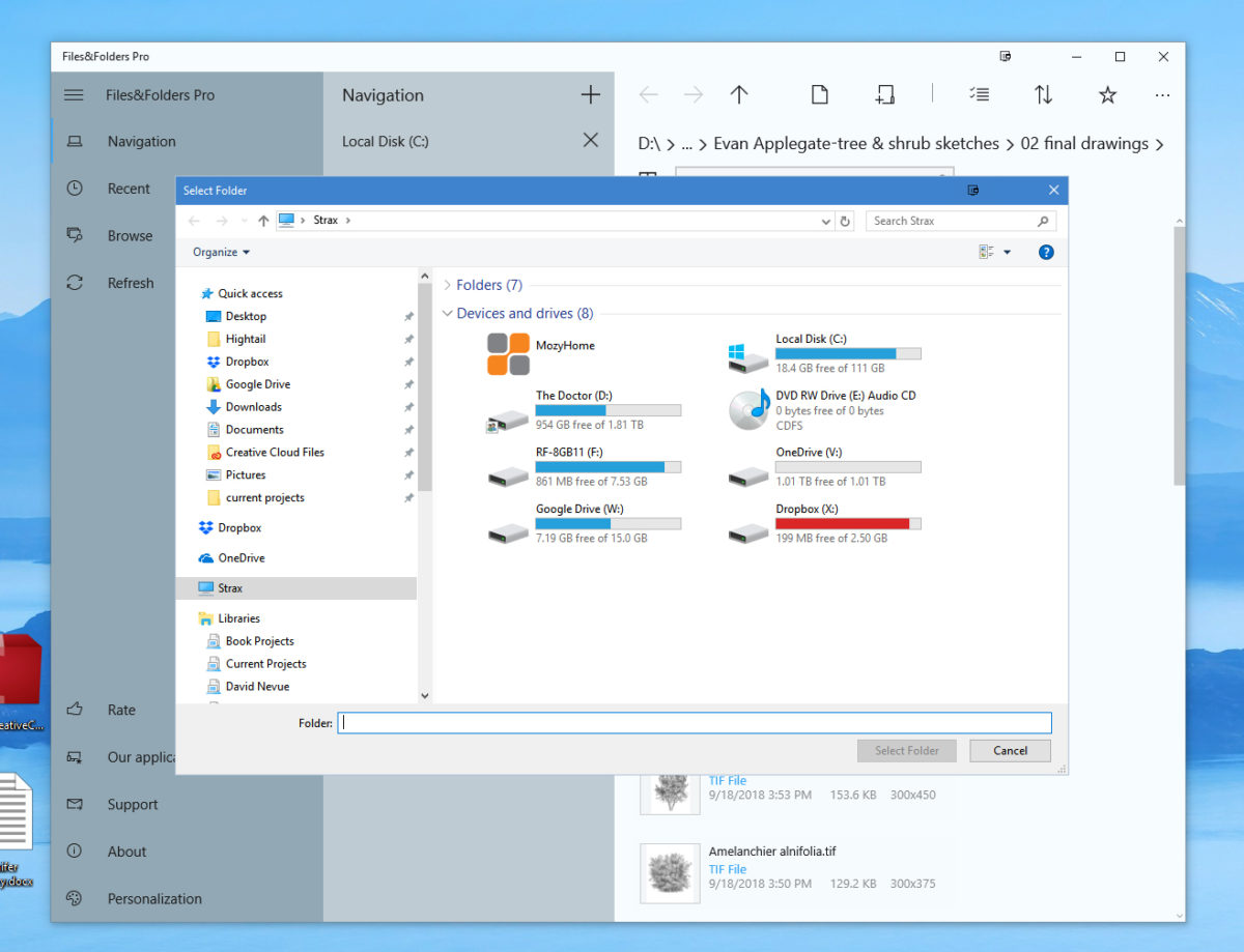
The layout is straightforward and very clean. Rather than opening a whole new window, clicking on a sidebar link (in this case “Navigation”) opens a middle column. This is a nice touch that keeps your desktop from getting too cluttered. You add navigation links by clicking on the “+” symbol. The default view shows only drives and a few other features like “Pictures,” “Music,” etc. So there is a little work to do to populate the Navigation sidebar, but once you do, you’re good to go. Removing a link is as easy as clicking on an “X” because, well, that’s what you do to remove one.
The top menu of icons is well thought-out. When you select a file, additional icons–cut, rename, sort, trash and clear selection–appear. By showing these icons only when relevant, things stay streamlined.
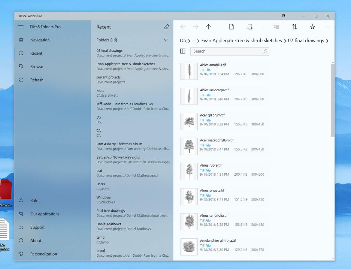
The “Recent” sidebar is pretty sweet. Sure, you can also access recent files by clicking “Task View” in the system tray, but this is accessible directly in the window. Me likee.
When you click the “+” to add new navigation links, you’re greeted with the standard File Explorer. Same thing happens when you select the “Browse” link on the left. This was a bit disappointing because now we’re back to the visual conflict between old and new. Maybe this is unavoidable, but if you’re hoping to eschew the old Explorer interface, that isn’t entirely possible.
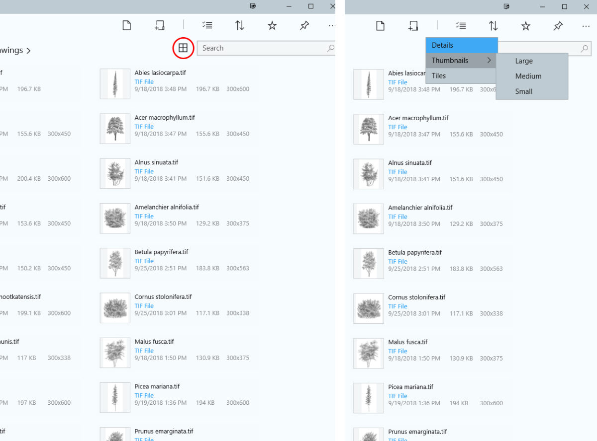
The view options aren’t as robust as the standard Explorer’s. Clicking on the grid/arrange icon reveals the options available. There’s also no preview pane. For some that won’t be a big deal, but I have scads of image files.
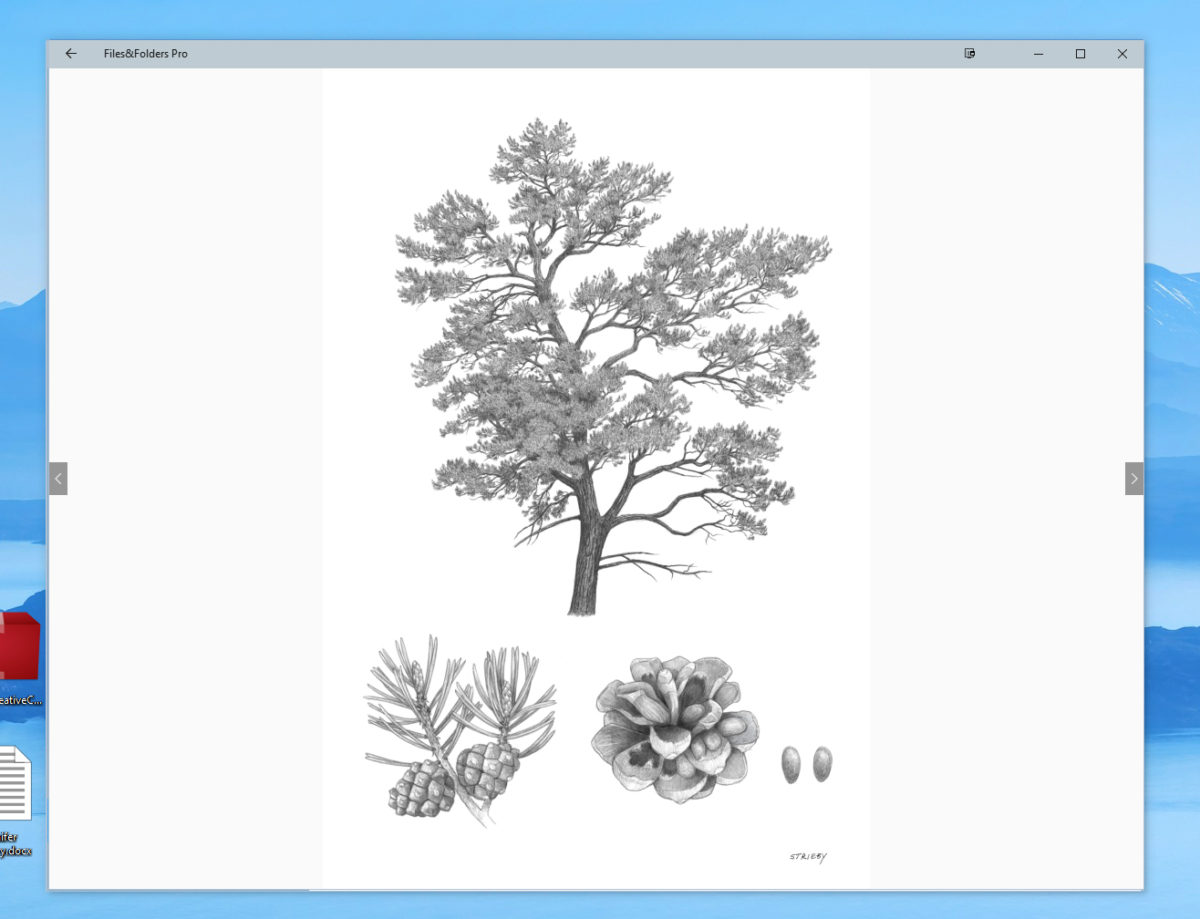
On the positive side, you can view a window-sized version of any image simply by double-clicking. If you have more than one image in the folder, you can also turn them into a slideshow.
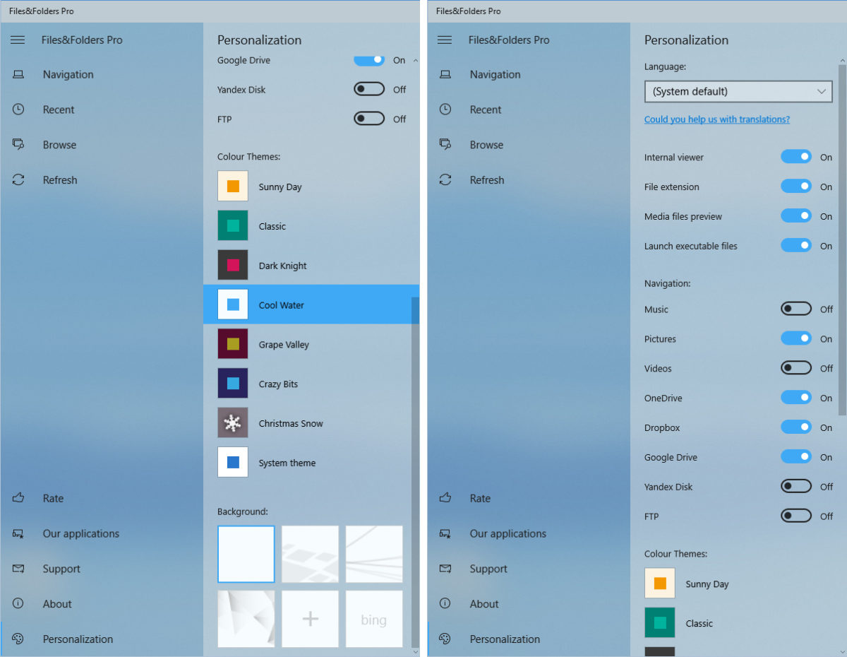
Personalization settings add some things not available in the standard Explorer. For instance, there are several color themes to choose from. Admittedly, a couple of them are wretched, but at least you have some options here. By contrast, other than changing the color of the title bars, there’s not much you can do to significantly change the look of regular ol’ Explorer.
There are some nice features in Files&Folders Pro that make interacting with Windows a better experience. However, there are also a couple of major shortcomings that will, at least in my case, keep it from being a total File Explorer replacement. One of the biggest demerits is the lack of drag-and-drop. You can have more than one window open at a time (though you have to select a window from the taskbar’s jumplist to do it), but you can’t drag files from one to another. This is such a basic feature of any OS, it’s a little baffling that they didn’t incorporate it. Yes, you can cut/copy and then paste, but drag and drop…come on! Files&Folders also doesn’t feature tabs, unlike some of its competitors. Yeah, I know, Windows 10 doesn’t have tabs, either, but if Files&Folders offered them, it would make a much more compelling reason to use it.
So will I keep using this app? I think I will play around with it some more, but there are also a couple alternatives I might try. Stay tuned…
The Good:
Sophisiticated, modern design with several color theme choices
Ability to launch .exe files (I didn’t mention this is the overview, but it’s pretty darn important)
Middle column for navigation and recent files is very convenient and keeps things streamlined
Intiutive and easy to navigate
The Not-so-good:
No drag and drop
You’ll still need to interact with the regular File Exploerer to perform certain tasks
No tabs




No comments yet. Be the first!