Hammer Time
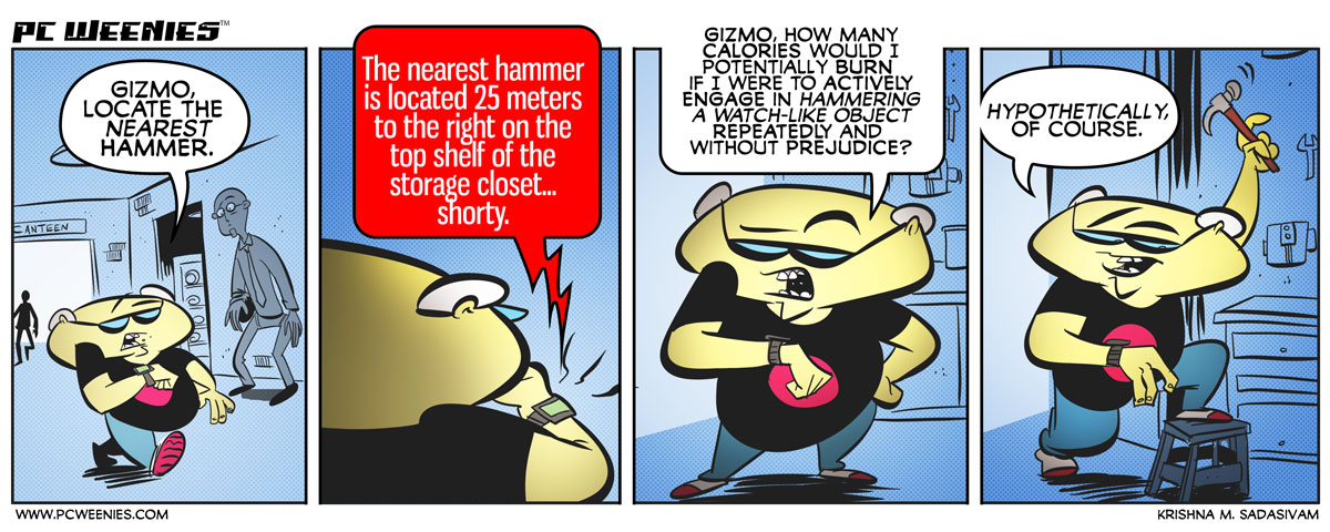
I’m trying a new approach when it comes to integrating backgrounds in my comic strips, by adapting some of the techniques used in old UPA cartoons – namely sparse, monochromatic backgrounds that have just enough detail to establish a setting.
I’m experimenting with this aesthetic – so let me know what you think in the comments below.
-Krishna


Jake Eskel
August 13, 2014 at 1:04 pmThat guy in panel one seems to be stunned. Perhaps it’s as crazy to use Gizmo as it is to say “Glass, find my coffee.” Will it ever be socially acceptable to talk to devices like that?
I notice there seems to be no Disqus anymore. It makes commenting easier! Only it would be nice to be told that name and email are required ;- )
I like your current site design. It’s fast and responsive
As for your main question, about backgrounds… I feel it worked for here, where the background had no importance. I can’t imagine, say the Maude storyline, working nearly as well with monochrome, but Bob in jail would have been fine.
Krishna
August 13, 2014 at 7:12 pmcool! I’m back to WP for comments – hope it makes it easier for people to share their thoughts and opinions. Thanks for the feedback, Jake! I also agree with your assessment – with the Maude storyline, colors added to the overall story. But for backgrounds as ordinary backgrounds (where it just provides context, and not a critical story element), monochrome makes it much simpler for me.
Jake Eskel
August 14, 2014 at 1:51 amMonochrome also has the added benefits of making what matters stand out. It’s simple, clean, elegant…. I like it.
David Garcia
August 13, 2014 at 6:24 pmI like the background, really makes the character stand out! This whole Gizmo thing is quite hilarious.
Krishna
August 13, 2014 at 7:10 pmThanks, David! :D
hari
August 13, 2014 at 11:42 pmGlad you got rid of disqus. I don’t like third party commenting systems tracking my comments on different sites in one place.
Yes, this is funny, especially the last panel where he’s aiming the hammer at his own wrist! Hm…