Illustration: Chaser7
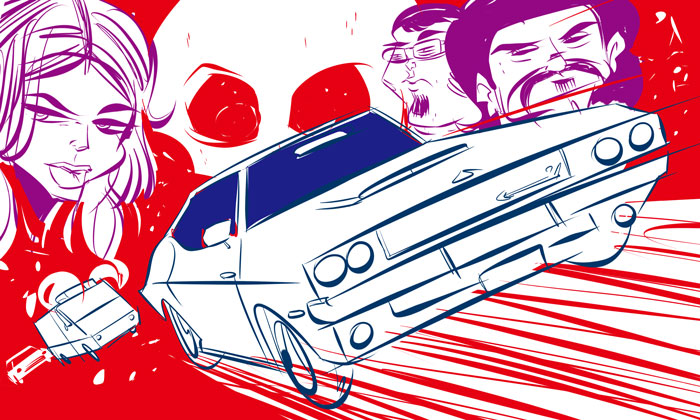
Last night I watched Drew: The Man Behind the Poster, a documentary about famed poster artist Drew Struzan. (It’s on Netflix. Go watch it!). Afterwards, I felt inspired to tackle a montage of sorts. Below are the rough pencils:
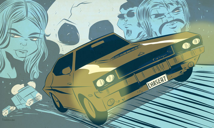
The finished piece is below.
In planning a montage, I’ve always made a conscious effort to create a focal point within the composition. The composition layout is worked out in the rough stage. I went for a monochromatic color scheme to reinforce the car as the primary focal point. Color contrast is a powerful way to add depth to a composition. Since I was using cooler, lighter colors for the background elements, I opted for darker and warmer colors for the car itself.
-Krishna
No comments yet. Be the first!