What's Eating Bob?
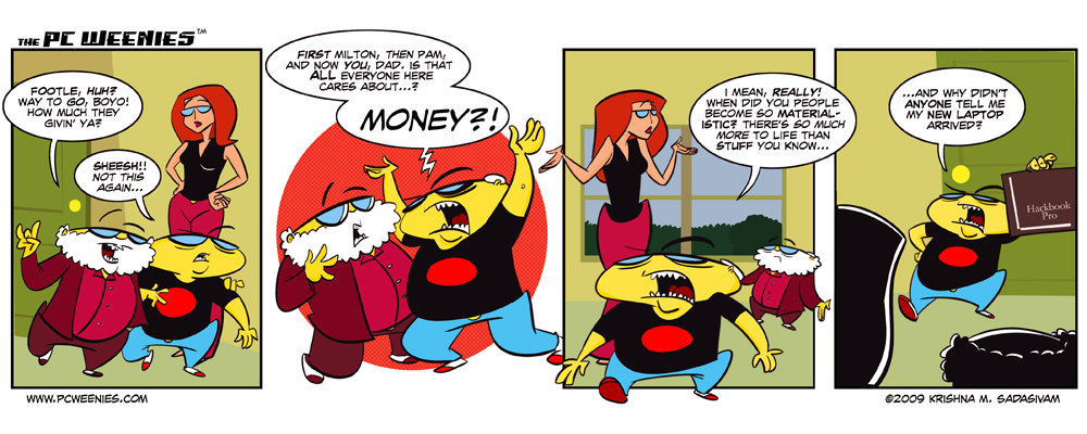
The strip you see above you was the second (and final) attempt. I was happy with the script, but the first version (shown in inks and colors, below) just didn’t sit well with me. Specifically, I felt that the characters in the panel layouts weren’t exaggerated enough. The third panel was particularly awkward, as Pam’s shrug is half cut off. The visuals for the 4th panel – meant to reinforce the punchline – was also weak. So, I decided to start from scratch once again.
Interestingly, the first version was done purely with the tablet from start to finish. What I realized after drawing it was the following: As much as I enjoy working digitally, my brain is somehow still wired “analog” when it comes to developing the initial sketches.
So that’s exactly what I did with the final version. I sketched it out on paper, then inked it in Painter X. Like usual. Oh, and I’ve also been experimenting with using a thicker brush. Lemme know your thoughts…
-Krishna


vyzion360
April 30, 2009 at 12:05 am*lmao* I really enjoyed this! *giggle* @ “hackbook pro”
Lynn K. Fletcher
April 30, 2009 at 7:34 amWow. I watched your first attempt on the stream. So much effort went into it. And you scraped it to do a second version because it didn’t sit well. Kudos to you my friend. That’s some serious dedication.
bullfinch
April 30, 2009 at 7:45 amTotal RE-DO?! nice. The second version is certainly improved. Nice colors too!
marcM
April 30, 2009 at 7:48 amI like how you modified panel 2 borderless and it always seems less rigid to me when a panel (like 3) overflows its borders a bit like Pams hand, Bobs foot, and the text.
As always, well done!
Maddpenciler
April 30, 2009 at 8:23 amKrish it definitely looks better with the story tellin in the final version. (I tried to look at the finished piece with out words and again it’s a lot better in my opinion) And I’m an old school type of cat any way and pencil and paper will always be my main source and starting point. Not taking away from folks that do straight digital but for me… bring on the paper. That’s my two bits.
Nate Fakes
April 30, 2009 at 8:37 amLooks awesome. I like it the way it is!
dgriff13
April 30, 2009 at 3:50 pmheh, “hackbook pro”. I love the brand-name-change we cartoonists have to do. Like Bill Amend’s “ifruit”.
Thanks for the glimpse in your methods… interesting to see “first drafts”.
Richard Walsh
April 30, 2009 at 3:53 pmAnother Great Krishna! So how much is bob making lol
Krishna
April 30, 2009 at 4:50 pmwow! some great feedback! Thank you! :D